Category: Rates (Page 1 of 2)

This is Not That

One of the (very few) benefits of being in the business of capital markets and investing across more than three decades is the ability to quickly recognize the similarity of an event to something in the past. Or, in the case of this past week, the lack of similarity. The rapid unraveling of Silicon Valley Bank and the apparent encore of Signature Bank has people talking of 2008 and the Financial Crisis. It is actually hard for us to believe it has been around 15 years since the Crisis. It seems much more recently that we were standing with our colleagues watching Bloomberg screens of credit default swaps wondering who would fall next and what the likelihood was it would be our own employer. The whole system was unraveling. This is not that.

Superficially, there is enough in common to suggest history may not be repeating itself but at least it is rhyming. High-flying bank gets too far over its skis, customers and markets lose confidence, run on the bank, regulators step in and shut it down and look for a buyer. Looking another layer deep there is still some commonality – the bank failed at its most basic function, providing safekeeping of and access to customer money.

So, reasonably, people are concerned about contagion and a more widespread run on banks. But, unless some startling levels of as-yet unknown malfeasance or malpractice emerge to change the narrative, there is an important difference between what took down SVB and what took down Lehman Brothers, Bear Stearns, WaMu and others. In the depths of the Financial Crisis, the main problem was that nobody knew what bank balance sheets were actually worth. Complex securitized loan pools were valued based on assumptions and risk models that proved to be fragile or entirely wrong all at once. It wasn’t possible to look at these holdings and get even the slightest idea of what they were worth, which meant there was no way to understand how much capital the banks actually held against their depository and other obligations. The banks’ use of leverage also multiplied these unknowns making the consequences even more far reaching.

SVB on the other hand appears to be a good old fashioned case of staggering incompetence. Don’t get us wrong – that is no excuse. But in this case, it does not appear that the balance sheet of SVB cannot be valued. It is simply that they entirely blew the most basic and central internal role they needed to perform, which was to properly match assets and liabilities. They ended up with too many long-dated assets and short-dated liabilities and simply did not have the liquidity to satisfy customer demands that then blossomed into a run on the bank. By all accounts everybody knows what is on the balance sheet and what it is worth – and the answer is… not enough in the current market environment. Not zero, but not enough.

It also doesn’t appear that there is a quality issue like what plagued banks in 2008 where the securities on the books turned out to be far junkier than their ratings would suggest. They simply held too much high quality but long-dated Treasury and other obligations that got hit hard with the spike up in rates this past year. After the Crisis, the rules did change on what types of holdings counted and to what degree when assessing an institution’s capital adequacy. Treasuries are right at the top of the chart of holdings that satisfy those ratios. The bonds are still there, and there is no reason to think they wouldn’t pay out 100 cents on the dollar if held to maturity. But, SVB couldn’t sell them today to satisfy withdrawals for what they will be worth a decade from now. Again, basic asset-liability management seems to have eluded them.

Bank management may have assumed since cash was coming in hard and fast over the last couple years that liquidity was never going to be an issue, so they could step further out on duration to squeeze extra basis points of yield out of the balance sheet. A little stress testing would have shown that a meaningful rise in rates would hit the value of those long bonds, which meant everything rested on either the cash continuing to come in or at the very minimum their customers not looking for withdrawals in size. SVB, because of their business strategy, is unusually concentrated in its client exposure to the Tech and tech-adjacent sectors. It wasn’t a mystery that the whole Tech space was undergoing market stress, investors were tightening purse strings, and companies and their funders would be looking to tap their cash reserves to keep things going. They got caught in a simple squeeze – their principal clients needed to access liquidity at a time the bank couldn’t satisfy it without taking a hit on those assets.

As of late this weekend the regulators have stepped in and assured liquidity for all depositors, insured and uninsured. They do have a facility paid into by the banks that was set up precisely for this kind of situation. SVB (and Signature) is essentially defunct, and likely will be bought whole or in parts by one or more big, solvent institutions at a very attractive price and without having to assume the kind of risks banks faced buying the failed banks in 2008. In a bank run psychology does become reality, and even though the problems are not systemic in the way they were in the Financial Crisis, it is right and reasonable to be concerned about contagion. Customers could manufacture a crisis where one didn’t exist just out of fear. Regulators are doing the politically unpalatable and interceding in a way that will benefit a lot of unsympathetic parties in order to keep a very specific problem with a very specific group of institutions from blossoming into something much more damaging.

Dodd-Frank has never been popular, seen as too odious and heavy-handed and in the way of free enterprise in the view of industry stakeholders, and with the benefit of more than a decade in use it could definitely be improved. However, this past week serves as a graphic example of why it is necessary, and why regulation and supervision are essential to the orderly functioning of our financial systems. In the all-too-apropos words of the comedian Ron White, there’s no cure for stupid.

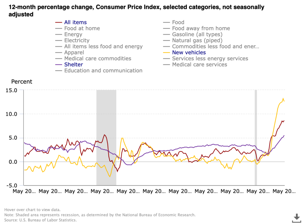
WCM Chart for June 10, 2022

We have a new CPI print today which sent markets into a week-ending nosedive. 8.6% for May puts inflation for consumers near where it was in 1981 before the Volcker Fed cranked rates to an eye-watering 17+%. For as painful as rate increases are right now we have light years to travel before anything even remotely resembling the 80’s, nostalgia for Soviet conflict and striped shirts notwithstanding. This chart from the US Bureau of Labor Statistics compares CPI in total against two of the three components that seem ripe for a nasty mean reversion, the third being energy which we covered in the last chart and commentary. Shelter has broken out, rising to 5.5% which exceeds the lusty moments before the housing market imploded with the Financial Crisis. We have been pointing out repeatedly that there are two major moving parts driving increases in shelter — the speculative fervor over single family housing fueled by low rates, urban migration and non-human (e.g. investment fund) buyers, and the inevitable upward correction in rentals after ending pandemic moratoria on rent, rent increases and evictions. It seems likely that the single family bubble is nearing its bursting point especially as the Fed acts, but rent will continue to grind higher as the economy digests the rental disruptions of the pandemic.

New vehicles on the other hand appear perched on the precipice. Supply chain disruptions, particularly for microchips, have tightened supply and handed dealers tremendous pricing power even while makers have largely kept their price increases steady (but have been able to slow or suspend aggressive promotional programs). The rate of increase peaked at 13.2% in April and posted 12.6% for May. Other than playing demand catch-up after the market for new vehicles crashed in the depths of the Financial Crisis, the 12-month change over the last 20 years has stayed in a band of +/- 2%, and most of the time close to zero. There will come a moment when makers catch up and inventory will be abundant (and auto loan and lease rates will be higher), and the market may well punish the dealers for exploiting the situation, potentially severely. [Chart courtesy US BLS, CPI All Items, Shelter and New Vehicles, May 2002 to May 2022]

WCM Chart of the Week for February 8, 2022

The market, in our view, is trying to come to grips with a less accommodative yet still supportive monetary and fiscal policy environment. Federal Reserve policy is dominant at this moment, since it appears fiscal policy progress has stalled until the mid-term elections and perhaps beyond. The Fed is unlikely to turn away from its recent pivot towards being less “dovish”, which in light of recent inflationary trends is still is a far cry from an aggressively “hawkish” stance.

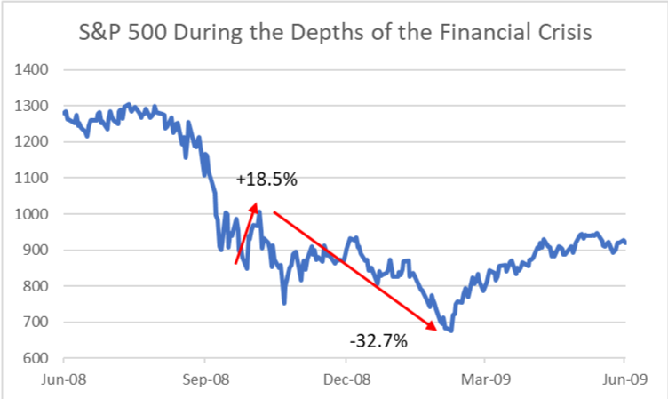
It seems probable the market will re-test the lows of January 24th over the coming days or weeks, and from there we will ultimately see from which way the equity market breaks. The recent intra-day volatility was reminiscent of some of the price action during the financial crisis, particularly around the 2008 election. When it appeared that President Obama would easily win, the S&P 500 rallied over 18% from October 27th to election day November 4th. With deep uncertainty about who would fill the new President’s cabinet and what steps they would take to address the worsening crisis, the S&P 500 subsequently fell nearly 33%. The market ultimately bottomed when Timothy Geithner, Obama’s most important new cabinet appointee at that moment (Sec. Treas.), announced the deployment of the TARP funds. There are certainly differences between 2008-2009 and now, most notably the health of the financial sector. However, the market fears uncertainty and that is a common thread between now and then. Another more tenuous thread, but one worth watching, is the speculative bubble in digital assets that has already partially ruptured, and the run-up in residential real estate in part fueled by loose lending practices. Today’s uncertainty is primarily around what the future holds in a less accommodative monetary and fiscal environment. Economic activity, while still growing, appears to be slowing and high inflation persists, prompting concerns about the potential for stagflation. [chart: Wilde Capital Management © 2022, data from Standard & Poor’s 500 Index]

A WCM Seasonal Chart for October 15, 2021

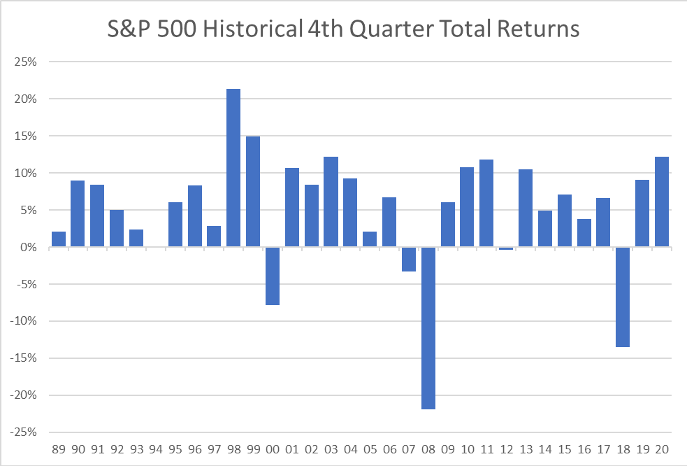
The total return of the S&P 500 tends to be positive in the final quarter of the year, averaging nearly 5.2% since Q4 of 1989. The worst final quarters of the year occurred during the technology bubble, the financial crisis and most recently 2018. Let’s look at today’s headwinds. Inflation, which is near universal across the economy, works like a broad tax on everyone. Price increases in many segments of the economy are outpacing wage growth, and that is impacting consumption which makes up about 70% of GDP. Supply chain issues will likely persist into next year and perhaps beyond, continuing to pressure prices. Next, the Fed. Their actions or inactions will be scrutinized and probably criticized for years. Tapering will start soon, but liquidity and monetary support will still be positive, just less so. It is doubtful, even with so many Fed seats open, that President Biden will appoint hawks in this environment, so we expect that will keep the Fed accommodative for longer and rate hikes pushed out further. In the Fall of 2018, our last “bad” Q4, the Fed was in balance sheet reduction mode and in the midst of raising policy rates when Powell remarked that they were “not near interest rate neutrality” causing a rout in equities worldwide. Three years and a more seasoned Powell later means we do not expect the same rhetorical mistake will be repeated. We also need to watch the ECB. Inflation could be here for longer and that would fuel ongoing volatility. Bad for bonds but not necessarily stocks. For us, even with additional volatility, equities remain the default asset class at least over the next few quarters. [chart WCM © 2021, data from Bloomberg LP]

WCM Chart of the Week — Summer-End 2021

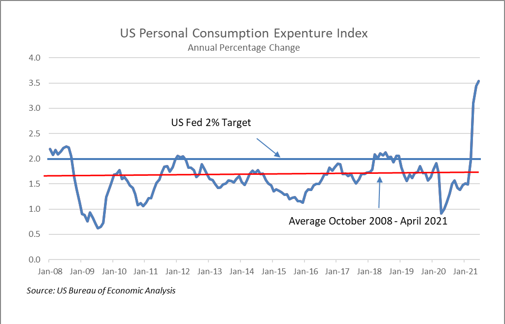
This will be our last chart before Labor Day. The US Federal Reserve’s preferred measure of inflation, the YoY rate of change in the Personal Consumption Expenditure Index (PCE), has been exceeding its 2% target rate since April making investors concerned that we may be approaching a monetary tightening cycle. That fear was escalated by this week’s release of the Fed’s July 28-29th meeting minutes that indicated they may begin to wind down the current $120 billion monthly asset purchases by the end of this year or the beginning of 2022. The Fed has expressed its view that current inflation trends are transitory and are likely due to temporary factors such as supply chain bottlenecks and a strong rebound in demand from last year’s lull in consumption. As of June 30th, the current annual rate of the PCE was 3.54%, well above the Fed’s target, but in June 2020 the reading was 1.13%. Since the Fall of 2008 during the Financial Crisis, the PCE has been stubbornly below 2%, averaging 1.59%. Over that period of nearly 13 years, the PCE has been over 2% only in Q1 2012 and for most of 2018.  Inflation has been undershooting for a long period leaving aggregate price levels far below the Fed’s ideal. This suggests to us that the Fed will likely tolerate inflation until the PCE normalizes.

WCM Chart of the Week for August 9, 2021

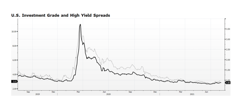
Investment Grade and High Yield bond spreads have been edging higher since reaching their tightest levels ever at the end of last quarter. Admittedly, the spread widening may have more to do with the decline in Treasury yields since June 30th than an indication of any deterioration in the credit markets. What is interesting to us is that this has been occurring while broad stock market indices in the US and Europe are hitting all-time highs. Equity market valuations are full, particularly in the US, but according to Bloomberg consensus earnings are expected to grow by 11.8% over the next 12 months, putting the forward PE ratio of the S&P 500 at 20.3x, lofty yet not extreme. Our sense is that, barring a major surprise or a misstep by the US Fed, the positive tone in equities in the Western world will continue. The outcome of the Fed’s September meeting will be highly scrutinized but the likelihood that they will surprise markets is low. [chart courtesy Bloomberg LP © 2021]

WCM Chart of the Week for March 1, 2021

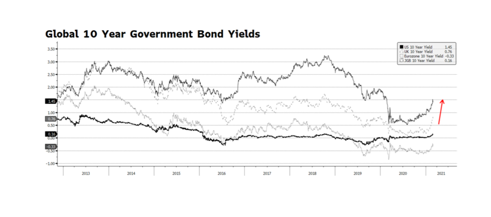
Equity markets around the globe were on edge as February came to a close. The technology-laden NASDAQ fell nearly 7% from an all-time high on February 12th. The weakness in equity prices came despite very accommodative comments from US Federal Reserve Chairman Jerome Powell during his scheduled two-day Congressional testimony last week. Equity markets became unnerved as government bond yields began to rise at an accelerated pace in the US, Eurozone and particularly the UK. Benchmark interest rates have been rising since the beginning of this year and US interest rates have been climbing since last Summer signaling expectations of improving economic conditions in the months ahead. As long as the rate environment increases gradually, gains can continue in equity markets. But, as we witnessed over the past few weeks, a steep ascent in market interest rates will have an expected adverse impact on risk assets. [chart courtesy Bloomberg LP (c) 2021]

WCM Chart of the Week for January 18, 2021

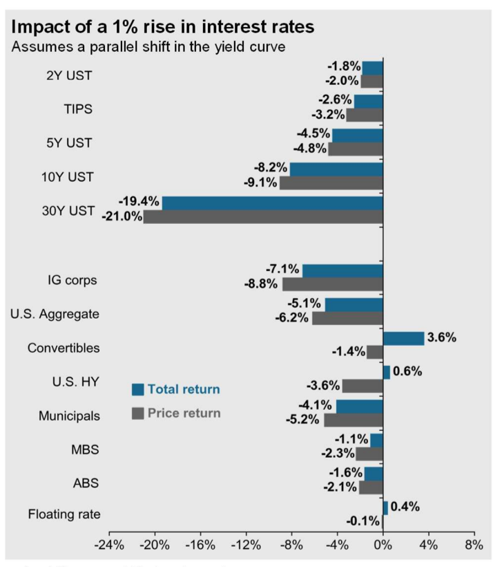
This week’s chart comes courtesy of J.P. Morgan Asset Management’s “Guide to the Markets” quarterly publication, expressing the near uniform adverse bond market impact of a nominal 1% rise across the yield curve. A key assumption cited in the chart subtitle is that the shift in the curve is parallel, which rarely happens. Yet, the illustration highlights a major challenge for US bond investors in the months ahead.  There may simply be few segments within fixed income where investors can expect positive total return. It is reasonable to assume that the rise in intermediate-to-long term US Treasury rates will continue, eventually approaching pre-pandemic levels. The yield on the 10-year US Treasury has risen from 0.5% on August 4, 2020 to 1.08% on January 18, 2021, while it stood at 1.77% 12 months ago. According to JPM’s analysis, only US Convertibles, High Yield and Floating Rate securities can be expected to deliver modestly positive total return in the year ahead. There are other key assumptions that would change the results of their modelling, such as benign equity market conditions and a steepening yield curve, but the chart illuminates the harsh reality facing bond investors in 2021. [chart courtesy JP Morgan Asset Management © 2021]

WCM Chart of the Week for November 16, 2020

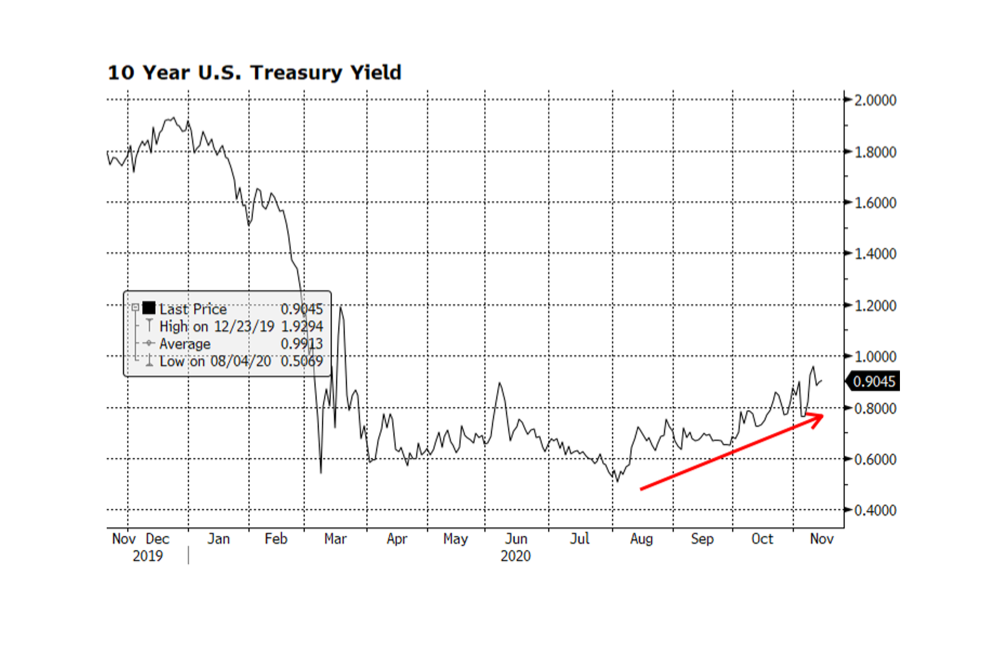
With US stock market indices across the capitalization spectrum at or above all-time highs, US Treasury yields have been grinding higher. Since early August, the yield on the benchmark 10-year Treasury has risen from an all-time low of 0.51% to 0.9%, forcing long-term US Treasury prices down over 7% since then according to the Bloomberg Barclays Long Term US Treasury Price Index. US stock prices have been rallying due to the announcements of highly effective COVID-19 vaccine trials, building economic momentum, clarity developing in the US political landscape and resilient as well as improving corporate fundamentals. We expect US interest rates will continue to normalize to pre-pandemic levels in coming quarters and that will likely keep downward price pressure on long term Treasuries. We expect this to be gradual given that comparable sovereign rates in Europe and Asia remain much lower or even negative. Overall conditions should be supportive for equities heading into 2021 even in the face of higher US Treasury yields. [chart courtesy Bloomberg LP © 2020]

WCM Chart of the Week for May 29, 2020

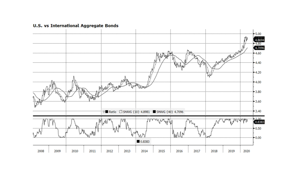
The Bloomberg Barclays Aggregate Bond Indices are widely considered to be the global standard for fixed income gauges. This week we compare the US Aggregate vs. the International Unhedged Aggregate. Over the long-term (12 years shown below) US bonds have outperformed significantly overall, with only brief bouts of underperformance in the short term. There are several reasons that explain US fixed income dominance — USD strength, interest rate spreads across comparable sectors and superior corporate fundamentals. The current phase of US leadership has persisted since early 2018 but may be showing signs of fatigue at the end of the longest period of outperformance over the past dozen years. The dollar remains elevated vs a basket of major currencies compared to pre-pandemic levels, although that appears to be normalizing in recent weeks. Our view is that, as long as comparable interest rates in other major economies remain negative, or spreads benchmarked against US interest rates remain wide, global investors will prefer US bonds. We currently hold little or no international fixed income and remain positioned in shorter duration instruments. [Charts and data courtesy Bloomberg LP © 2020]

« Older posts