Category: Rates (Page 2 of 2)

WCM Chart of the Week for April 24, 2020

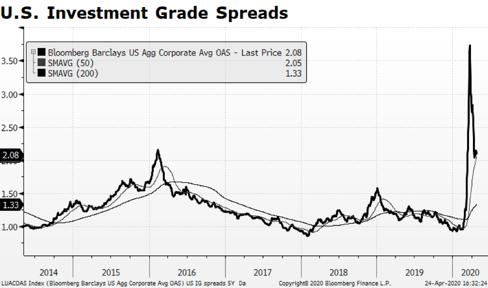
A positive development has surfaced within the US fixed income market — Investment Grade Corporate Credit spreads have narrowed relative to the 10-year US Treasury yield, yet still remain wide by historical measures. There may be some opportunity in that sector of the bond market. Even with that backdrop, oil price volatility unnerved many observers as the near-term WTI contract (for May 2020 delivery) priced with a negative sign Monday closing at a bizarre -$37.63. It has since recovered to about $17. Ongoing anemic demand combined with a lack of available storage to create a moment where there was no immediate bid for oil.  From an equity market standpoint, the impact was limited though as the major integrated energy companies continued to rebound along with the overall stock market. Importantly, the sector currently stands at only 2.9% of the S&P 500 while 10 years ago it represented nearly three times that share of the index.

We are optimistic about US capital markets, but the health crisis will continue to generate grim news and adversely impact the labor market and the overall economy.  This week’s first-time unemployment claims brought the running total to 26.5 million American jobs, essentially wiping out all job gains since the Great Recession. The US is far from out of the woods, but the market is handicapping a positive outcome in the long term.

WCM Chart of the Week for November 8, 2019

The global rally in stocks and key US equity indices hitting all-time highs are again garnering the majority of the financial press’ collective attention. We however prefer to focus on government bond markets. Long-term interest rates may have bottomed towards the end of this past summer. 10-year government bond yields in key developed economies are on the upswing and may even have positive readings in Japan and the Eurozone before year end. We find the upward interest rate trajectory interesting in the context of the US Federal Reserve’s recent decision to lower its target rate. It is encouraging that yields are rising together which may be a signal that economic conditions across the globe are stabilizing and safe haven asset prices are falling. [chart courtesy Bloomberg LP © 2019]

WCM Chart of the Week for Oct. 11, 2019

Volatility in US Treasury prices has been building for the past six months or so as measured by the ICE Bank of America Merrill Lynch Move Index. That is not all that surprising given the magnifying effect even small interest rate movements have on Treasury prices in today’s low rate environment.  The challenge investors face is that bonds, particularly longer-dated issues, offer anemic income streams and the likelihood of principal erosion as rates rise to more normal levels.  We continue to maintain lower duration within fixed income allocations than our benchmark because we believe that the long end of the yield curve, here and abroad, offers little investment merit and the potential for a great deal of volatility.

WCM Chart of the Week for August 30, 2019

As we end the month of August US stocks have contracted 1.7% while US bonds have advanced 2.5% (through 8/29) and it seems like we have been in a tug of war between the asset classes since at least last fall.  Could we be at a pivot point when investors rotate back into equities?  The chart below shows the total return relationship between the S&P 500 and the Bloomberg Barclays Aggregate indices and it appears that large cap US stocks may be bottoming relative to bonds.  The bond market has been supported by a benign interest rate environment as the yield on the US 10 Year Treasury Bond has fallen from 2.68% at the beginning of the year to a low of 1.47% on August 27th.  There are several reasons why rates have fallen — no real inflationary pressures and lower and even negative interest rates in the rest of the developed world.  If rates stabilize around current levels, equities should regain leadership given that corporate fundamentals remain solid, market valuations are not elevated, and the US economy is still expanding. [Chart courtesy Bloomberg LP (c) 2019]

WCM Chart of the Week for August 23, 2019

The US fixed income market has had a tremendous run so far in 2019. The Bloomberg Barclays US Aggregate has risen 8.4% through August 22nd. That performance is not surprising given that the 10-year US Treasury yield has fallen by roughly 50% from November 2018 to current levels. The overall fixed income market is overextended based on several fundamental metrics and it is overbought relative to its long-term trend. This week’s chart shows the aggregate index plotted with the 50 and 200-day moving averages in the top panel while the lower panel shows the ratio of the index to its long-term 200-day moving average.  The arrow on the top chart highlights the significant spread between the current level of the benchmark and the long-term trend.  Usually, when the index reaches elevated levels versus long-term trends, a consolidation or even modest correction follows. What concerns us is the ratio of this relationship (bottom panel) currently registers 1.057, the highest reading we have seen in the past five years. Forward 6- and 12-month total returns were mostly positive over the past 20 years when this ratio reached or even surpassed the current level largely because interest rates were higher than they are now.  With current interest rates so low, the ability of yield to overcome principle loss if or when rates rise is nonexistent in our view. This is the main reason why we continue to allocate towards shorter duration instruments with the fixed income portion of portfolios.

WCM Chart of the Week for August 16, 2019

The US Yield Curve inverted this week for the first time since 2005 as the yield on the 10-year US Treasury fell below the 2-year.  Stock markets around the world fell with the Dow Jones Industrials suffering its worst point drop of 2019 — over 800 points alone on August 14th.  Investors are concerned because an inverted yield curve has preceded the three most recent recessions, highlighted in the shaded areas on this week’s chart. This time may be different because a case can be made that longer-term interest rates in the US are being suppressed due to negative interest rates in several developed countries, which is likely distorting the US yield curve. Another observation from the chart is that, while an inverted yield curve causes equity market volatility, it does not necessarily derail stock prices in the intermediate term.  US equities continued to rise in the early and late nineties as well as from 2005-2007, all instances that occurred with curve inversions.

WCM Chart of the Week for August 8, 2019

There has been little doubt in investors’ minds that monetary policy has played a critical role in supporting the global economy and capital markets for several decades.  Lately, the focus has been on how many times (and for how long) the US Federal Reserve will cut its Target Rate this cycle.  The current US economic expansion is the longest on record, and the question is whether late cycle rate cuts can sustain growth and the upward trajectory in the US stock market.  The most recent prior period we had a mid-to-late cycle reduction in the Fed Funds Target Rate was during the Alan Greenspan era when easy monetary policy fueled the Technology-driven bull market during the 1990s.  In the aftermath of the Tech bubble bursting, Greenspan was criticized for being too accommodative and ultimately producing a deeper rout than otherwise could have been.  Many forget that the rationale for easy monetary policy at the time was in part a response to the Asian currency crisis that spread from Thailand throughout South East Asia in 1997.  The current US Fed actions are a response to global economic weakness and should ultimately provide support for stock markets around the world.  A critical difference this time around is that fundamentals and valuations in the US stock market are far stronger than we experienced during the late 1990s. [chart courtesy Bloomberg LP (c) 2019]

Chart courtesy Bloomberg LP (c) 2019

WCM Chart of the Week for July 17, 2019

The total amount of negative yielding debt has been steadily climbing (in fact doubling) since last September, and now stands at a staggering $12.7 trillion dollars according the Bloomberg Global Aggregate Negative-Yielding Debt Index.  Negative yielding debt now represents over 23% of the Bloomberg Global Aggregate Index and consists of both investment grade corporate and sovereign bonds, predominantly in Continental Europe and Japan, areas of the capital markets we have avoided.  Hyper-accommodative monetary policy throughout the world in the form of quantitative easing, and negative interest rate policy in particular, is the main impetus producing this upside-down phenomenon of forcing investors to pay to hold bonds.  The risk is that this negative income stream situation will be adversely compounded as interest rates ultimately rise, risking principal, in our view.  We are concerned how long these conditions can persist and the ultimate fallout on the real economy and capital markets.

Chart courtesy Bloomberg LP (c) 2019

WCM Chart of the Week for June 27, 2019

The dollar has weakened considerably over the course of the past few weeks after having strengthened for much of the year.  It has fallen below its long term trend (the 200-day moving average) which in the past has led to further weakness.  The decline in US interest rates and expectations for further reductions in policy rates by the Fed are likely behind the dollar’s fall yet it is difficult to make the case for the dollar’s value to decline further against major currencies.  Economic activity in the US is stronger than all other major economies (with the exception of China, which is slowing) and the yield on the 10-year US Treasury is positive while comparable rates in much of the developed world are negative.  Currency movements are notoriously challenging to predict, but the dollar could decline more despite US economic strength as the other major currency values normalize to levels seen earlier in the decade. [chart courtesy Bloomberg LP (c) 2019]

Courtesy Bloomberg LP (c) 2019
Newer posts »