Thanks for visiting our blog. Here you will find a wide range of content discussing market conditions and the world events that affect them, sustainability issues and Environmental, Social and Governance (ESG) oriented investing, and other topics that have a direct bearing on how capital flows around the world and how investing creates and even protects wealth. Please browse the blog at your leisure, and then visit the rest of the site by navigating the menus at the top of the window, or by clicking here.
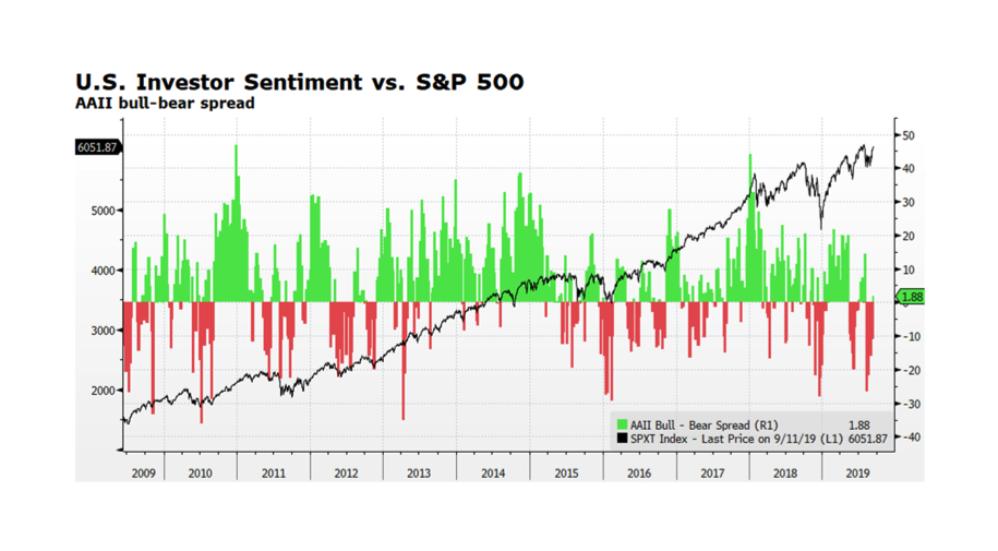
As Friday the 13ths go, not so bad. Large Cap US stocks, as measured by the S&P 500 total return index, have broken out and are approaching all-time highs reached earlier in the summer. The index spent the better part of August consolidating after peaking in late July. The positive market movement has boosted investor morale as the American Association of Individual Investors Bull-Bear Spread has just turned modestly positive. Improved investor sentiment and further market advances could persist with dovish signaling from the US Federal Reserve, a more positive tenor in US – China trade discussions, and corporate fundamentals and equity market valuations which remain supportive. The US 10 Year Treasury Yield now stands at 1.7% (9/12/2019) after reaching 1.46% on September 3, 2019 indicating that, for now, the flight to safety trade may be off as well. Many reasons to remain watchful though. Mario Draghi’s transition out of his leadership role at the ECB leaves some uncertainty regarding the bank’s future commitment to strong monetary support. The onset of Brexit carries its own uncertainties and the economic slowdown in China may be deepening.
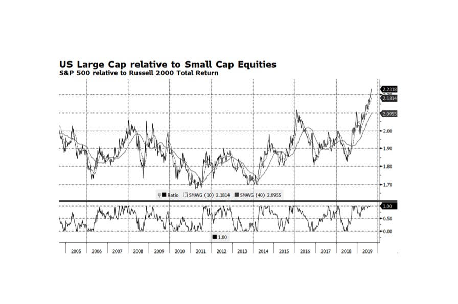
WCM Chart of the Week for September 6, 2019. Large Cap US stocks continue to outperform with the S&P 500 total return reaching 20.7% YTD through (September 5, 2019). This end of the US equity market, in particular, the Technology sector, contains the world’s strongest performers so far in 2019. US Small Cap equities however have lagged considerably, only gaining 13.2% over the same time period while global stocks as measured by the FTSE Global All Cap Index have advanced 15.8%.
Economic trends in the US are much more favorable than in
other key regions such as Europe and Asia. US Small Cap companies generally are
more domestically oriented while Large US companies earn significant amount of
revenue overseas. Intuitively, the global
environment should favor US Small Caps but that has not been the case. The key might be the low interest rate
environment enabling large companies to raise substantial amounts of debt
through the corporate bond market while smaller companies are more dependent on
regional bank financing. Another key factor explaining the performance
disparity between Large and Small Cap stocks may be sector representation. The financial sector of the S&P 500 represents
roughly 12% of the index while the Russell 2000 has about 17%. The financial sector has been a laggard
overall and a small financial service company’s revenue is generally more
dependent on lending which tends to struggle in low interest rate environments.
This week’s chart shows the total return relationship of US Large relative to Small Cap Equities. Large Cap stocks are trading at their highest levels relative to Small Caps in at least the past 15 years and are clearly extended. This is highly unusual but may persist at least until the US Federal Reserve ends its current rate cutting path and other monetary stimulus activities. [chart courtesy of Bloomberg LP (c)2019]
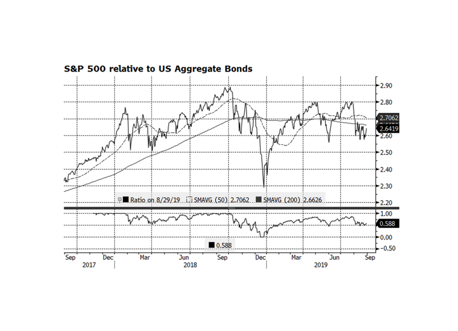
As we end the month of August US stocks have contracted 1.7% while US bonds have advanced 2.5% (through 8/29) and it seems like we have been in a tug of war between the asset classes since at least last fall. Could we be at a pivot point when investors rotate back into equities? The chart below shows the total return relationship between the S&P 500 and the Bloomberg Barclays Aggregate indices and it appears that large cap US stocks may be bottoming relative to bonds. The bond market has been supported by a benign interest rate environment as the yield on the US 10 Year Treasury Bond has fallen from 2.68% at the beginning of the year to a low of 1.47% on August 27th. There are several reasons why rates have fallen — no real inflationary pressures and lower and even negative interest rates in the rest of the developed world. If rates stabilize around current levels, equities should regain leadership given that corporate fundamentals remain solid, market valuations are not elevated, and the US economy is still expanding. [Chart courtesy Bloomberg LP (c) 2019]
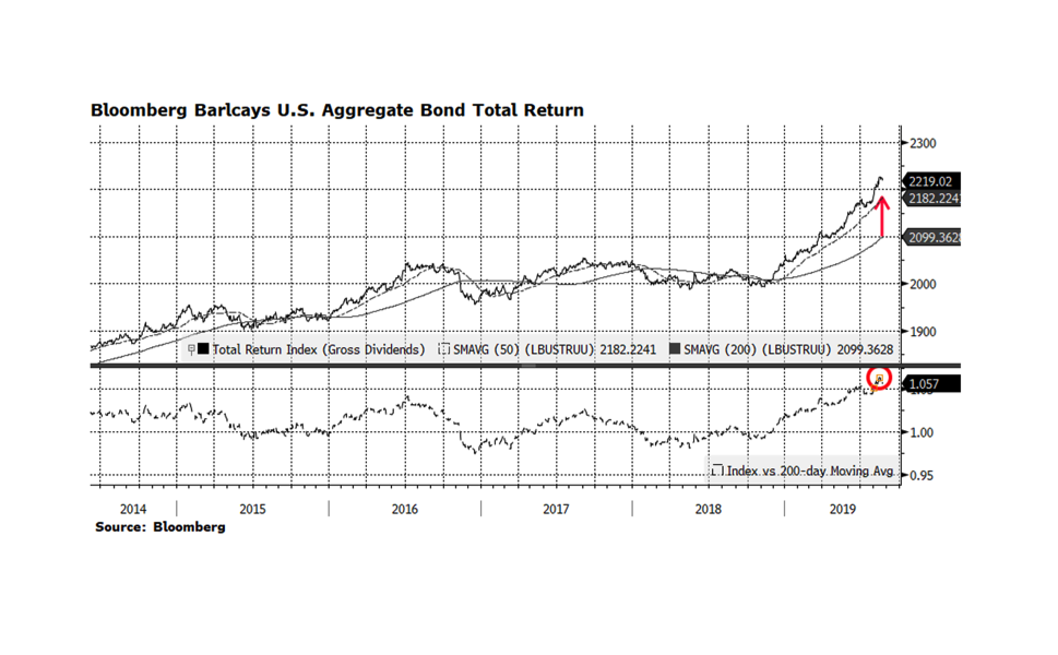
The US fixed income market has had a tremendous run so far in 2019. The Bloomberg Barclays US Aggregate has risen 8.4% through August 22nd. That performance is not surprising given that the 10-year US Treasury yield has fallen by roughly 50% from November 2018 to current levels. The overall fixed income market is overextended based on several fundamental metrics and it is overbought relative to its long-term trend. This week’s chart shows the aggregate index plotted with the 50 and 200-day moving averages in the top panel while the lower panel shows the ratio of the index to its long-term 200-day moving average. The arrow on the top chart highlights the significant spread between the current level of the benchmark and the long-term trend. Usually, when the index reaches elevated levels versus long-term trends, a consolidation or even modest correction follows. What concerns us is the ratio of this relationship (bottom panel) currently registers 1.057, the highest reading we have seen in the past five years. Forward 6- and 12-month total returns were mostly positive over the past 20 years when this ratio reached or even surpassed the current level largely because interest rates were higher than they are now. With current interest rates so low, the ability of yield to overcome principle loss if or when rates rise is nonexistent in our view. This is the main reason why we continue to allocate towards shorter duration instruments with the fixed income portion of portfolios.
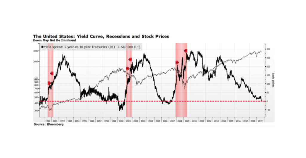
The US Yield Curve inverted this week for the first time since 2005 as the yield on the 10-year US Treasury fell below the 2-year. Stock markets around the world fell with the Dow Jones Industrials suffering its worst point drop of 2019 — over 800 points alone on August 14th. Investors are concerned because an inverted yield curve has preceded the three most recent recessions, highlighted in the shaded areas on this week’s chart. This time may be different because a case can be made that longer-term interest rates in the US are being suppressed due to negative interest rates in several developed countries, which is likely distorting the US yield curve. Another observation from the chart is that, while an inverted yield curve causes equity market volatility, it does not necessarily derail stock prices in the intermediate term. US equities continued to rise in the early and late nineties as well as from 2005-2007, all instances that occurred with curve inversions.
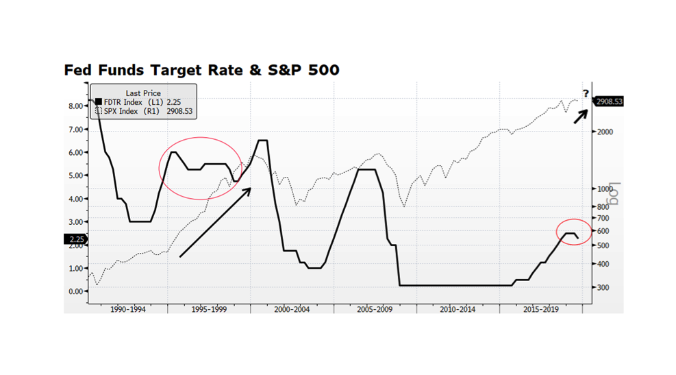
There has been little doubt in investors’ minds that monetary policy has played a critical role in supporting the global economy and capital markets for several decades. Lately, the focus has been on how many times (and for how long) the US Federal Reserve will cut its Target Rate this cycle. The current US economic expansion is the longest on record, and the question is whether late cycle rate cuts can sustain growth and the upward trajectory in the US stock market. The most recent prior period we had a mid-to-late cycle reduction in the Fed Funds Target Rate was during the Alan Greenspan era when easy monetary policy fueled the Technology-driven bull market during the 1990s. In the aftermath of the Tech bubble bursting, Greenspan was criticized for being too accommodative and ultimately producing a deeper rout than otherwise could have been. Many forget that the rationale for easy monetary policy at the time was in part a response to the Asian currency crisis that spread from Thailand throughout South East Asia in 1997. The current US Fed actions are a response to global economic weakness and should ultimately provide support for stock markets around the world. A critical difference this time around is that fundamentals and valuations in the US stock market are far stronger than we experienced during the late 1990s. [chart courtesy Bloomberg LP (c) 2019]
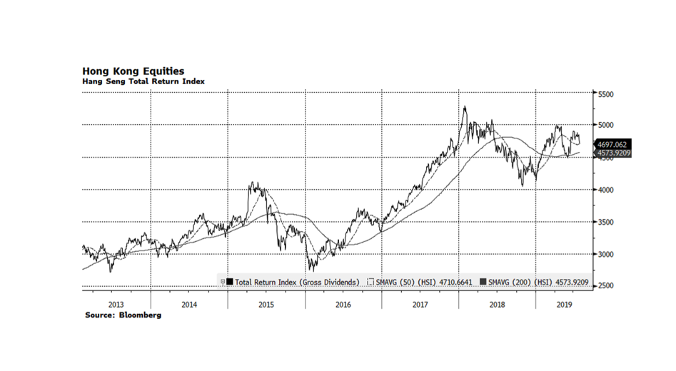
The Hong Kong equity market, and in particular its world-class financial sector, has been a critical gateway for foreign investors to participate in and fund Mainland China’s economic resurgence over the past several decades. Lately, the Hang Seng Index, Hong Kong’s most recognized stock market gauge, has been selling off in response to pro-democracy and anti-extradition protests throughout the territory. Our concern is that the Chinese President, Xi Jinping, will lose patience with the uprisings and respond in a manner consistent with the 1989 Tiananmen Square Massacre when military assaults resulted in the loss of life for hundreds if not thousands of protesters. This is a risk that could derail the upward trend in global stock since the beginning of the year.
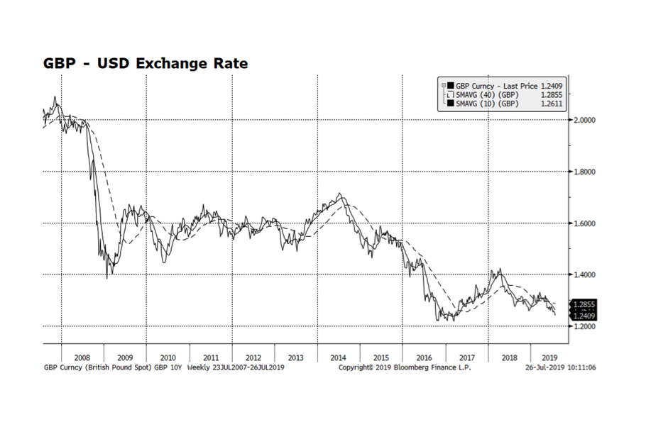
It was worth waiting a couple days to post our chart to see how markets would handicap the new occupant of 10 Downing Street. The British Pound, currently trading at 1.24 US Dollars, is approaching the lows reached after the Brexit referendum vote of June 23, 2016. Britain’s formal deadline to exit from the European Union has been extended to October 31, 2019, and with the newly appointed Prime Minister Boris Johnson that deadline could turn out to be firmer than it was perceived to be under May. If Johnson pushes through with a “hard” Brexit, it would likely lead to trade and supply chain disruption, uncertainty regarding the residency status of both UK and EU citizens, and the potential return of a physical border in Northern Ireland. The potential fallout is another headwind facing the struggling UK and EU economies. Given all this uncertainty we would not be surprised to see the Pound head to even lower levels.
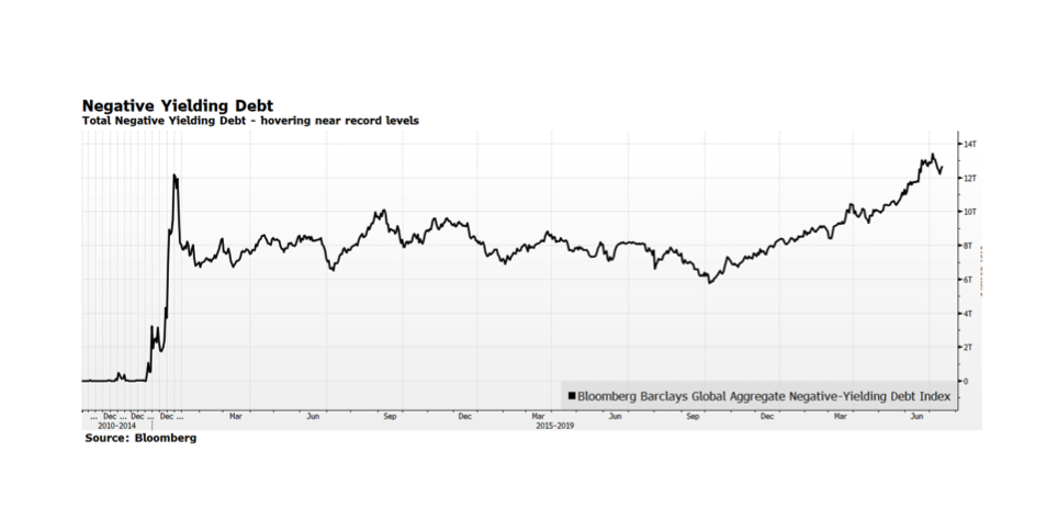
The total amount of negative yielding debt has been steadily climbing (in fact doubling) since last September, and now stands at a staggering $12.7 trillion dollars according the Bloomberg Global Aggregate Negative-Yielding Debt Index. Negative yielding debt now represents over 23% of the Bloomberg Global Aggregate Index and consists of both investment grade corporate and sovereign bonds, predominantly in Continental Europe and Japan, areas of the capital markets we have avoided. Hyper-accommodative monetary policy throughout the world in the form of quantitative easing, and negative interest rate policy in particular, is the main impetus producing this upside-down phenomenon of forcing investors to pay to hold bonds. The risk is that this negative income stream situation will be adversely compounded as interest rates ultimately rise, risking principal, in our view. We are concerned how long these conditions can persist and the ultimate fallout on the real economy and capital markets.