Page 14 of 28

WCM Chart of the Week for November 15, 2019

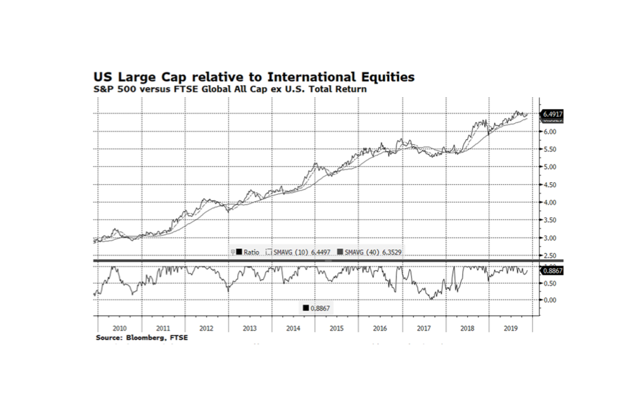
Large Cap stocks in the United States have outperformed the rest of the world for the better part of the past ten years largely because of superior demographic, economic and corporate conditions in America.  However, there have been several periods this decade when international bourses have gained ground on America and that has been the case since mid-August this year.  While US companies have tended to exhibit robust fundamentals compared to their international rivals, stock market valuations favor international equities. Can the rest of the world continue to outpace the US?  We continue to favor American stocks and bonds because economic conditions abroad continue to be challenging.  Eurozone economic activity is barely expanding, although the German economy did surprise on the positive side (thus narrowly avoiding a recession) and Chinese GDP growth may be slowing more than expected.  The headwinds international markets face may prove to be too much to overcome from a relative performance standpoint. [chart courtesy Bloomberg LP (c) 2019]
WCM Chart of the Week for November 8, 2019

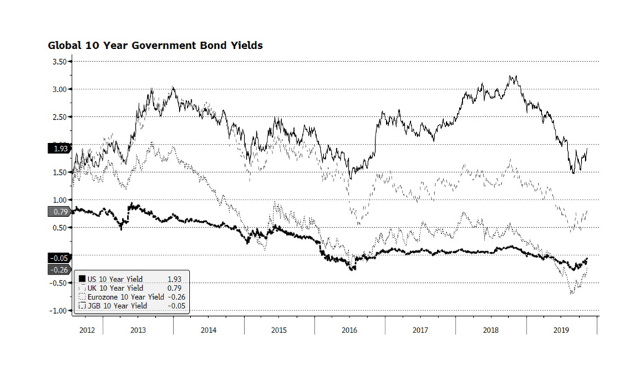
The global rally in stocks and key US equity indices hitting all-time highs are again garnering the majority of the financial press’ collective attention. We however prefer to focus on government bond markets. Long-term interest rates may have bottomed towards the end of this past summer. 10-year government bond yields in key developed economies are on the upswing and may even have positive readings in Japan and the Eurozone before year end. We find the upward interest rate trajectory interesting in the context of the US Federal Reserve’s recent decision to lower its target rate. It is encouraging that yields are rising together which may be a signal that economic conditions across the globe are stabilizing and safe haven asset prices are falling. [chart courtesy Bloomberg LP © 2019]

WCM Chart of the Week for November 1, 2019

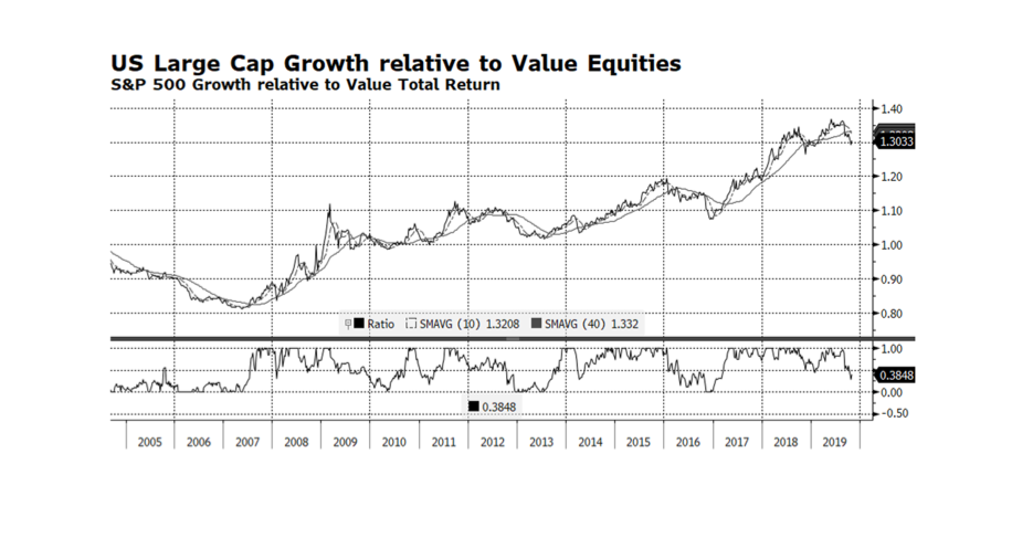
Growth stocks in the US have outperformed value stocks for the better part of the past three years with the exception of the US Fed induced sell off at the end of last year. However, since mid-August value stocks have outpaced growth stocks by a considerable amount rallying nearly 8% versus 3.5% according to S&P 500 Value and Growth indices.  If value stocks can continue to outperform or even keep pace with the overall market, we would view this as a positive development because it could mean that broader participation is developing.  That is important because the S&P 500’s largest the sector, Information Technology, continues to outperform, powering the market higher.  We find this interesting because usually technology stocks outperform with growth leading value. [chart courtesy Bloomberg LP © 2019]

WCM Chart of the Week for October 18, 2019

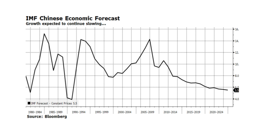
Chinese officials announced year-on-year 6% GDP growth for the third quarter, which was slightly below consensus estimates of 6.1%. The main drag on the economy was slowing investment growth while factory output rose along with retail sales. Tightening credit conditions are also contributing to the moderation in growth as officials continue to address excesses in the financial system. The on again/off again US trade negotiations continue to be a source of uncertainty. The government’s target of 6-6.5% growth for 2020 is at odds with market forecasts. The International Monetary Fund (IMF) is expecting Chinese GDP to fall below 6% to 5.8% in 2020 and continue to moderate in subsequent years, slowing to 5.5% in 2024. In the near term, Chinese officials have ample fiscal and monetary flexibility to manage the economy. However, in the long run, the adverse impact of the one child policy will cause demographic trends to deteriorate rapidly. The National Bureau of Statistics previously announced that births dropped to 15.2 million in 2018, representing a 12% annual decline following a decline in 2017. Some see China’s population beginning to shrink as early as 2027 and others argue that it had already begun in 2018. A rapidly aging population will place strain on social services and likely constrain China’s fiscal flexibility in years to come.

WCM Chart of the Week for Oct. 11, 2019

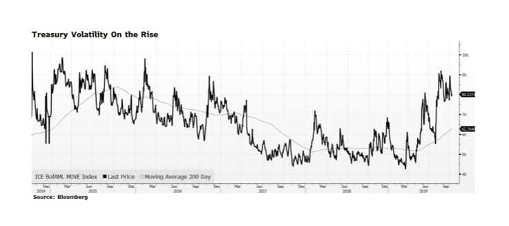
Volatility in US Treasury prices has been building for the past six months or so as measured by the ICE Bank of America Merrill Lynch Move Index. That is not all that surprising given the magnifying effect even small interest rate movements have on Treasury prices in today’s low rate environment.  The challenge investors face is that bonds, particularly longer-dated issues, offer anemic income streams and the likelihood of principal erosion as rates rise to more normal levels.  We continue to maintain lower duration within fixed income allocations than our benchmark because we believe that the long end of the yield curve, here and abroad, offers little investment merit and the potential for a great deal of volatility.

WCM Chart of the Week for October 4, 2019

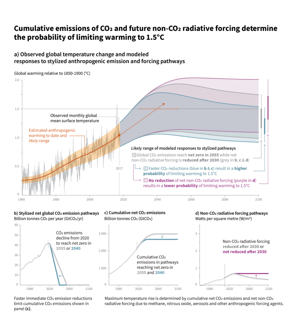
A 1.5 degree Celsius rise in global mean surface temperature over pre-1900 levels is considered to be a critical threshold above which environmental systems start to break down and serious and durable damage from climate change to the world around us really takes hold. 2 degrees is recognized as a tipping point where the damage is both catastrophic and irreversible, at least in terms of human timelines. This week’s chart is from the Intergovernmental Panel on Climate Change (IPCC) and shows us where we have been, and a possible range of temperature outcomes 80 years out, if we reduce anthropogenic (human-caused) CO2 emissions to zero over various time horizons. Even the best case projections, assuming aggressive and immediate emissions reductions, have us only leveling off around 1 degree over 1900, more or less where we find ourselves today. From a capital markets point of view this tells us two things – first, a best case means a continuation of much of what we have been experiencing with extreme climate events and therefore climate resiliency must be factored into risk assessments and securities pricing for equities, real estate, infrastructure, natural resources and bonds in the public and private sectors. Second, if we don’t turn the corner, the system will run away from us, mitigation will no longer be an option and asset prices will be jeopardized globally. Even being motivated solely by profit and loss this challenge is existential to the capital markets and must be addressed.

WCM Chart of the Week for September 27, 2019

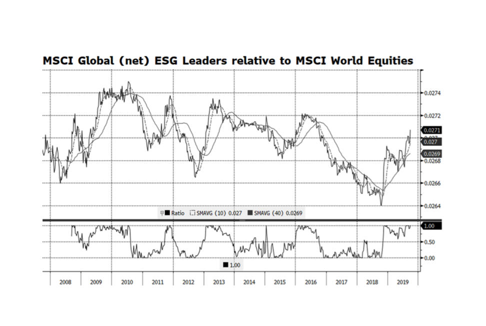
On the last day of Climate Week, we shift our focus from where we started with bonds to conclude with global equities. One of the tired old tropes that gets trotted out for people who have not looked at the data is that ESG-oriented strategies are structurally disadvantaged and destined to underperform. Of course, every strategy follows its own course based on benchmarks, PM decisionmaking, trading effectiveness, and a variety of other factors. But if we take the discretionary elements out and just focus on index comparisons, we do not find any persistent lag or advantage. Yes, performance varies somewhat in the short term.

Sometimes ESG leads, sometimes it lags. Over market cycles though, these small variations sort themselves out and you end up in the same place. MSCI, one of the world’s preeminent index authorities, has maintained an ESG Leaders series of equity indices that start in 2007.  According to Bloomberg, since the inception of the global ESG Leaders Index (on September 28, 2007) through September 26, 2019, the ESG index total return is 72.4% compare to 71.3% for the global equity index, or annualized total returns of 4.64% and 4.59%, respectively. This week’s chart shows this relationship graphically and there do appear to be cycles of outperformance as well as underperformance of the ESG index.  However, this is considerably exaggerated by the scale of the chart as the differences measure in fractions of basis points.

WCM Chart of the Week for September 23, 2019

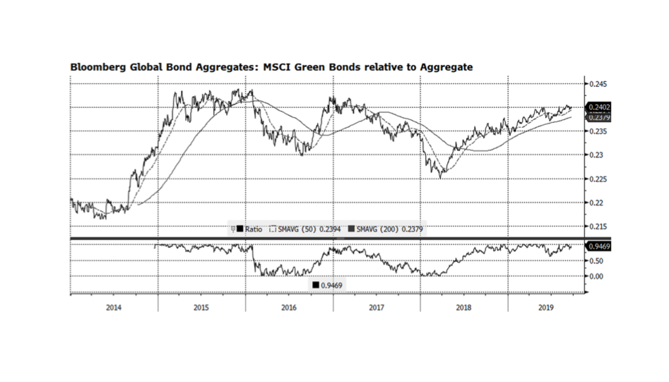
On this convening day for the UN Climate Action Summit, we take a fresh look at the benefits of climate-centric fixed income investment strategies. There is a persistent myth that disciplined ESG investing dampens investment performance, which we believe is short sighted.  This week’s chart examines the total return properties of the Bloomberg Barclays MSCI Global Green Bond Total Return Index versus the Global Aggregate equivalent index.  The green bond Index is based on issuers that adhere to the Green Bond Principles which include energy efficiency, renewable energy, pollution prevention and control, sustainable management of land and natural resources, potable water and wastewater management, and clean transport among other critical green activities. What this relationship shows us is that there are periods when the green index underperforms and also periods when the index outperforms the broader aggregate index.  This index started at the end of 2013, so we have nearly seven years of data to evaluate.  According to Bloomberg, over that time frame (as of September 20, 2019), the green index is up 22.3% compare to 12.2% for the global aggregate or annualized total returns of 3.6% and 2.0%, respectively.  Clearly, over the longer term, green-oriented fixed income investors have done well by investing in issues that are doing good as compared to the overall global bond market. [Chart courtesy Bloomberg LP (c) 2019]
WCM Chart of the Week for September 13, 2019

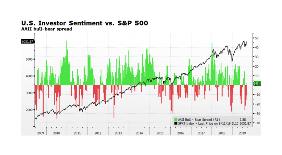
As Friday the 13ths go, not so bad. Large Cap US stocks, as measured by the S&P 500 total return index, have broken out and are approaching all-time highs reached earlier in the summer.  The index spent the better part of August consolidating after peaking in late July.  The positive market movement has boosted investor morale as the American Association of Individual Investors Bull-Bear Spread has just turned modestly positive. Improved investor sentiment and further market advances could persist with dovish signaling from the US Federal Reserve, a more positive tenor in US – China trade discussions, and corporate fundamentals and equity market valuations which remain supportive.  The US 10 Year Treasury Yield now stands at 1.7% (9/12/2019) after reaching 1.46% on September 3, 2019 indicating that, for now, the flight to safety trade may be off as well. Many reasons to remain watchful though.  Mario Draghi’s transition out of his leadership role at the ECB leaves some uncertainty regarding the bank’s future commitment to strong monetary support. The onset of Brexit carries its own uncertainties and the economic slowdown in China may be deepening.

WCM Chart of the Week for September 6, 2019

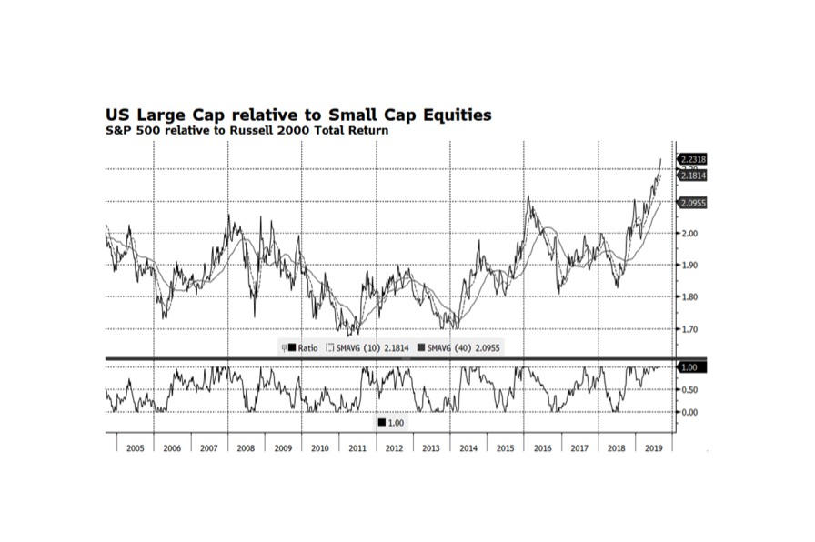
WCM Chart of the Week for September 6, 2019.  Large Cap US stocks continue to outperform with the S&P 500 total return reaching 20.7% YTD through (September 5, 2019).  This end of the US equity market, in particular, the Technology sector, contains the world’s strongest performers so far in 2019.  US Small Cap equities however have lagged considerably, only gaining 13.2% over the same time period while global stocks as measured by the FTSE Global All Cap Index have advanced 15.8%.

Economic trends in the US are much more favorable than in other key regions such as Europe and Asia. US Small Cap companies generally are more domestically oriented while Large US companies earn significant amount of revenue overseas.  Intuitively, the global environment should favor US Small Caps but that has not been the case.  The key might be the low interest rate environment enabling large companies to raise substantial amounts of debt through the corporate bond market while smaller companies are more dependent on regional bank financing. Another key factor explaining the performance disparity between Large and Small Cap stocks may be sector representation.  The financial sector of the S&P 500 represents roughly 12% of the index while the Russell 2000 has about 17%.  The financial sector has been a laggard overall and a small financial service company’s revenue is generally more dependent on lending which tends to struggle in low interest rate environments.

This week’s chart shows the total return relationship of US Large relative to Small Cap Equities.  Large Cap stocks are trading at their highest levels relative to Small Caps in at least the past 15 years and are clearly extended.  This is highly unusual but may persist at least until the US Federal Reserve ends its current rate cutting path and other monetary stimulus activities. [chart courtesy of Bloomberg LP (c)2019]

« Older posts Newer posts »