Category: Coronavirus (Page 3 of 5)

WCM Chart of the Week for July 10, 2020

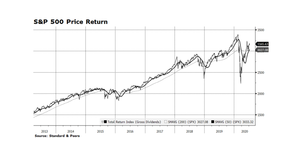
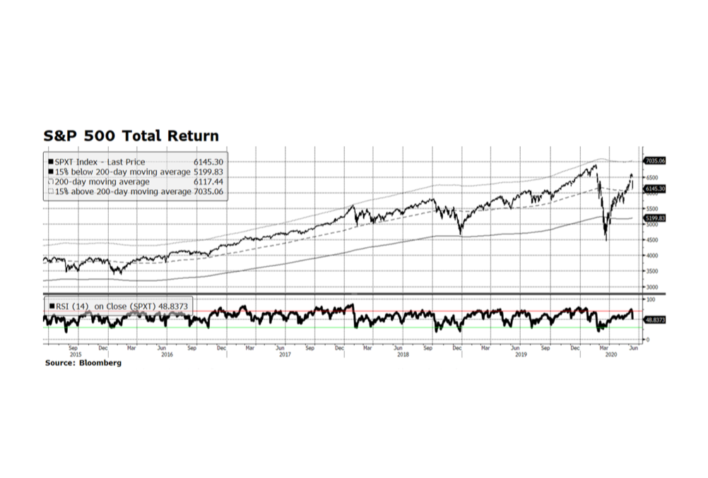
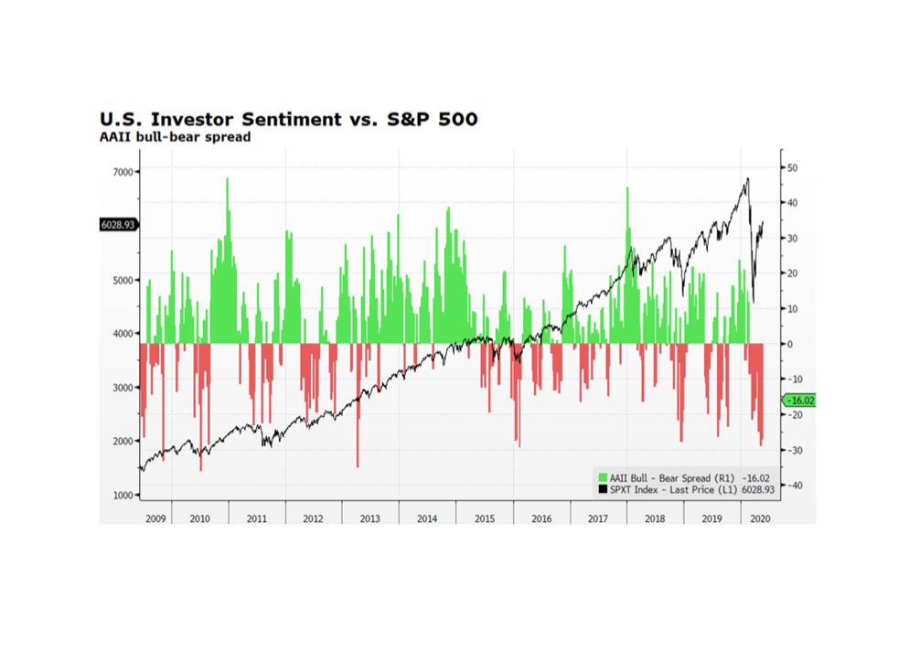
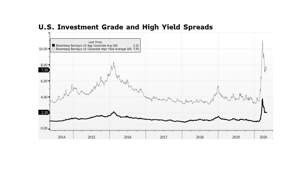
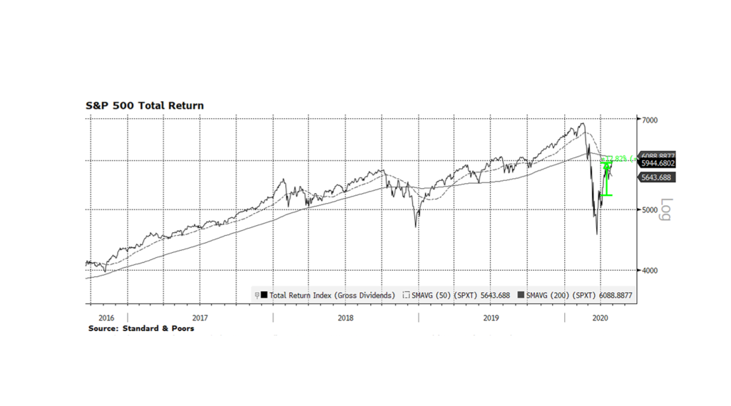
Equities in the US have been rallying since late March. The total return of the S&P 500 is 41.7% from the crisis trough on March 23 through July 9. The recovery in stocks has been among the swiftest in history and has caught many market participants underinvested during this uncertain pandemic period. Even with tremendous stress in the labor market, the overall economy and current corporate earnings, the S&P 500 price level has produced a widely followed bullish technical pattern know as a “golden cross” after Thursday’s close. This formation occurs when two key trend lines, the 50-day and 200-day moving averages, intersect while trending upwards. Generally, this condition needs to be supported by other factors, such as the powerful fiscal and monetary stimulus which we have been highlighting for the past several months, as the main reason markets have been rebounding. Another positive development is influential investment research organizations have begun to increase corporate earnings expectations for 2021. There are still well-known risks including the ebb and flow of the global pandemic and China-related tensions with the rest of the world. We expect volatility in the capital markets emanating from these and other factors, but equities, particularly in the US, will grind higher. Chart courtesy Bloomberg LP and Standard & Poors (c) 2020.

WCM Chart of the Week for June 26, 2020

The US Federal Reserve has used the power of its balance sheet to support key segments of US capital markets since early March. Recently, it began to purchase corporate securities including high yield bonds, a move some view as controversial. However, purchasing investment grade (and below) bonds essentially supports companies and ultimately jobs, and full employment is a critical element of the Fed’s mandate. Another beneficial aspect of these purchases is that corporations are making coupon payments and returning principal to the Fed, and that is not necessarily the case with US Treasury purchases. In June, the balance sheet began to shrink, albeit modestly. It peaked at $7.22 trillion on June 10th and currently stands at $7.13 trillion. Following two consecutive weeks of balance sheet declines, stocks have fallen 5.3% as measured by the S&P 500 through June 26. News headlines cite the rise in COVID-19 cases as the reason for recent stock market volatility, but the Fed’s purchasing activity is likely a greater fundamental force dictating the direction of asset prices. Is this a pause or the beginning of a monetary policy tightening cycle? The state of the Fed’s balance sheet is a critical metric that we will continue to monitor. [Chart courtesy Bloomberg LP © 2020]

WCM Chart of the Week for June 19, 2020

Chinese Communist Party (CCP) aggression in the Asia-Pacific region is on the rise. Military tension along the Himalayan border with India resulted in some 20 Indian soldiers perishing this past week. Chinese naval ships have been harassing the Japanese commercial fleet in the East China Sea, and exhibiting similar in Vietnamese, Malaysian, and Indonesian trade routes in the South China Sea. Domestically, the CCP is suppressing Hong Kong freedoms in violation of the 1984 Sino-British Joint Declaration. Globally, the lack of COVID-19 related contrition or even transparency regarding the origin and spread may all contribute to China-related backlash or retaliation. Nearly all Pacific nations have aligned with the US against Chinese aggression. We find it odd that the CCP has chosen hostility in their weakened economic condition, a moment when they really need the rest of the world for their own recovery efforts. Unfortunately, this situation is unlikely to de-escalate anytime soon.  As an example, China’s defense spending is approaching four times India’s and that military show of strength compromises the Asia-Pacific region’s stability and sovereign rights. [source: World Bank and Bloomberg LP © 2020]

WCM Chart of the Week for June 12, 2020

The main equity indices in the US were routed this past Thursday, making the week negative for the first time in three.  The decline was likely due to concerns about climbing rates of COVID-19 in new parts of the country, and comments made by the Chairman of the US Federal Reserve (Powell) regarding the economic challenges ahead.  Thursday’s sell-off was the worst in percentage terms for the S&P Total Return Index since March 16, a week before the gauge made its cyclical bottom. Another factor may have been that the US equity market was extended heading into the week.  Still, on Thursday the index managed to close above the 200-day moving average, and on Friday rebounded 1.3%.  Prior to Thursday, the index was elevated well above that long-term measure, so some give back was reasonably expected.  Friday’s gain is encouraging but we are mindful of the real challenges facing the US economy and capital markets going forward.  The next several trading days will be telling. [chart courtesy S&P and Bloomberg LP © 2020]

WCM Chart of the Week for June 5, 2020

Economic fault lines run deep across America. Many of these lines have been laid bare as a consequence of the economic crisis unleashed by the COVID-19 outbreak, but the lines were there long before, and will continue long after. Those sitting on the bottom rungs of the prosperity ladder not only were among the most vulnerable as business, trade and service ground to a halt, they are in the worst position to participate in the recovery. Access to capital is critical to household and business formation, maintenance and growth. As recently as 2017, the last time the FDIC released its biennial national survey, 18.7% of American households were underbanked (relying on payday lenders, rent-to-own, pawn shops, refund anticipation loans, and other non-bank resources), and a full 6.5%, or nearly 8.5 million households, were completely unbanked. Without access to the financial infrastructure enjoyed by nearly 70% of the population, the road ahead will be difficult if not impossible, and investing in community financing through CDFIs and other non-traditional conduits will be critical to an inclusive recovery.

WCM Chart of the Week for May 29, 2020

The Bloomberg Barclays Aggregate Bond Indices are widely considered to be the global standard for fixed income gauges. This week we compare the US Aggregate vs. the International Unhedged Aggregate. Over the long-term (12 years shown below) US bonds have outperformed significantly overall, with only brief bouts of underperformance in the short term. There are several reasons that explain US fixed income dominance — USD strength, interest rate spreads across comparable sectors and superior corporate fundamentals. The current phase of US leadership has persisted since early 2018 but may be showing signs of fatigue at the end of the longest period of outperformance over the past dozen years. The dollar remains elevated vs a basket of major currencies compared to pre-pandemic levels, although that appears to be normalizing in recent weeks. Our view is that, as long as comparable interest rates in other major economies remain negative, or spreads benchmarked against US interest rates remain wide, global investors will prefer US bonds. We currently hold little or no international fixed income and remain positioned in shorter duration instruments. [Charts and data courtesy Bloomberg LP © 2020]

WCM Chart of the Week for May 22, 2020

A key contrarian indicator sustains bullish readings, at least for the time being. The American Association of Individual Investor bull-bear spread survey continues to post negative readings, which is not surprising given the dire news on the US economic front. The labor market alone shows initial jobless claims approaching 40 million. Positive economic indicators are rare, yet US stocks continue to rebound, establishing higher highs and higher lows. Equity investors, for now, are looking past day-to-day bad news and towards the recovery as the country re-opens. There are still risks as new consumption patterns emerge and the potential for a second wave of COVID-19 looms later in the year, but the repatriation of American manufacturing and key service functions will likely lead to higher median wages, greater sustainability, and stronger national security. These long-term trends, in our view, will continue to attract the marginal global investment dollar to the US capital markets. [Chart courtesy Bloomberg LP (c) 2020]

WCM Chart of the Week for May 18, 2020

Stocks of companies that qualify for inclusion in the MSCI Global ESG Leaders Index have outperformed global peers for the better part of the past year and most importantly during the global health crisis.  The most recent few months have seen terrible loss of life and livelihood, sorely testing the resiliency of sustainably oriented companies. Based on full-market comparisons, it appears the environmental, social and governance focus of these companies has collectively contributed to outperformance relative to their less ESG-centric peers.  The avoidance of or minimal revenue related to the (old) carbon economy is certainly a factor, with world oil prices falling by over 50% in the last year and energy price volatility contributing to earnings uncertainty across a number of industries.  Our core thesis has been that investments that express better ESG performance will deliver market or better financial and market performance over the long term. Building on that, we have seen in the second global economic and societal crisis in a dozen years that these investments also have the potential to guard against risk and outperform in moments of peak stress as well. [Chart courtesy MSCI and Bloomberg LP © 2020]

WCM Chart of the Week for May 8, 2020

US corporate credit spreads are narrowing, but they are still quite wide by historical standards. Investment grade spreads appear to be stabilizing while high yield (junk bond) spreads are still volatile. Yields premiums in both segments of the credit market have contracted by about half-way from their recent peak on March 23rd compared to their pre-pandemic levels. What we find interesting is that volatility persists in the high yield market given the Fed’s disclosure that they intend to purchase issues and instruments including ETFs within this credit market segment. The volatility is likely a signal that investors expect defaults, insolvencies and bankruptcies. What intrigues us is the potential for Fed purchases of ETFs, because the Fed could opt to receive the underlying bonds, hold them until maturity and absorb any resulting defaults. That would in effect support distressed companies and potentially preserve jobs. It may prove to be a novel way for the Fed to support the labor market using the balance sheet to honor its mandate for full employment. [chart courtesy Bloomberg LP © 2020]

WCM Chart of the Week for May 1, 2020

This past week we witnessed two of the worst US economic reports many of us have ever seen. On Wednesday, it was reported Q1 GDP contracted 4.8% on an annualized basis, and Thursday’s unemployment report brought the total number of newly unemployed to over 30 million, consuming all of the jobs gains since the depths of the Great Recession. But, even with all the bad news on the economic front over the past several weeks, the US stock market as measured by the S&P 500 posted its strongest monthly gain since 1987. At least for now, the stock market is looking beyond the current rut to the potential for prosperity on the other side. That is certainly reasonable considering the amount of monetary and fiscal stimulus being injected into the economy and capital markets as we have been discussing for several weeks. Against this backdrop we are still compelled to ask ourselves what the trigger for re-testing the March equity drop might be. It could be an acceleration of virus cases, a state-level bankruptcy or two, or China-related backlash or retaliation. Current state of mind – hopeful but watchful. [chart courtesy Standard & Poors and Bloomberg LP © 2020]

« Older posts Newer posts »