Category: Consumer (Page 1 of 2)

This is Not That

One of the (very few) benefits of being in the business of capital markets and investing across more than three decades is the ability to quickly recognize the similarity of an event to something in the past. Or, in the case of this past week, the lack of similarity. The rapid unraveling of Silicon Valley Bank and the apparent encore of Signature Bank has people talking of 2008 and the Financial Crisis. It is actually hard for us to believe it has been around 15 years since the Crisis. It seems much more recently that we were standing with our colleagues watching Bloomberg screens of credit default swaps wondering who would fall next and what the likelihood was it would be our own employer. The whole system was unraveling. This is not that.

Superficially, there is enough in common to suggest history may not be repeating itself but at least it is rhyming. High-flying bank gets too far over its skis, customers and markets lose confidence, run on the bank, regulators step in and shut it down and look for a buyer. Looking another layer deep there is still some commonality – the bank failed at its most basic function, providing safekeeping of and access to customer money.

So, reasonably, people are concerned about contagion and a more widespread run on banks. But, unless some startling levels of as-yet unknown malfeasance or malpractice emerge to change the narrative, there is an important difference between what took down SVB and what took down Lehman Brothers, Bear Stearns, WaMu and others. In the depths of the Financial Crisis, the main problem was that nobody knew what bank balance sheets were actually worth. Complex securitized loan pools were valued based on assumptions and risk models that proved to be fragile or entirely wrong all at once. It wasn’t possible to look at these holdings and get even the slightest idea of what they were worth, which meant there was no way to understand how much capital the banks actually held against their depository and other obligations. The banks’ use of leverage also multiplied these unknowns making the consequences even more far reaching.

SVB on the other hand appears to be a good old fashioned case of staggering incompetence. Don’t get us wrong – that is no excuse. But in this case, it does not appear that the balance sheet of SVB cannot be valued. It is simply that they entirely blew the most basic and central internal role they needed to perform, which was to properly match assets and liabilities. They ended up with too many long-dated assets and short-dated liabilities and simply did not have the liquidity to satisfy customer demands that then blossomed into a run on the bank. By all accounts everybody knows what is on the balance sheet and what it is worth – and the answer is… not enough in the current market environment. Not zero, but not enough.

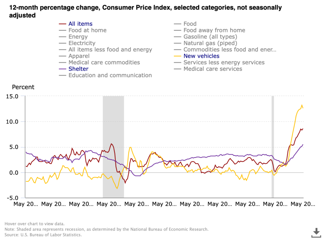
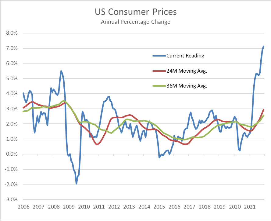
It also doesn’t appear that there is a quality issue like what plagued banks in 2008 where the securities on the books turned out to be far junkier than their ratings would suggest. They simply held too much high quality but long-dated Treasury and other obligations that got hit hard with the spike up in rates this past year. After the Crisis, the rules did change on what types of holdings counted and to what degree when assessing an institution’s capital adequacy. Treasuries are right at the top of the chart of holdings that satisfy those ratios. The bonds are still there, and there is no reason to think they wouldn’t pay out 100 cents on the dollar if held to maturity. But, SVB couldn’t sell them today to satisfy withdrawals for what they will be worth a decade from now. Again, basic asset-liability management seems to have eluded them.

Bank management may have assumed since cash was coming in hard and fast over the last couple years that liquidity was never going to be an issue, so they could step further out on duration to squeeze extra basis points of yield out of the balance sheet. A little stress testing would have shown that a meaningful rise in rates would hit the value of those long bonds, which meant everything rested on either the cash continuing to come in or at the very minimum their customers not looking for withdrawals in size. SVB, because of their business strategy, is unusually concentrated in its client exposure to the Tech and tech-adjacent sectors. It wasn’t a mystery that the whole Tech space was undergoing market stress, investors were tightening purse strings, and companies and their funders would be looking to tap their cash reserves to keep things going. They got caught in a simple squeeze – their principal clients needed to access liquidity at a time the bank couldn’t satisfy it without taking a hit on those assets.

As of late this weekend the regulators have stepped in and assured liquidity for all depositors, insured and uninsured. They do have a facility paid into by the banks that was set up precisely for this kind of situation. SVB (and Signature) is essentially defunct, and likely will be bought whole or in parts by one or more big, solvent institutions at a very attractive price and without having to assume the kind of risks banks faced buying the failed banks in 2008. In a bank run psychology does become reality, and even though the problems are not systemic in the way they were in the Financial Crisis, it is right and reasonable to be concerned about contagion. Customers could manufacture a crisis where one didn’t exist just out of fear. Regulators are doing the politically unpalatable and interceding in a way that will benefit a lot of unsympathetic parties in order to keep a very specific problem with a very specific group of institutions from blossoming into something much more damaging.

Dodd-Frank has never been popular, seen as too odious and heavy-handed and in the way of free enterprise in the view of industry stakeholders, and with the benefit of more than a decade in use it could definitely be improved. However, this past week serves as a graphic example of why it is necessary, and why regulation and supervision are essential to the orderly functioning of our financial systems. In the all-too-apropos words of the comedian Ron White, there’s no cure for stupid.

WCM Chart for June 10, 2022

We have a new CPI print today which sent markets into a week-ending nosedive. 8.6% for May puts inflation for consumers near where it was in 1981 before the Volcker Fed cranked rates to an eye-watering 17+%. For as painful as rate increases are right now we have light years to travel before anything even remotely resembling the 80’s, nostalgia for Soviet conflict and striped shirts notwithstanding. This chart from the US Bureau of Labor Statistics compares CPI in total against two of the three components that seem ripe for a nasty mean reversion, the third being energy which we covered in the last chart and commentary. Shelter has broken out, rising to 5.5% which exceeds the lusty moments before the housing market imploded with the Financial Crisis. We have been pointing out repeatedly that there are two major moving parts driving increases in shelter — the speculative fervor over single family housing fueled by low rates, urban migration and non-human (e.g. investment fund) buyers, and the inevitable upward correction in rentals after ending pandemic moratoria on rent, rent increases and evictions. It seems likely that the single family bubble is nearing its bursting point especially as the Fed acts, but rent will continue to grind higher as the economy digests the rental disruptions of the pandemic.

New vehicles on the other hand appear perched on the precipice. Supply chain disruptions, particularly for microchips, have tightened supply and handed dealers tremendous pricing power even while makers have largely kept their price increases steady (but have been able to slow or suspend aggressive promotional programs). The rate of increase peaked at 13.2% in April and posted 12.6% for May. Other than playing demand catch-up after the market for new vehicles crashed in the depths of the Financial Crisis, the 12-month change over the last 20 years has stayed in a band of +/- 2%, and most of the time close to zero. There will come a moment when makers catch up and inventory will be abundant (and auto loan and lease rates will be higher), and the market may well punish the dealers for exploiting the situation, potentially severely. [Chart courtesy US BLS, CPI All Items, Shelter and New Vehicles, May 2002 to May 2022]

WCM Chart for June 2, 2022

What’s up with gas? Inflation is everywhere, but it is hard to normalize when we are having the breakfast table conversations about how much prices have climbed. Our shopping carts are different from each other’s and aren’t always consistent from one trip to the next, but we get a general sense that the final tally is higher but the receipt isn’t any longer. One thing most of us, with the exception of certain urban dwellers and the small population of EV drivers, do have in common though is the price of gas. There is some geographic dispersion because of cost of delivery and local/state taxes, but we all buy the same three or four grades of gasoline, measure it in gallons, pay for it in dollars, and unless we change vehicles from one fill to the next, consume it at roughly the same rate per mile driven. This chart won’t reveal the mysteries of why prices are up, but there are a few interesting takeaways that show that there aren’t likely any easy answers. Maybe the most notable observation is that gasoline has gotten more expensive than the prior all-time peak in 2008 (about 11% higher right now). What isn’t on the graph is that oil (WTI Cushing) is about 21% cheaper than it was during the ’08 bubble.

Back to the chart, we can see that the spread between premium and regular gas has been steadily grinding higher for years, with few interruptions in the relationship outside of brief reactions to the Tech Bubble, 9/11, the Financial Crisis, etc. For those old enough to remember, it was bankable that mid-grade was 10 cents more than regular, and premium was ten cents more than that. Now that premium/regular spread hovers between 65 and 70 cents, today and two years ago when everyone was hunkered down at home. These figures would indicate that the petro industry still enjoys tremendous pricing power. When thinking about inflation it is important to consider what the drivers are and who gets hurt, but also who benefits. It was almost exactly 11 years ago when WTI was the same price it is today ($112/bbl). Regular was $3.91, and Premium was $4.15. Today at $112/bbl, Regular is $4.44 and Premium $5.12. [chart © WCM 2022, national data from US Energy Information Administration (EIA)]

WCM Chart of the Week for April 14, 2022

Let’s talk about something that proves that short-sighted or wrong-headed decisionmaking in ESG is bipartisan. One of the incredibly unfortunate halo effects of the Ukraine conflict is the global food shortage caused by Europe’s breadbasket being at war and the sanctions limiting access to Russian natural gas (key source for fertilizer). In addition to placing at risk a large percentage of the world population that are already nutritionally insecure, it has the effect of driving up commodity and food prices in the developed West. As we have discussed in prior blogs and newsletters, the conflict has also destabilized the petroleum market because of Russia’s role as a petrostate. The US is effectively energy independent, or nearly so if we look at all of North America together, but no question energy prices are higher. So what’s an American to do in the face of a global food and energy crisis? The US administration has an answer – put food in your gas tank. The decision to move to E15, 15% anhydrous denatured alcohol in the fuel mix, for the Summer arguably makes the whole situation worse. Referring to the US Energy Information Administration, the ASTM D4806 specification for ethanol compatible with spark-ignition engines is produced by “fermenting the sugar in the starches of grains such as corn, sorghum, and barley, and the sugar in sugar cane and sugar beets”. The first chart is from the USDA Foreign Agricultural Service and shows just how material Ukraine is to the global food supply. The second from the USDA statistics service shows already how much US corn production goes to fuel. There is a whole additional discussion to be had about the sense or senselessness of grain and cane crops being turned into fuel, from the energy intensity of the chemical conversion to the natural gas used to make fertilizer to the diesel burned for farm equipment to the climate costs of unsustainable monocrop farming practices that strongly suggests shortening the path from drill bit to burner tip is more efficient. But right now, we are focusing on the fact the US could (profitably) ameliorate rising food scarcity and prices with the same agricultural products it is planning to ferment and burn to save 10 cents on a $5 gallon of gas at the pump.

WCM Chart of the Week for April 4, 2022

With the release of “Climate Change 2022: Mitigation of climate change”, which is the third segment of this year’s sixth assessment report (AR6) from the IPCC, most of the attention will be focused again on the doomsday charts. One of the notable ones in the press packet is entitled “We are not on track to limit warming to 1.5 (deg) C.” But, the report is surprisingly optimistic in one very critical sense – it declares the problem addressable if global action is taken promptly and capital is called in off the sidelines to drive a transition in energy, land use, industry, urban zones, buildings and transportation that could halve GhG emissions by 2030. At this point the debate then usually swings to the nature of capitalist systems and that capital will flow to where it can be used most efficiently and to greatest effect (e.g. risk-adjusted return), and there it stops. Advocates for changing policy on climate will trot out the “if we don’t act we’ll all die and your money won’t mean anything” argument, having failed to learn that existential threats don’t tend to deter markets until they become existential realities, supporting a party-like-it’s-1999 mentality. However, one slide in the press packet which probably won’t get much attention actually holds the key to activating capital entitled “(In some cases) costs for renewables have fallen below those of fossil fuels.” This is profound in that it doesn’t require the rest of the science or policy or existential concerns to affect the flow of capital. It is simply becoming cheaper to convert today’s sunshine and wind into electricity and shove it into batteries than to dig up fossilized sunshine from more than 65 million years ago and burn it. Even with investment and innovation in efficiency, modern society will continue to be increasingly energy intensive, and as more of the world’s population joins the middle class, utilization will become even more widespread. Intelligent allocators of capital will pursue the cheaper inputs that will meet that demand.

WCM Chart of the Week for January 18, 2022

Evidence of consumer price pressure abound ranging from rising food to energy to consumer staples. Overall, US consumer prices rose over 7%, a growth rate the US has not faced since the 1980s. There are several well-documented reasons why prices have risen so rapidly, including the pandemic-forced economic shutdowns and supply chain disruptions of the past two years. How long will inflationary conditions persist, and will it become structural? Prior to the pandemic, the US was in a benign inflationary environment. Then, disinflation resulting from government-mandated shutdowns across the country suppressed prices. The annual change in US CPI averaged 1.4% from April 2020 to April 2021. The current CPI reading on December 31, 2021 is based off pandemic nadir levels, and the base effect may lead to higher “headline” inflation in the months ahead. However, if annual gains in consumer prices fail to keep pace with the high inflation trends of 2021 [which include 2020’s low base effect], forward looking inflation could moderate. Capital markets will likely remain on edge, and the US Federal Reserve will be challenged balancing appropriate monetary policy against inflationary trends that may prove temporary, but also may not. (chart © 2022 Wilde Capital Management, data from Bureau of Labor Statistics)

WCM Chart of the Week for November 29, 2021

Consumer prices in the US are observably on the rise across a broad array of products and services. The Federal Reserve’s preferred inflation gauge, the PCE, last week registered a 4.1% annual increase, well above the Fed’s target. The causes of higher prices are well known, ranging from supply chain bottlenecks to raw material scarcity to higher energy costs to a shortage of transportation personnel. Adding to the inflationary mix is strength in the US dollar which has recovered over 6% according to the Bloomberg US Dollar index, comprised of a basket of major currencies. The dollar has recovered to pre-pandemic levels and could strengthen further as the Fed begins to reign in liquidity towards the end of 2022 if not earlier. Continued dollar strength could provide some inflationary relief in the form of lower import prices and could be justified given strong US economic growth and the interest rate differential between the US bonds and the rest of the world. As this week’s chart illustrates though, currency movements are notoriously difficult to predict. [chart courtesy Bloomberg LP © 2021]

Charting COP-26 and The Global (In)Action Agenda for Innovation in Agriculture, November 9, 2021

On November 6th, we got a clever hashtag mention — #climateshot – and a “Global Action Agenda”: Increase investment in agricultural research and innovation to create more climate-resilient, low-emission technologies and practices; Focus at least a third of agricultural research and innovation investments deliver demand-driven solutions across food systems, to protect nature and limit climate change; Showcase successful business models and promote public-private partnerships that deploy these innovations on the scale needed to meet the climate and food security challenge; Forge consensus on the evidence of what works, and facilitate inclusive dialogue among food and climate champions around the world. A lot of the right stakeholders (160 institutions, NGOs, countries and companies) are at the table, and there are four key initiatives: “The 100 Million Farmers Multi-Stakeholder Platform, led by the World Economic Forum. The Global Research Alliance on Agricultural Greenhouse Gases (GRA) initiative, which brings countries together to find ways to grow more food without growing greenhouse gas emissions. The new CGIAR organisational structure, research and innovation strategy and portfolio of initiatives. ClimateShot allies from the impact investment community comprise over 20 investors, funders and initiatives, including innovative funds aiming to mobilise over US$5 billion in financing to transform agriculture for people, nature and the climate.” And that is where it all falls down. 20 investors, funders and initiatives and $5 billion in capital is not going to transform anything. (Re)Learning from our world indigenous communities how to shift, or shift back, to regenerative agricultural practices has the potential to address a major carbon problem while also making significant strides in stewardship of water systems, all the while feeding the planet and providing economic opportunity to individuals, families, communities, companies and countries. It starts at the grassroots. This graphic, courtesy of Marc Barasch and Green World Ventures, is a hand illustration of a regenerative approach to smallholder farming already employed in Nigeria which at scale addresses a myriad of economic, nutritional and climatological challenges. What is old is very much new again, and requires activation of those 100 million farmers as well as activation of sufficient capital, from far more than 20 stakeholders, to catalyze a global change.

WCM Chart of the Week for September 13, 2021

We are back, but maybe China is not. China’s purchasing manager index for exports has signaled a decline since April’s reading of 50.4 (a reading below 50 suggests a deterioration in conditions). This data series is interesting in the current inflation debate because it is a barometer of global trade and aggregate demand. If demand is weakening while headline consumer and industrial prices remain elevated, that suggests that the supply/demand balance is being dominated by supply-related issues. This could make sense given the numerous instances of supply chain bottlenecks, transportation issues, etc. that we have discussed and that continue to make headlines. Consequence for the markets — this may be another reason why the Fed may be dovish for longer. [chart courtesy Bloomberg LP (c) 2021]

WCM Chart of the Week — Summer-End 2021

This will be our last chart before Labor Day. The US Federal Reserve’s preferred measure of inflation, the YoY rate of change in the Personal Consumption Expenditure Index (PCE), has been exceeding its 2% target rate since April making investors concerned that we may be approaching a monetary tightening cycle. That fear was escalated by this week’s release of the Fed’s July 28-29th meeting minutes that indicated they may begin to wind down the current $120 billion monthly asset purchases by the end of this year or the beginning of 2022. The Fed has expressed its view that current inflation trends are transitory and are likely due to temporary factors such as supply chain bottlenecks and a strong rebound in demand from last year’s lull in consumption. As of June 30th, the current annual rate of the PCE was 3.54%, well above the Fed’s target, but in June 2020 the reading was 1.13%. Since the Fall of 2008 during the Financial Crisis, the PCE has been stubbornly below 2%, averaging 1.59%. Over that period of nearly 13 years, the PCE has been over 2% only in Q1 2012 and for most of 2018.  Inflation has been undershooting for a long period leaving aggregate price levels far below the Fed’s ideal. This suggests to us that the Fed will likely tolerate inflation until the PCE normalizes.

« Older posts