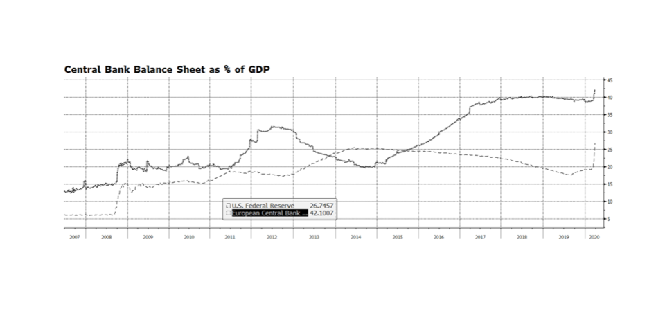
The US Federal Reserve has taken several powerful steps in recent weeks ranging from lowering policy interest rates, intervening in credit markets to provide stability and re-engaging in asset purchases, also known as QE. The amount of monetary stimulus is unprecedented and staggering. Since March 4, the Fed’s balance sheet has expanded nearly $1.6 trillion through their asset purchase plan, accumulating Mortgage Backed Securities, Treasuries and Corporate Credit. That is an incredible amount of expansion in such a short period of time considering that it took some 15 months during the financial crisis from when the QE program began to reach an equivalent level of assets. Some are concerned that the Fed has expended all of its monetary tools and that is a real concern given policy rates are at or near zero. The balance sheet now stands near $5.9 trillion, a level that just a few years ago would have seemed unimaginable. But it could become even larger. The Fed’s balance sheet represents nearly 27% of US GDP. By contrast the European Central Bank’s balance sheet stands at over 42% of European Union GDP. The Bank of Japan stands at over 100% of GDP. The Fed’s asset purchase program could even become more active and remain manageable, especially considering the relative vibrancy of our economy compared to Europe and Japan. [chart courtesy Bloomberg LP © 2020]
Category: Chart of the Week (Page 10 of 18)
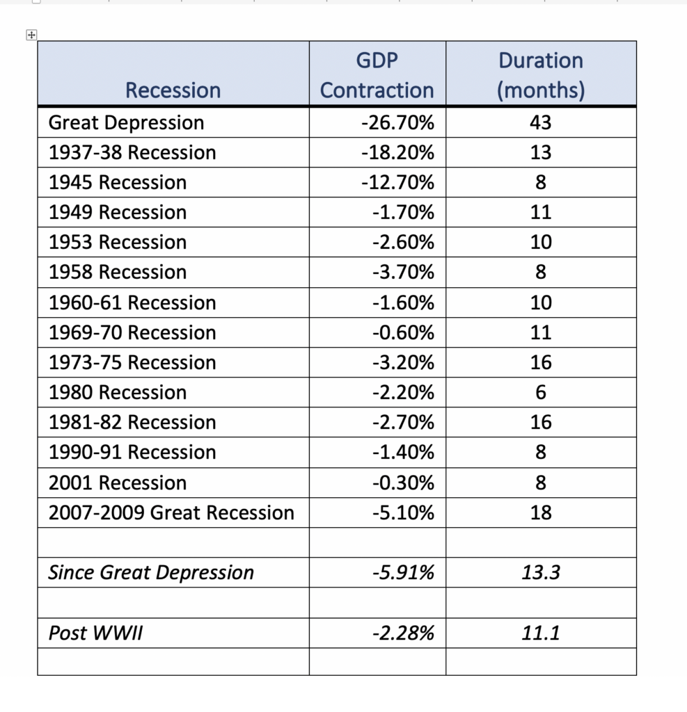
Economists are forecasting in some cases severe contractions in US GDP through the next quarter due to the impact of the COVID-19 virus. We believe that the US economy started decelerating at the beginning of March and it is extremely difficult to estimate the extent of the slowdown. America has likely never before experienced as abrupt an economic disruption. In this week’s chart (table) we have enumerated the National Bureau of Economic Research list of recessions beginning with the Great Depression. The average contraction in GDP since the Great Depression is 5.9% and lasted 13 months. Post WW II in the industrial rebound-fueled era the average contraction was 2.3%, lasting 11 months. Economists’ current forecasts range from declines in GDP growth in the mid-single digits to close to 10% from current quarter to Q2 2020. America has not realized that level of contraction in economic activity for over 70 years.
The American economy is vastly more modern and resilient than in the past and the US Federal Reserve and federal government have pledged as much as $1.7 trillion in monetary and fiscal expenditures to buttress the economy. That extraordinary amount is nearly 8% of nominal GDP. We could experience a sharp rebound as this injection of liquidity stimulates spending, a temporary wealth effect, and pent-up demand stemming from service-sector employees returning to the labor force when this crisis subsides.
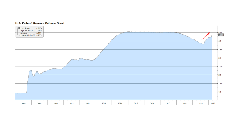
On Sunday, March 15, 2020 after an emergency meeting, the US Fed announced that it was lowering the US Fed funds target rate by 100 basis points to a range between zero and 0.25%, and that it will expand its bond holdings by at least $700 billion. The expansion of the Fed’s balance sheet, depicted in this week’s chart, will likely bring it to levels surpassing records reached in the aftermath of the Financial Crisis. Hyper accommodative measures being undertaken by the Fed (and other central banks) are occurring simultaneously with aggressive fiscal measures being enacted by the Trump administration and the US Congress. The magnitude of the fiscal and monetary spending underscores the degree of uncertainty regarding the economic and social impact of the COVID-19 virus. What had been a robust economic and fundamental backdrop in America just a few short weeks ago will likely turn out to be a low-growth to stagnating to contracting-growth environment during the current quarter and likely the following quarter. The economic downshift beyond the Summer is a major question mark and will be dependent on the efficacy of containment measures, potential seasonal dormancy of the virus, and successful treatments and outcomes. [chart courtesy Bloomberg LP © 2020]
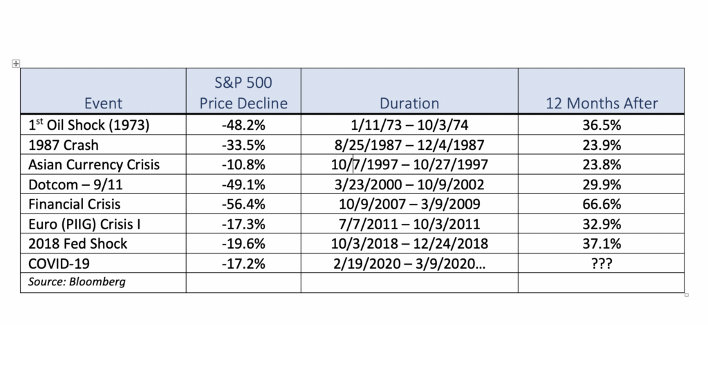
As of this writing stock markets around the globe are reacting violently to the latest COVID-19 related news. From our perspective, while the past several weeks of volatility has been unnerving, it is important to evaluate the current market in the context of previous global events. We have listed several periods over the span of the past 40 years when the US stock market, as measured by the S&P 500, either corrected or even entered a bear market. While this list is by no means exhaustive, it is intended to show that while previous downdrafts were painful, US equities rebounded impressively over the course of the following year once the market bottomed. It is also important to consider that each sell-off was caused by different events both international and domestic in origin as well as ranging in duration, yet stock prices in the US were higher 12 months afterwards. As tragic as this pandemic has been and will likely continue to be, our sense is that US equities will likely follow a similar pattern and be higher a year from now. [data courtesy Standard & Poor’s and Bloomberg LP © 2020]
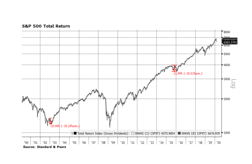
Heightened fears of COVID-19 spreading to other countries and regions over the past few days has unnerved investors and sent global equity markets lower. Since hitting an all-time high on February 12th, the FTSE Global All Cap Stock Index fell 6.4% just through February 25th. Taken in context, global stocks may continue this week’s trend. In 2003 the SARS pandemic temporarily derailed the post dot-com recovery in the U.S. The S&P 500 Total Return Index contracted nearly 11% from late November 2002 through early March 2003. The Zika virus outbreak in 2015-16 also had a similar impact on stocks as the index fell 12% from late July 2015 until bottoming in mid-February 2016. These instances are cited in this week’s chart.
The corporate environment in America is still quite strong compared to the two periods cited above and the rest of the world today. One indication can be found in credit markets where investment grade corporate credit prices continue to grind higher in the midst of stock market volatility. The toll on the human condition is tragic but our sense is that this will pass in time and may turn out to be shorter in duration due to advancements in biotechnology. That is certainly our hope but in the meantime equity markets will likely continue to be volatile. [Data courtesy S&P, chart courtesy Bloomberg LP © 2020]
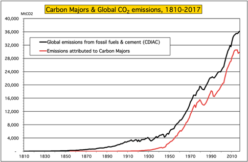
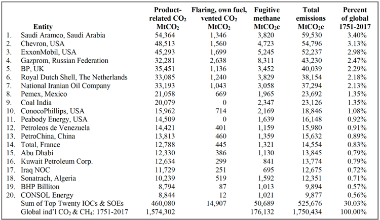
More and more companies, including airlines and oil companies, are announcing an intention to achieve carbon-neutral operations over the next couple decades. But, it is important to look behind the headlines and understand what that sort of pledge actually means. What business is the company actually in and does the pledge include their supply chain or product output? From the Climate Accountability Institute (Oct. 9, 2019, data through 2017), global fossil fuel and cement emissions from 1965 to 2018 totaled 1,354 billion tonnes of carbon dioxide and energy-related methane (GtCO2e); The twenty largest investor-owned and state-owned fossil fuel companies produced carbon fuels that emitted 35% of the global total (480 GtCO2e); Looking over the entire historical data set they find their current database of 103 fossil fuel and cement entities emitted 1,221 GtCO2e, or 69.8% of global since 1751 (1.75 TtCO2e); of which the Top Twenty companies are responsible for 526 GtCO2e, or 30% of all fossil fuel and cement emission since 1751. [Charts and data, Climate Accountability Institute, October 2019]
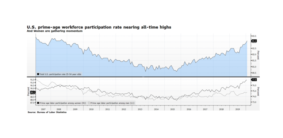
The US Bureau of Labor Statistics has been reporting impressive trends across many demographic categories for several quarters. One of the most important trends we see is development in the female workforce. Total US Labor Market participation reached an impressive 83.1% rate in the key age category of 25-54 year-olds. These levels have not been reached since the pre-crisis era over a decade ago. The real story is gains made by female workers. Women in this demographic have led the overall participation rate, rising from 73.3% in late 2015 to its latest reading of 77%, three times the percentage gain of men in the same category who rose from 88.2% to 89.3% over the same period. Even with this good news, we cannot lose focus on UN SDG #5 (Achieve Gender Equality and Empower All Women and Girls). Women in the US still earn only about 80 cents on the equivalent dollar wage for a man, a gap which expands further for Latinas, black women and women of Native American and Hawai’ian descent. [Chart courtesy Bloomberg LP © 2020, data US BLS]
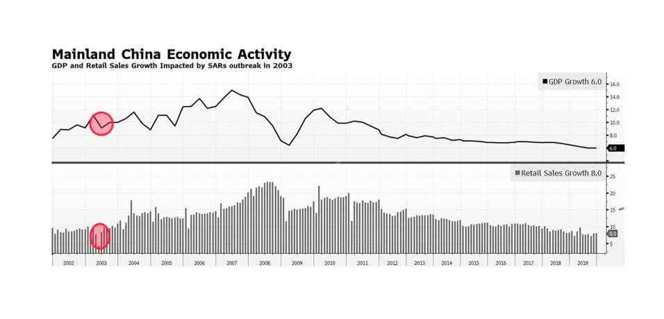
In the wake of Brexit and the risk of a pandemic it was time to take a diligent step back and compare current happenings with a bit of history. As the Coronavirus spreads within China and the WHO raises the specter of a global pandemic, investors have become concerned about the impact on the human condition and the global economy. During the SARs outbreak in 2003, Chinese economic activity was sharply impacted as GDP decelerated from 11.1% to 9.1% in the second quarter of 2003, and retail sales growth plummeted from 11.1% to 4.5% in the April to May months of that year. The SARS epidemic may, in contrast, look reasonably contained given what we don’t know about the Coronavirus. From a global economic standpoint, the Coronavirus impact is likely to be more severe given that China’s economy in 2003 represented a much smaller share of the world and it was much less consumer-oriented then. Chinese officials have limited travel and quarantined large segments of their population in order to limit the spread of the virus. Those actions will likely lead to stunted manufacturing output, and more importantly lower levels of consumption and retail sales which today represent a larger share of China’s economy. The impact of an even slower growing China will likely be a challenge for growth in the rest of the world. [chart courtesy of Bloomberg LP © 2020]
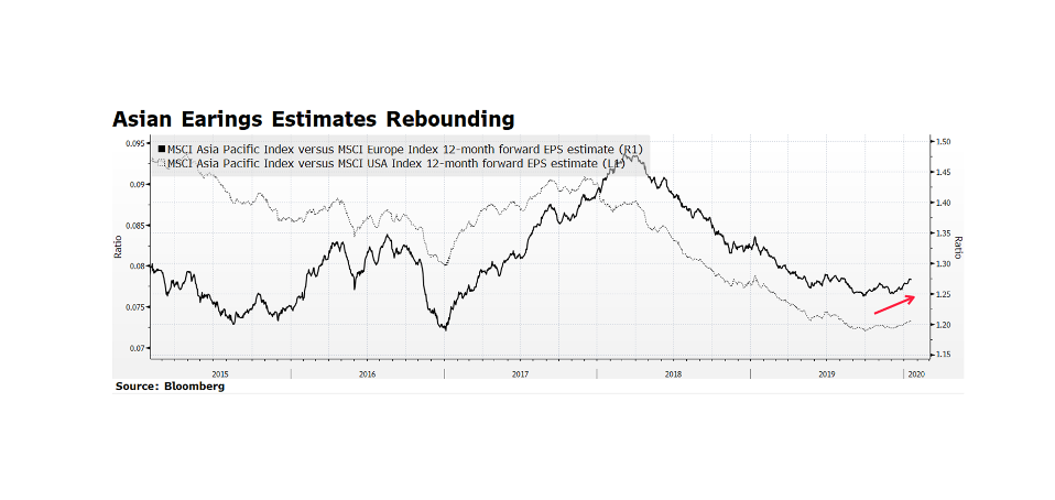
Earnings estimates across corporate Asia are gaining ground on European and even American companies. This is a welcome sign especially compared to the US with its well publicized solid fundamentals. Beyond the headlines stemming from social unrest in Hong Kong, many of the region’s stock markets exhibit favorable valuations and may attract investors pursuing stronger growth that is difficult to find in Europe at the moment. Also, with US equities continuing to hit all-time highs, investors may opportunistically rotate into this part of the world until American indices consolidate. [chart source Bloomberg LP © 2020]
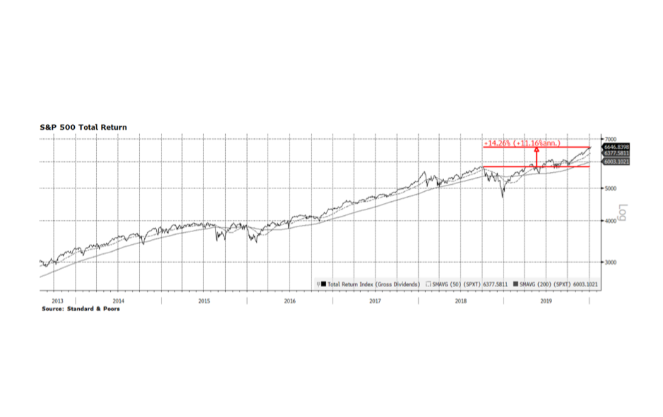
When you measure is everything. The major stock indices in the United States posted the strongest returns in recent years with the Nasdaq up 36.7%, Dow Jones Industrials up 25.3% and the S&P 500 (pictured below) 31.5% on a total return basis in the calendar year 2019. These results are undoubtedly impressive but are highly endpoint dependent. At the beginning of 2019 the equity market was reeling mainly due to the perception that the US Federal Reserve intended to pursue overly restrictive monetary policy only to announce quite the opposite at this time last year. The beginning of 2019 was a low point for US equity indices and the year ended with all-time record highs, producing very impressive calendar year returns. What we highlight on this week’s chart is the 14.26% total return (11.16% annualized) of the S&P 500 when measured from the September 2019 high prior to the fourth quarter US Fed-induced market rout. That return is historically strong but not as dramatic as measuring January to January would suggest.
For a bit of recent historical perspective, 2013 surpassed 2019 when the Nasdaq, Dow Jones and S&P 500 delivered total returns of 41.7%, 29.7%, and 33.1% respectively, followed by solid returns (all three indices posted 10%+ total returns) in 2014. [data courtesy S&P, chart courtesy Bloomberg LP © 2020]