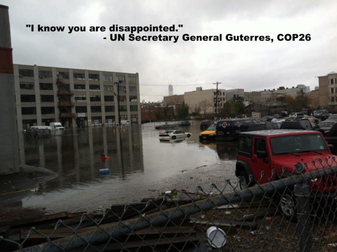
“I know you are disappointed”. That was UN Secretary General Gutteres’ message to “young people, indigenous communities, women leaders, and all those leading the charge on climate action” as COP-26 adjourned in Glasgow. From the perspective of those four groups, representing rather a large percentage of the planet’s population, “disappointed” might be the diplomatic understatement of this century as they cling to the edge of an existential cliff. Can an institution that by design is meant to move (extremely) slowly and deliberately and with total consensus actually address something with this much urgency?
Perhaps the issue is one of framing. From the UN’s perspective, if they were presented with an international conflict where food systems were to collapse, millions of lives were to be at risk, millions were to become refugees, hundreds of billions of dollars of infrastructure were to be destroyed, and this catastrophe would know no borders and respect no nation, law, or military might, what would it do? Guns pointed at each other is actually one of many societal byproducts of climate change, but for this thought experiment we should focus on the magnitude of devastation and hardship that is happening without a shot being fired. If slowing things down is the UN’s true nature, what can it slow down to forestall the full impact of this emerging catastrophe while it finds a permanent fix? What resources would it mobilize?
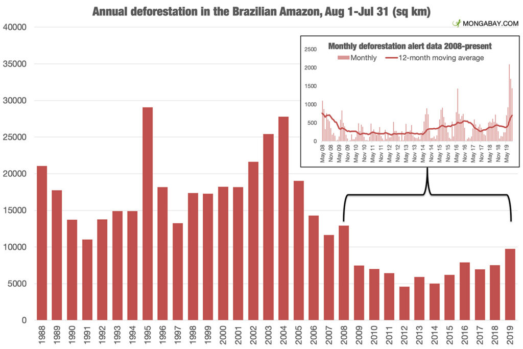
197 nations are signing the “Glasgow Climate Pact”, but the two most populous countries insisted on a language change from “phase out” to “phase down” coal. That fundamentally changes the coal question from one of “when” to one of “if”. Again, looking at other activities that pose imminent threat to life and land that bring UN involvement, say, nuclear weapons development or massing troops on a national border, the distinction between “phase out” and “phase down” would be of monumental import. We are mired in process over outcome.
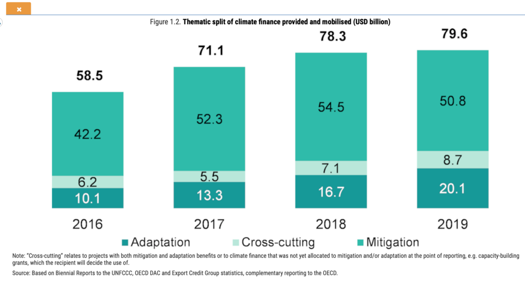
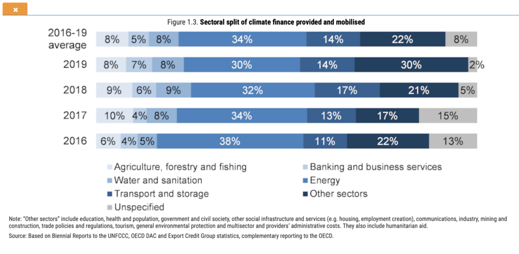
On the UN’s news feed for November 3rd, they reported “It’s ‘Finance Day’ at COP26, and the spotlight is on a big announcement: nearly 500 global financial services firms agreed on Wednesday to align $130 trillion – some 40 per cent of the world’s financial assets – with the climate goals set out in the Paris Agreement, including limiting global warming to 1.5 degrees Celsius.” At the UN above all other institutions, words mean something. What does “align” mean? Is this another “phase down” vs. “phase out” situation? For what we do on a regular basis as allocators of capital within that ecosystem of global financial services firms, we are forced to ask if this is a commitment to the largest greenwashing campaign in history. As we have written and spoken about repeatedly, we are looking to see whether this is the first step of many along a path to more sustainable capital allocation, or window dressing to manage optics. Intentionality is everything.
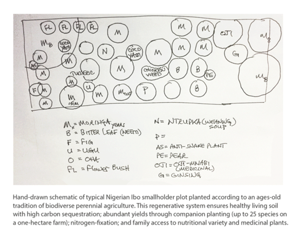
As noted previously, it is going to take the mobilization of private and not government capital to reach the intensity and scale of development necessary to forestall the worst effects of the climate crisis. Governments, who already failed to live up to their prior pledges to deploy $100 billion annually, should instead pivot to facilitating marketplaces and lowering barriers and allow the free market to do its work. Shifting capital to a regenerative model for food, energy, water, and infrastructure could unlock an economic boom and broaden participation in a way which would be historic in defining the 21st century.