Category: Federal Reserve (Page 3 of 4)

WCM Chart of the Week for February 22, 2021

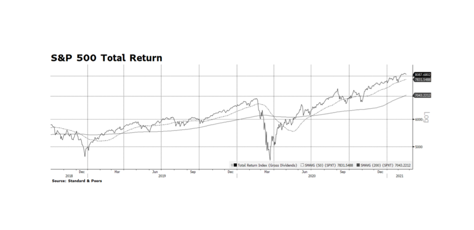
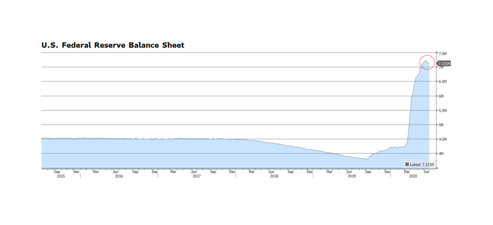
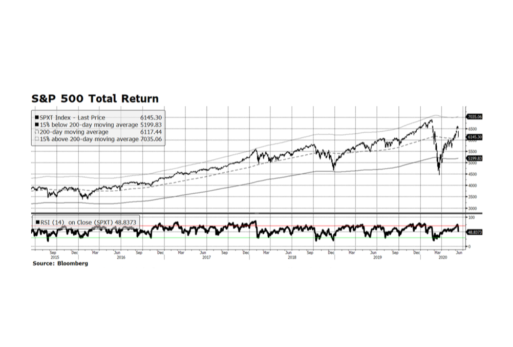
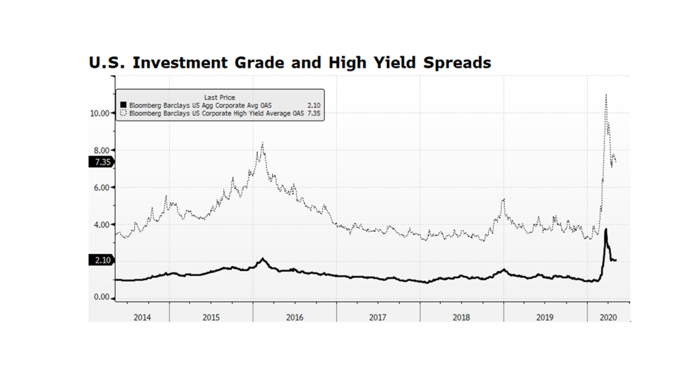
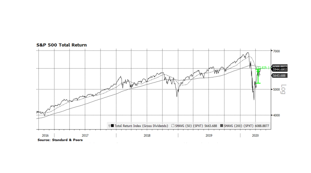
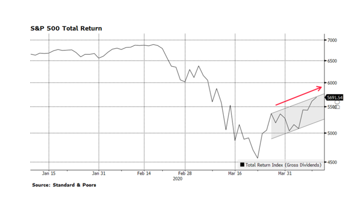
As we pass through the 12-month mark of the pandemic-caused rout in equities and risk assets across the world, investors are concerned about stretched stock market valuations, tight investment grade and high yield credit spreads, rising interest rates and poor labor market conditions. As of February 22nd, the one-year total return on the S&P 500 is just over 18% which is significant by any historical measure. As the next month or so passes, and as long as equity prices stay near where they are now, trailing returns are likely to grow even stronger as the anniversary of the March 23rd market bottom approaches. This may provide an additional psychological boost for investors as more stimulus is poured into the economy. Our concern is that the tremendous forthcoming stimulus now being debated in Congress might not be fully needed, or at least might not be properly apportioned. The stimulus may propel stocks higher here and abroad but may force the US Fed, which remains the dominant force in global capital markets, to reign in liquidity sooner than the market anticipates. [chart courtesy Standard & Poors and Bloomberg LP ©2021]

WCM Chart of the Week for February 15, 2021

Investors are concerned that US equity market levels are reaching new all-time highs and valuation readings continue to be stretched. Several months ago narrow leadership within US stocks was the reason to justify underexposure to the asset class. Market participation has broadened considerably since the pandemic-caused nadir of 2020 as equity prices have climbed. One measure of greater market participation is the percentage of stocks trading above their long-term trends, depicted as the dotted line in the chart, revealing 89% of the S&P 500 universe trading above their 200-day moving average. While the current level of participation is high, it can persist for prolonged periods as it had over the past decade. The 2010s were a period of slow economic and job growth post-financial crisis, and yet equity prices delivered robust gains during times of high participation, only temporarily interrupted by bouts of Euro-related uncertainty, the US Treasury debt downgrade, and the “Taper Tantrum”. Given the amount of monetary and fiscal support pledged by the Fed and Congress, our sense is that US stock prices could maintain their general upward trend even in the face of more near-term challenges. [chart courtesy Bloomberg LP, © 2021]

WCM Chart of the Week for December 14, 2020

US stock market indices are trading near all-time highs and many market observers are highlighting valuation measures that are reaching levels last seen during the dot-com era. The bellwether S&P 500 is currently approaching a forward price to earnings ratio of 26 times consensus earnings while other key metrics such as price-to-cash flow and price-to-book are also well above their long-term trends. This is a cause of concern but not necessarily alarm even as valuations stand at premiums compared to the rest of the developed world. The Fed model which compares the S&P earnings yield to the yield on BAA US Corporate Credit is registering readings near its long-term average after reaching extremely attractive levels at the onset of the pandemic. A major tailwind for US equities is likely to be a continued benign interest rate environment heading into 2021 and perhaps beyond. The US Federal Reserve has signaled accommodative policy conditions perhaps reaching well into 2022 and fiscal policy remains supportive as well. Both policy positions should be supportive of US stocks in the intermediate term. [chart courtesy Bloomberg LP © 2020]

WCM Chart of the Week for October 5, 2020

Over the past several weeks, credit spreads in US Investment Grade and High Yield bonds have risen while US equity prices hover near key support levels established since the S&P 500 and Nasdaq Composite indexes posted record highs in early September. Some consolidation in equities can be justified given the rapid recovery from the pandemic-induced lows reached in late March. The bond market appears to be sensing heightened risk. Credit spreads fell a considerable amount since the late-March spike but remain elevated compared to pre-pandemic levels and are on the rise even considering the modest tightening this past week. The yield on the 10-year US Treasury has been relatively stable since the beginning of September, fluctuating 5-10 basis points, and the US Federal Reserve remains in hyper-accommodative mode implying that the rising price of money for US corporate creditors is the main driver of widening spreads. This trend suggests that there may be further volatility ahead for US corporate securities. [chart courtesy Bloomberg LP (c) 2020]

WCM Chart of the Week for June 26, 2020

The US Federal Reserve has used the power of its balance sheet to support key segments of US capital markets since early March. Recently, it began to purchase corporate securities including high yield bonds, a move some view as controversial. However, purchasing investment grade (and below) bonds essentially supports companies and ultimately jobs, and full employment is a critical element of the Fed’s mandate. Another beneficial aspect of these purchases is that corporations are making coupon payments and returning principal to the Fed, and that is not necessarily the case with US Treasury purchases. In June, the balance sheet began to shrink, albeit modestly. It peaked at $7.22 trillion on June 10th and currently stands at $7.13 trillion. Following two consecutive weeks of balance sheet declines, stocks have fallen 5.3% as measured by the S&P 500 through June 26. News headlines cite the rise in COVID-19 cases as the reason for recent stock market volatility, but the Fed’s purchasing activity is likely a greater fundamental force dictating the direction of asset prices. Is this a pause or the beginning of a monetary policy tightening cycle? The state of the Fed’s balance sheet is a critical metric that we will continue to monitor. [Chart courtesy Bloomberg LP © 2020]

WCM Chart of the Week for June 12, 2020

The main equity indices in the US were routed this past Thursday, making the week negative for the first time in three.  The decline was likely due to concerns about climbing rates of COVID-19 in new parts of the country, and comments made by the Chairman of the US Federal Reserve (Powell) regarding the economic challenges ahead.  Thursday’s sell-off was the worst in percentage terms for the S&P Total Return Index since March 16, a week before the gauge made its cyclical bottom. Another factor may have been that the US equity market was extended heading into the week.  Still, on Thursday the index managed to close above the 200-day moving average, and on Friday rebounded 1.3%.  Prior to Thursday, the index was elevated well above that long-term measure, so some give back was reasonably expected.  Friday’s gain is encouraging but we are mindful of the real challenges facing the US economy and capital markets going forward.  The next several trading days will be telling. [chart courtesy S&P and Bloomberg LP © 2020]

WCM Chart of the Week for May 8, 2020

US corporate credit spreads are narrowing, but they are still quite wide by historical standards. Investment grade spreads appear to be stabilizing while high yield (junk bond) spreads are still volatile. Yields premiums in both segments of the credit market have contracted by about half-way from their recent peak on March 23rd compared to their pre-pandemic levels. What we find interesting is that volatility persists in the high yield market given the Fed’s disclosure that they intend to purchase issues and instruments including ETFs within this credit market segment. The volatility is likely a signal that investors expect defaults, insolvencies and bankruptcies. What intrigues us is the potential for Fed purchases of ETFs, because the Fed could opt to receive the underlying bonds, hold them until maturity and absorb any resulting defaults. That would in effect support distressed companies and potentially preserve jobs. It may prove to be a novel way for the Fed to support the labor market using the balance sheet to honor its mandate for full employment. [chart courtesy Bloomberg LP © 2020]

WCM Chart of the Week for May 1, 2020

This past week we witnessed two of the worst US economic reports many of us have ever seen. On Wednesday, it was reported Q1 GDP contracted 4.8% on an annualized basis, and Thursday’s unemployment report brought the total number of newly unemployed to over 30 million, consuming all of the jobs gains since the depths of the Great Recession. But, even with all the bad news on the economic front over the past several weeks, the US stock market as measured by the S&P 500 posted its strongest monthly gain since 1987. At least for now, the stock market is looking beyond the current rut to the potential for prosperity on the other side. That is certainly reasonable considering the amount of monetary and fiscal stimulus being injected into the economy and capital markets as we have been discussing for several weeks. Against this backdrop we are still compelled to ask ourselves what the trigger for re-testing the March equity drop might be. It could be an acceleration of virus cases, a state-level bankruptcy or two, or China-related backlash or retaliation. Current state of mind – hopeful but watchful. [chart courtesy Standard & Poors and Bloomberg LP © 2020]

WCM Chart of the Week for April 10, 2020

Over the past week we have witnessed encouraging signs in US equities as the three main indexes, the Dow Jones Industrial Average, the S&P 500 and the NASDAQ Composite have come off of their recent lows on March 23 and are making higher highs and higher lows – a key bullish technical pattern.  We are optimistic about US stocks but also understand that we are quite far from containing this health crisis and the recovery in our capital markets remains fragile.

The rout that began in earnest late February has arguably been exacerbated by State and Federal government-led virus containment efforts — business, school, recreational closures as well as encouraging social distancing — that have effectively suppressed the economy.  Throughout history recessions, depressions and bear markets were caused by bubbles bursting like Asian currencies, Dotcom companies, US mortgages, and not by intentional government economic restraint.  Government intervention normally supports economic activity.

Along with roughly $1.8 trillion in asset purchases and other stimulus from the Federal Reserve, The US Federal Government has approved and is now implementing the $2.3 trillion CARES Act directly supporting American families, small businesses and larger corporations. An important aspect of the package is the speed that funds will be sent directly to citizens, anticipated to be just a few weeks.  This is critical considering that over 16 million Americans have filed for first-time unemployment assistance in the past three weeks alone.

Taken together, monetary and fiscal policy stimulus surpasses $4 trillion being injected into the American economy which could represent greater than 20% of GDP.  At the same time, large swaths of the US economy remain virtually frozen as COVID-19 infection rates peak.  There is nothing in modern history like this tension between top-down support and restraint to compare and judge an outcome, but in the longer term we believe support will win out. [Chart courtesy S&P and Bloomberg LP © 2020]

WCM Chart of the Week for April 3, 2020

The US Federal Reserve has taken several powerful steps in recent weeks ranging from lowering policy interest rates, intervening in credit markets to provide stability and re-engaging in asset purchases, also known as QE. The amount of monetary stimulus is unprecedented and staggering. Since March 4, the Fed’s balance sheet has expanded nearly $1.6 trillion through their asset purchase plan, accumulating Mortgage Backed Securities, Treasuries and Corporate Credit. That is an incredible amount of expansion in such a short period of time considering that it took some 15 months during the financial crisis from when the QE program began to reach an equivalent level of assets. Some are concerned that the Fed has expended all of its monetary tools and that is a real concern given policy rates are at or near zero. The balance sheet now stands near $5.9 trillion, a level that just a few years ago would have seemed unimaginable. But it could become even larger. The Fed’s balance sheet represents nearly 27% of US GDP. By contrast the European Central Bank’s balance sheet stands at over 42% of European Union GDP. The Bank of Japan stands at over 100% of GDP. The Fed’s asset purchase program could even become more active and remain manageable, especially considering the relative vibrancy of our economy compared to Europe and Japan. [chart courtesy Bloomberg LP © 2020]

« Older posts Newer posts »