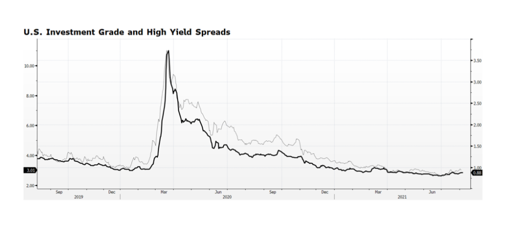
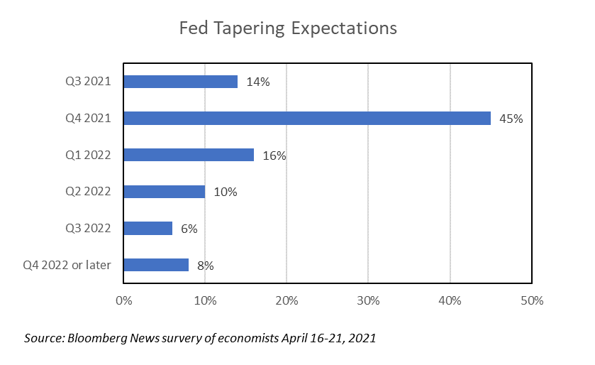
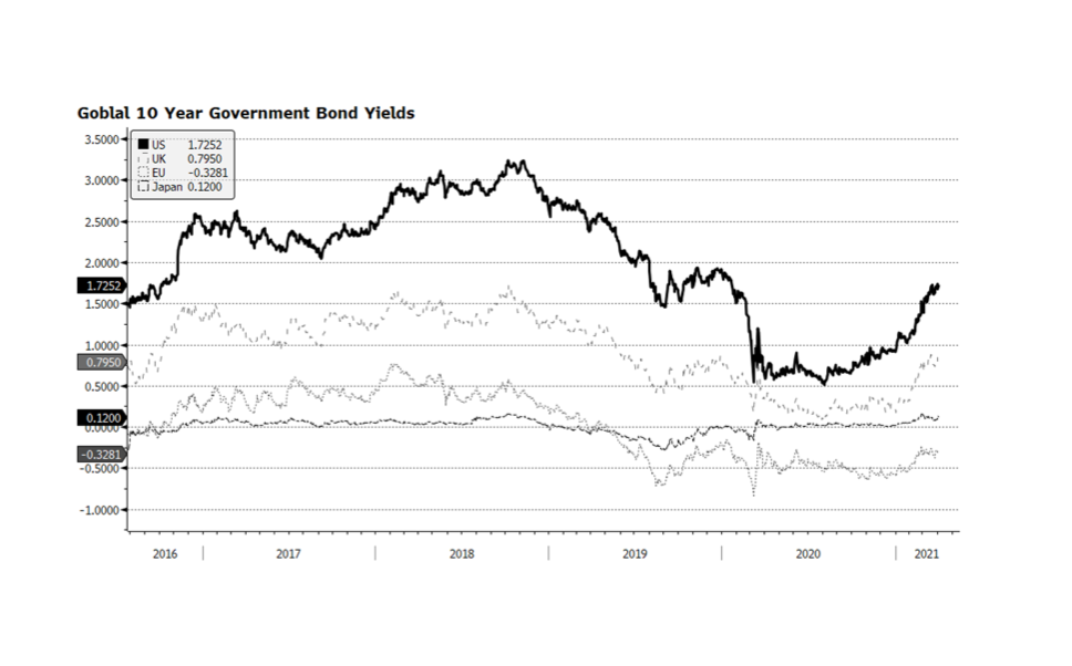
Category: Monetary Policy (Page 2 of 3)

WCM Chart of the Week for June 22, 2021

Those participating in the frenzy in crypto-related investing may be in for some more downside pain in the months ahead as a bellwether, Bitcoin, has formed the notorious “death cross”, which is when the 50-day moving average falls below the 200-day. So far it is approaching nearly a 50% drop since its peak in mid-April. Technical analysis may be more useful in evaluating the merit of such investments that have no or little fundamental data on which to base a decision. Part of the rationale for investors to acquire positions in Bitcoin and other related investments lies in the idea of using them as a means of exchange and potentially as a store of value. The latter dimension has been gaining credibility as major central banks continue to pursue aggressive quantitative easing, effectively debasing their currencies to one degree or another. We cannot divine where the trend in cryto investing is headed in the intermediate term, but there is no denying that interest is growing. If recent history is any guide, investors who chose to hold these investments need to be prepared for further losses. The previous two times when death crosses were formed in 2018 and late 2019, losses surpassed 64% and 30%. Not for the faint of heart. [chart courtesy Bloomberg LP (c) 2021]

WCM Chart of the Week for May 25, 2021

The US Fed and European Central Bank (ECB) continue to pursue aggressive quantitative easing while the two dominant Asian central banks, the Bank of Japan and the People’s Bank of China, have slowed their securities purchases so far this year. The ECB’s activity is of particular interest, not only because of the size of the balance sheet ($9.2T, €7.6T), but the pace that it has expanded over the course of the past year. The ECB’s monetary support continues at a critical time as the EU economy appears to be emerging from the pandemic-induced slump. Lock downs are slowly being lifted and infection rates are plunging from the March and April spikes. Another promising (gradual) trend emerging is in sovereign interest rates in the region, which appears to be an indication of stronger economic activity in the months ahead. [chart courtesy Bloomberg LP (c) 2021]

WCM Chart of the Week for May 17, 2021

According to the US Federal Reserve, growth in the money supply, widely described as M2, peaked at nearly 27% at February’s month end reading and as of March it registered a 24% annual clip. To place those figures in context, the pre-pandemic average annual growth rate of M2 over the preceding 20 years [February 2000 – February 2020] was 6.1% according to Fed data. The previous peaks in M2 growth never surpassed 10.3%. Put another way, the entire US money supply, from the birth of our nation to now, expanded by around 25% in the past year alone.

This tremendous amount of additional liquidity is tied to quantitative easing and the numerous fiscal stimulus plans that have delivered direct payments to individuals and families that, for the most part, landed in bank deposit accounts. Commercial Bank Liabilities, the equivalent of consumer deposits, have swelled some 26% since the beginning of the pandemic, indicating that stimulus recipients have fortified savings as opposed to increasing spending. The good news is that consumers are in better shape than they have been in several years. The bad news, if it can be considered that way, is that there is likely pent-up demand that could ultimately fuel inflationary concerns.

The most recent annual headline inflation figure (CPI) reported by the US Bureau of Labor Statistics for April was 4.2%, well above the consensus of 3.6% and over two times the Fed’s target rate. Our main concern is whether the recent upward trend in prices is reflationary or a more enduring inflationary trend. The Fed has stated that it considers current price conditions to be “transitory” and thus falling into the reflationary category. [chart courtesy Bloomberg LP © 2021]

WCM Chart of the Week for April 26, 2021

Bloomberg’s most recent update on economists’ expectations for the US Federal Reserve to begin tapering its asset purchases found that 45% of those surveyed believe the Fed balance sheet will begin to contract in Q4 of 2021. This is important because expectations are moving forward, as the previous month survey (March) had only 27% of respondents foreseeing the Fed tapering beginning in Q4 2021. The main difference between the April and March reports was a shift from Q1 2022 to Q4 2021. The Fed is not expected to alter policy in this week’s FOMC policy statement release and will likely maintain highly accommodative monetary conditions. But, the shift in expectations may turn out to be critical for capital markets. Benign Fed policy has been one of the main factors supporting asset prices over decades and especially in recent years. The shift in expectations may become a headwind for risk assets in the months ahead.

WCM Chart of the Week for April 12, 2021

According to Citigroup’s Earnings Revision Indices, Eurozone earnings are far outpacing the rest of the world, and equity prices are gaining on a relative basis as well. Year-to-date through April 12th, Eurozone shares still trail the S&P 500 total return in US dollar terms 7.2% to 10.2%. Equity investors may be signaling that even in the midst of reimplemented economic shutdowns and virus spikes, the worst may be over on the Continent and more prosperous conditions are on the horizon. There are also reasons to be optimistic about the region’s stocks — they trade at favorable valuations compared to US equities and the ECB is continuing to be highly accommodative making fixed income alternatives unattractive. If Eurozone equities can continue to rally and broaden the global advance of stocks it would likely provide a boost of confidence for investors worldwide. [chart courtesy Bloomberg LP, Citigroup © 2021]

WCM Chart of the Week for April 5, 2021

Not surprisingly. as the global economy recovers, benchmark bonds yields in the developed world are on the rise. The spreads between US rates and the developed world are also widening, particularly versus the EU and Japan. We are concerned that higher yields in the US will pull interest rates higher in the Eurozone, which is already not recovering from the pandemic as quickly as much of the rest of the developed world, complicated by their slower pace of vaccine deployment. Another major concern is the cost of US debt servicing in a higher yield environment as the US Federal government embarks on yet more fiscal spending legislation that, if passed, will push the government debt-to-GDP ratio to levels that have plagued Japan for decades. [chart courtesy Bloomberg LP © 2021]

WCM Chart of the Week for March 29, 2021

It has been just over a year since stocks around the world began to recover from the pandemic-driven sell off. Stocks in the US found their bottom around March 23, 2020.  Since then, returns have been unusually strong with small cap stocks leading the way with the Russell 2000 Index up 115% and the Nasdaq Composite up nearly 90%. The rebound is not so surprising given the amount of fiscal and monetary stimulus that has been injected into the economy over the past year. The fiscal stimulus including the CARES Act, PPP, Consolidated Appropriations and the American Rescue Plan amount to over $5.4 trillion, while the Federal Reserve has expanded its balance sheet by nearly $3.6 trillion. Taken together, the stimulus efforts amount to over 43% of 2020 US GDP with even more potential fiscal plans. To place the astronomical stimulus in context, the Bureau of Economic Analysis (BEA) announced on March 25th that US GDP contracted 3.5% in the full year 2020. The BEA also announced its Q4 2020 GDP estimate indicating expansion at a 4.3% pace following Q3 growth of 33.4%. With the economy clearly on a strong path to recovery, we see continued stimulus as potentially overkill, at least in market terms, and the excess liquidity will likely produce further gains in stocks in the months ahead. [chart courtesy Bloomberg LP © 2021]

WCM Chart of the Week for October 26, 2020

Over the past decade or more, Europe has endured several painful crises spanning Euro-related stresses to the recent Brexit uncertainty.  The common thread retarding recoveries from these epochal events has been the lack of coordinated policy response, in particular fiscal stimulus. The European Union, now with the UK removed, simply does not have the strength to influence its member states to expand fiscal spending that would benefit the region beyond each country’s own national borders. Now the global Coronavirus pandemic is accelerating to frightening levels across Europe as evidenced by case momentum. The imprint on European stock prices is telling.  From the onset of the pandemic, the broad-based EuroStoxx 600 is over 8% lower in US dollar terms and has been range trading since early June. By contrast, The S&P 500 is flirting with all-time highs. We believe the difference is that, while Europe has generally been more aggressive in the public health response to the pandemic, the overwhelming US fiscal and monetary response carries the day as compared to the apparent EU policy vacuum.

WCM Chart of the Week for August 28, 2020

The US stock market continues to rebound from the pandemic panic-driven lows, with the NASDAQ and S&P 500 continuing to post new all-time highs over the past several weeks. This is prompting investors to question if the current rally can last, or even if it marks the beginning of a new bull market.  There are risks that could derail the stock market’s advance ranging from tensions with China, resurging virus hot spots, social upheaval around the country, and the upcoming national elections. The US labor market is also a persistent drag and will not likely have recovered until well into 2021.

There are several factors that are supportive of asset prices including unprecedented fiscal and monetary support, and mounting positive momentum in key economic sectors such as manufacturing, housing and the consumer.  As previously mentioned in our COTWs, in the US personal savings rates remain elevated and personal balance sheets have been de-levered, suggesting the consumer has the ability to spend if they wish.  This week’s chart highlights total assets in money market funds, which remain near peak levels suggesting private investors have been underexposed to equities during the stock market’s historic recovery rally.  This is a condition many cite as additional evidence that equities could continue to advance higher in the months ahead. [chart courtesy Bloomberg LP © 2020]

WCM Chart of the Week for August 17, 2020

Over the last several months we have cited several factors that, in our view, explain why the US stock market indices have been rising and may continue to do so. The most significant contributors are measures being undertaken by the US Federal Reserve and Federal government to support the labor market. The US consumer has been responding by increasing consumption, and so we see core components of the US economy like auto purchases and manufacturing rebounding. The official unemployment rate is still terribly high, measuring 10.2% in July, but that is a significant improvement over 11.1% in June.

Pandemic-related government-mandated lockdowns are being lifted (although in some areas of the country those being reinstituted) and economic trends should continue to improve as people return to work and to consumption.  Critically, there are encouraging signs related to COVID-19.  According to the National Center for Health Statistics (part of the CDC), weekly total provisional deaths as of August 8th registered 438, lower than the pre-surge figure registered on March 21st. These totals are significantly lower than figures cited by media outlets and Johns Hopkins University, a consequence of how deaths are verified and reported, but most importantly we are seeing improving trends regardless of methodology, and that is a relief.  Very well known yet still necessary to point out, this week’s chart demonstrates the concentration of fatalities for those age 55 and older, showing the terrible risk to and impact on the elderly. But, by contrast, the low concentration and declining trend among the young may alleviate concerns about the upcoming school year and broadening re-openings across the country.

« Older posts Newer posts »