Category: Chart of the Week (Page 6 of 18)

WCM Chart of the Week for February 8, 2021

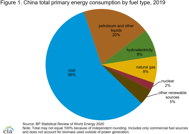
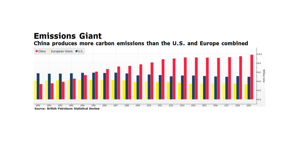
What does a pledge from China of carbon neutrality by the year 2060 actually mean, and how do we measure progress? There are various global targets for climate change mitigation that attempt to quantify what needs to be done so that the global system does not exceed the point of no return, generally seen as a rise of 1.5 – 2.0 degrees Celsius. Under the Paris climate accord, a number of nations committed to carbon neutrality in the next 30 years. China said 40, but as the largest economy on Earth how do we measure their progress? This week’s chart from the US Energy Information Administration country analysis of China (Sept. 2020) is just one hint at the structural challenges China faces in achieving the target. On a per-capita basis China’s carbon footprint is still smaller than the developed West, but their total footprint is more than a quarter of the world’s total output, and their energy mix is just 15% non-carbon and more than half coal. After the pandemic interruption that marked the period around the Lunar New Year, China’s carbon output returned to or even exceeded pre-pandemic levels. We are looking for the steps China will take now to level out carbon growth so that it can begin reversing the trend after 2030, and wonder, even worry whether another 10 years of increasing output takes us past the global point of no return.

WCM Chart of the Week for February 2, 2021

It is not surprising that China’s carbon emissions are growing given relatively strong economic activity compared to the developed world. Or perhaps it is given China’s pledge of carbon neutrality by the year 2060. China’s contribution to carbon in our atmosphere is approaching 10 billion tons annually, an amount that is greater than the US and Europe combined. To place that in context, according to the World Bank, as of 2019 the Chinese economy is only 38.6% of US and EU economic output. It is important to note that carbon output in the US and Europe has been steady and even declining as their economies are expanding. Another startling fact is the Chinese economy represents 16.3% of Global GDP (also World Bank data) and yet contributes nearly 29% of the 34.2 billion tons of carbon emissions, according to the British Petroleum Statistical Review. In our view, China has a great deal to do to meet its 2060 carbon neutrality pledge on its way to becoming the world’s largest economy, starting with action on its COP21 Paris commitments including reducing its dependence on coal.  [chart courtesy British Petroleum Statistical Review, © 2021]

WCM Chart of the Week for January 25, 2021

While conditions in the US labor market remain dire with initial and continuing jobless claim registering persistently high levels, other surveys are showing early reasons for optimism. The US ISM (Institute of Supply Management) produces several influential surveys of their members, and they have released key reports on the impact of COVID-19 on US business trends. The December surveys on US Manufacturing New Orders and Business Production suggest that purchasing managers are optimistic. In fact, the New Orders reading stands at a level not seen since 2004. This is a critical development because, if business optimism remains elevated, eventually staffing will have to expand bringing job seekers back to work. A lot needs to occur for the economy to fully recover — vaccines need to be distributed in mass and be effective, people need to feel comfortable re-engaging in economic activity, and states need to allow businesses and schools to reopen. We believe supply managers are seeing beyond these significant near-term challenges to an economic recovery in the quarters ahead. [chart courtesy US ISM, Bloomberg LP © 2021]

WCM Chart of the Week for January 18, 2021

This week’s chart comes courtesy of J.P. Morgan Asset Management’s “Guide to the Markets” quarterly publication, expressing the near uniform adverse bond market impact of a nominal 1% rise across the yield curve. A key assumption cited in the chart subtitle is that the shift in the curve is parallel, which rarely happens. Yet, the illustration highlights a major challenge for US bond investors in the months ahead.  There may simply be few segments within fixed income where investors can expect positive total return. It is reasonable to assume that the rise in intermediate-to-long term US Treasury rates will continue, eventually approaching pre-pandemic levels. The yield on the 10-year US Treasury has risen from 0.5% on August 4, 2020 to 1.08% on January 18, 2021, while it stood at 1.77% 12 months ago. According to JPM’s analysis, only US Convertibles, High Yield and Floating Rate securities can be expected to deliver modestly positive total return in the year ahead. There are other key assumptions that would change the results of their modelling, such as benign equity market conditions and a steepening yield curve, but the chart illuminates the harsh reality facing bond investors in 2021. [chart courtesy JP Morgan Asset Management © 2021]

WCM Chart of the Week for January 4, 2021

What happens when one ESG priority comes into conflict with another? This week we examine a chart from the World Resources Institute (www.wri.org) of data from the Servicio de Información Agroalimentaria y Pesquera chronicling a decade of growth in avocado production in Mexico. Avocados play on ESG themes of healthy eating, job creation and economic opportunity. Unfortunately, the explosion of consumption, primarily in the US as a result of NAFTA, of Mexican avocados has fueled deforestation, draining of aquifers, soil degradation, increased CO2 emissions, threatens indigenous species and even triggers small earthquakes. According to various studies assembled by the World Economic Forum, avocado groves consume multiples of the water of indigenous forest, and the fruit has an end-point carbon emissions footprint many times that of bananas. As with other monocultures like palm in Indonesia, avocado has brought economic opportunity to areas that badly need it like Michoacán province, but at a profound and unsustainable cost. Conscientious consumption and deploying capital to find more sustainable methods of cultivation without depriving Michoacán of needed money and opportunity are examples of where ESG is headed to address whole-systems challenges rather than focusing narrowly on single issues or ideas.

WCM Thanks of the Week/Year for December 28, 2020

As the sun sets on 2020, we want to extend our gratitude and appreciation for our amazing clients, partners, vendors, friends and colleagues. It was quite a ride, and we are thankful to have taken it with you. We will take a break from the weekly charts to leave room for both celebration and contemplation about the challenges and opportunities in front of all of us in the new year. Wishing everyone a terrific holiday season, and a happy, HEALTHY, and prosperous new year. The COTW will return in January!

WCM Chart of the Week for December 21, 2020

European equities have been rallying yet continue to lag the US and the rest of the world. Since global equities found their pandemic-induced bottom on March 23rd, both the S&P 500 and the MSCI World Indices have rallied over 65% as of last week’s closing levels (12/18/2020) while European shares have climbed just over 60% measured in US dollar terms. While a 60% recovery in approximately three quarters is impressive, it is masked due to currency movement over the period. The Eurostoxx 600 itself has climbed 44% in local currency terms from March 23rd through Friday’s close, and the Euro has rallied over 17% since March 23rd. The disparity in performance suggests a few things to us. First, European investors may have less confidence in their stock markets due to a lack of forceful coordinated continental response to the pandemic. Second, the currency tailwinds for European shares reflect more of a “retreat” from the pandemic flight-to-safe-haven currencies like the Dollar than true economic resiliency. Finally, we are particularly mindful that other stock markets beyond Europe may offer superior growth prospects, which would be especially attractive in a low-growth developed West.

WCM Chart of the Week for December 14, 2020

US stock market indices are trading near all-time highs and many market observers are highlighting valuation measures that are reaching levels last seen during the dot-com era. The bellwether S&P 500 is currently approaching a forward price to earnings ratio of 26 times consensus earnings while other key metrics such as price-to-cash flow and price-to-book are also well above their long-term trends. This is a cause of concern but not necessarily alarm even as valuations stand at premiums compared to the rest of the developed world. The Fed model which compares the S&P earnings yield to the yield on BAA US Corporate Credit is registering readings near its long-term average after reaching extremely attractive levels at the onset of the pandemic. A major tailwind for US equities is likely to be a continued benign interest rate environment heading into 2021 and perhaps beyond. The US Federal Reserve has signaled accommodative policy conditions perhaps reaching well into 2022 and fiscal policy remains supportive as well. Both policy positions should be supportive of US stocks in the intermediate term. [chart courtesy Bloomberg LP © 2020]

WCM Chart of the Week for December 7, 2020

This week we are in the midst of examining the likelihood of a pandemic-induced housing crisis and its effects on families, the economy, and markets.  As we learned during the Financial Crisis, it is a very slow process to foreclose on a mortgagee and remove them from a home, particularly when there is a massive backlog of borrowers in similar circumstances. Renters, on the other hand, are more immediately vulnerable to eviction and subsequent homelessness. This week’s chart from econofact.org illustrates the percentage of households suffering a moderate or extreme cost-burden of rent (30% to 50% of income) by household income tier. These observations are pre-COVID, so we can reasonably expect this picture to be much worse in 2020. Government-issued moratoria on evictions kept people in their homes but also shifted the economic burden to the literal doorstep of landlords, many of whom are small businesses. As those edicts roll off but the pandemic still rages in the coming months, landlords will of necessity pursue their economic and business interests and housing insecurity will jump. Whether it is on the backs of the landlords or the renters, the social and economic consequences of this income and housing crisis will play out in our communities, in the real economy and in the investment markets for some time to come.

WCM Chart of the Week for November 30, 2020

Beyond the rosy headlines of a strong economic recovery and a rally of over 40% in the Shanghai Shenzhen CSI 300 Index from the depths of the pandemic, trouble may be brewing in China’s bond markets. Total debt in China was approaching 325% of GDP in 2019, a point that economies generally struggle. The largest segment of total debt growth from 2018 to 2019 was in the corporate sector, which rose from 165% to 205% of GDP. China’s 2019 corporate debt binge appears to have hit a wall. According to Chinese media reports as much as 69% of private enterprises have defaulted on their outstanding loans so far in 2020 and the festering crisis may impact local governments and state enterprises as well. Further deterioration in the Chinese financial system would obviously have negative implications for the rest of the world.

« Older posts Newer posts »