Category: Chart of the Week (Page 5 of 18)

WCM Chart of the Week for May 3, 2021

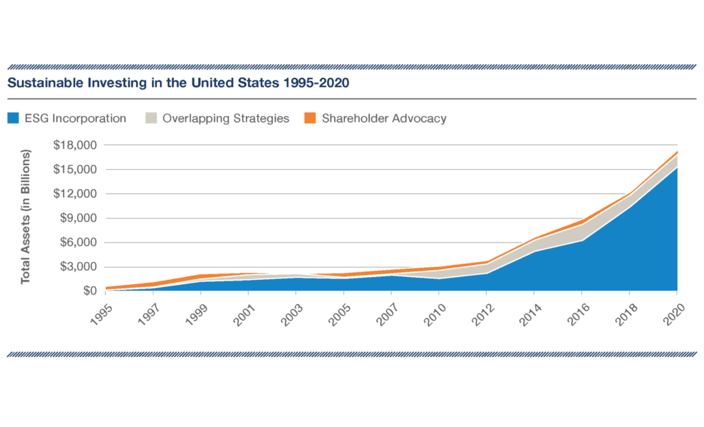
The idea of investing in a way that is consistent with your values is continuing to gain traction, maybe even more so through the pandemic. Beyond values, there is also an understanding that investing in a way that is socially, environmentally and ethically aligned also delivers market-like (or potentially even better than market) financial results. According to the US SIF Foundation’s 2020 Trends Report from which this week’s chart is taken, more than $17 trillion of the $51.4 trillion in professionally managed assets in the US as of year-end 2019 were aligned with the principles of ESG investing. Even deeply discounting that figure leaves an enormous quantity of assets and a steep growth curve. Investors who do not cleave to ESG or related disciplines still must take note of a market move of this magnitude. Stakeholders have spoken and ESG is part of the mainstream market conversation.

WCM Chart of the Week for April 19, 2021

We can’t leave Women’s History Month completely in the rear-view mirror without taking a long and hard look at how impossibly difficult it is for women founders to obtain venture capital funding for their early-stage enterprises. COVID-19 was certainly no friend either, leaving 2020 as the worst year in the last five for women. As compiled by Crunchbase (news.crunchbase.com), a paltry 2% of funding went to women-led startups in 2020, a figure which obnoxiously more than quadruples to 9% with a male co-founder but is still an embarrassment.  The system is not just biased – it is broken. There is no credible case that can be made that, out of a universe comprising more than half the world’s population and representing more than half of the Associates, Bachelors, Masters AND Doctorates awarded just in the US, women barely represent even one fiftieth of the economic potential of men to investors. Next time the question is asked about how we continue to grow the global economy and unlock the full potential of the capital markets given all the headwinds we face, give this answer – Invest. In. Women… Now. And particularly invest in black, indigenous, and other women of color. [chart from Crunchbase News, © 2020]

WCM Chart of the Week for April 12, 2021

According to Citigroup’s Earnings Revision Indices, Eurozone earnings are far outpacing the rest of the world, and equity prices are gaining on a relative basis as well. Year-to-date through April 12th, Eurozone shares still trail the S&P 500 total return in US dollar terms 7.2% to 10.2%. Equity investors may be signaling that even in the midst of reimplemented economic shutdowns and virus spikes, the worst may be over on the Continent and more prosperous conditions are on the horizon. There are also reasons to be optimistic about the region’s stocks — they trade at favorable valuations compared to US equities and the ECB is continuing to be highly accommodative making fixed income alternatives unattractive. If Eurozone equities can continue to rally and broaden the global advance of stocks it would likely provide a boost of confidence for investors worldwide. [chart courtesy Bloomberg LP, Citigroup © 2021]

WCM Chart of the Week for April 5, 2021

Not surprisingly. as the global economy recovers, benchmark bonds yields in the developed world are on the rise. The spreads between US rates and the developed world are also widening, particularly versus the EU and Japan. We are concerned that higher yields in the US will pull interest rates higher in the Eurozone, which is already not recovering from the pandemic as quickly as much of the rest of the developed world, complicated by their slower pace of vaccine deployment. Another major concern is the cost of US debt servicing in a higher yield environment as the US Federal government embarks on yet more fiscal spending legislation that, if passed, will push the government debt-to-GDP ratio to levels that have plagued Japan for decades. [chart courtesy Bloomberg LP © 2021]

WCM Chart of the Week for March 29, 2021

It has been just over a year since stocks around the world began to recover from the pandemic-driven sell off. Stocks in the US found their bottom around March 23, 2020.  Since then, returns have been unusually strong with small cap stocks leading the way with the Russell 2000 Index up 115% and the Nasdaq Composite up nearly 90%. The rebound is not so surprising given the amount of fiscal and monetary stimulus that has been injected into the economy over the past year. The fiscal stimulus including the CARES Act, PPP, Consolidated Appropriations and the American Rescue Plan amount to over $5.4 trillion, while the Federal Reserve has expanded its balance sheet by nearly $3.6 trillion. Taken together, the stimulus efforts amount to over 43% of 2020 US GDP with even more potential fiscal plans. To place the astronomical stimulus in context, the Bureau of Economic Analysis (BEA) announced on March 25th that US GDP contracted 3.5% in the full year 2020. The BEA also announced its Q4 2020 GDP estimate indicating expansion at a 4.3% pace following Q3 growth of 33.4%. With the economy clearly on a strong path to recovery, we see continued stimulus as potentially overkill, at least in market terms, and the excess liquidity will likely produce further gains in stocks in the months ahead. [chart courtesy Bloomberg LP © 2021]

WCM Chart of the Week for March 22, 2021

The European Central Bank’s net purchase of bonds through March 19th surpassed 21 billion Euros, the most since December, in an attempt to halt the rise in continental bond yields. According to Bloomberg, the yield on the Generic 10-year Euro Government Bond has risen from -0.67% in mid-December last year to -0.3% currently. Granted, Euro yields from 2-to-10 year issues are still negative but the pace of escalation has many concerned given the economic headwinds caused by the pandemic and the recent resurgence of infections and “re”closings. ECB President Christine Lagarde arguably faces a tougher challenge than her central bank counterparts because the EU does not have the fiscal flexibility of other major economies. That constraint may turn out to be a blessing for them as the US, for instance, implements yet another round of fiscal stimulus amounting to $1.9 trillion while the economy across the pond shows signs of accelerated economic activity.

WCM Chart of the Week for March 15, 2021

UN SDG 5 – “Achieve Gender Equality and Empower All Women and Girls”. During Women’s History Month we again turn our attention to equal access to economic opportunity for women in the American workforce. COVID has further exposed one of the ongoing issues with fair and equal compensation, which is the wage gap between women (and particularly women of color) who are mothers and men who are fathers in the same roles. The National Women’s Law Center gathered data pre-pandemic (2018) assessing the compensation picture for frontline occupations which turned out to be the exact roles hurt worst through the last year of COVID, including housekeepers, retail, wait staff, childcare, home health and nursing. Between 15 and 35% are working mothers, and of those as much as 74% of color. The gap between working mothers and fathers ranged from 36 cents down to 13 cents per hour. That is a bit of an abstraction. This week’s chart, taken from the NWLC and the 2018 American Community Survey, illustrates that gap much more starkly in real dollars on an annual basis, and points to the downstream economic drag on food, housing, education, job training and other expenditures and investments families make for healthy living and vibrant communities and economies.

WCM Chart of the Week for March 1, 2021

Equity markets around the globe were on edge as February came to a close. The technology-laden NASDAQ fell nearly 7% from an all-time high on February 12th. The weakness in equity prices came despite very accommodative comments from US Federal Reserve Chairman Jerome Powell during his scheduled two-day Congressional testimony last week. Equity markets became unnerved as government bond yields began to rise at an accelerated pace in the US, Eurozone and particularly the UK. Benchmark interest rates have been rising since the beginning of this year and US interest rates have been climbing since last Summer signaling expectations of improving economic conditions in the months ahead. As long as the rate environment increases gradually, gains can continue in equity markets. But, as we witnessed over the past few weeks, a steep ascent in market interest rates will have an expected adverse impact on risk assets. [chart courtesy Bloomberg LP (c) 2021]

WCM Chart of the Week for February 22, 2021

As we pass through the 12-month mark of the pandemic-caused rout in equities and risk assets across the world, investors are concerned about stretched stock market valuations, tight investment grade and high yield credit spreads, rising interest rates and poor labor market conditions. As of February 22nd, the one-year total return on the S&P 500 is just over 18% which is significant by any historical measure. As the next month or so passes, and as long as equity prices stay near where they are now, trailing returns are likely to grow even stronger as the anniversary of the March 23rd market bottom approaches. This may provide an additional psychological boost for investors as more stimulus is poured into the economy. Our concern is that the tremendous forthcoming stimulus now being debated in Congress might not be fully needed, or at least might not be properly apportioned. The stimulus may propel stocks higher here and abroad but may force the US Fed, which remains the dominant force in global capital markets, to reign in liquidity sooner than the market anticipates. [chart courtesy Standard & Poors and Bloomberg LP ©2021]

WCM Chart of the Week for February 15, 2021

Investors are concerned that US equity market levels are reaching new all-time highs and valuation readings continue to be stretched. Several months ago narrow leadership within US stocks was the reason to justify underexposure to the asset class. Market participation has broadened considerably since the pandemic-caused nadir of 2020 as equity prices have climbed. One measure of greater market participation is the percentage of stocks trading above their long-term trends, depicted as the dotted line in the chart, revealing 89% of the S&P 500 universe trading above their 200-day moving average. While the current level of participation is high, it can persist for prolonged periods as it had over the past decade. The 2010s were a period of slow economic and job growth post-financial crisis, and yet equity prices delivered robust gains during times of high participation, only temporarily interrupted by bouts of Euro-related uncertainty, the US Treasury debt downgrade, and the “Taper Tantrum”. Given the amount of monetary and fiscal support pledged by the Fed and Congress, our sense is that US stock prices could maintain their general upward trend even in the face of more near-term challenges. [chart courtesy Bloomberg LP, © 2021]

« Older posts Newer posts »