Category: Chart of the Week (Page 3 of 18)

Charting COP-26 and the Path to Zero, November 5, 2021

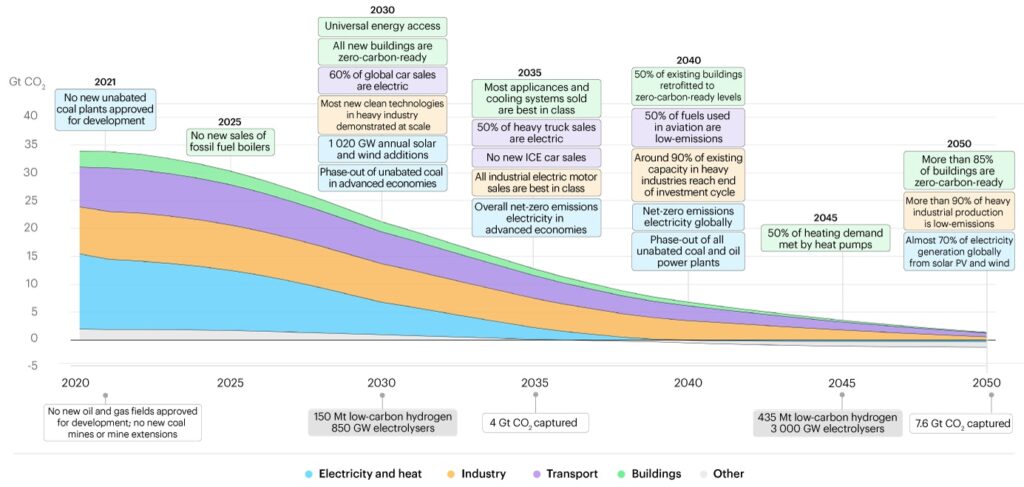
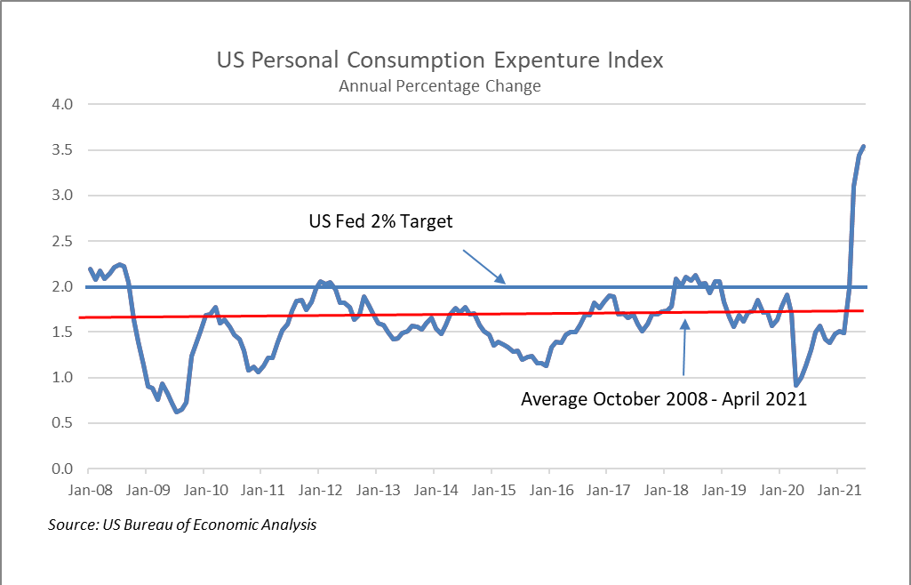
Yesterday a consortium of mostly Anglo and European countries signed a statement affirming a commitment to “deliver sustainable, green and inclusive economic growth to meet the challenge of decarbonising our economies, in line with limiting the global average temperature increase to 1.5°C above the preindustrial levels.” The statement covers six categories of targets — Support for workers in the transition to new jobs, social dialogue and stakeholder engagement, economic strategies, local, inclusive, and decent work, supply chains, and Paris Agreement reporting. The important thing we note in this statement is the recognition of the necessity of public/private partnership. The path to zero requires industry and market-wide activation of capital and corporate infrastructure in the private sector and regulatory and reporting frameworks from the public sector that facilitate the private sector’s work. This chart from a May 2021 International Energy Agency (IEA) report “Net Zero by 2050: A Roadmap for Global Energy Sector” provides an excellent overview of the business and industry targets that must be met with the facilitation and support of both governments and NGOs over the next 30 years. The signatories to the statement make sense in that these are many of the wealthiest industrialized nations that have both the capital to pursue this agenda and a high degree of responsibility for having brought us to the climate precipice. However, the lack of presence from Australia, China and Japan is concerning as they must help lead among the community of nations as the most developed and prosperous (polluting) countries of the Asia-Pacific region.

Charting COP-26, Take 2, November 3, 2021

Jair Bolsonaro isn’t there either. While the President of Brazil is not in attendance, the country is still represented, but one is forced to wonder what the degree of commitment is when the boss chooses not to attend for “strategic” reasons. On the positive side of the ledger, even with Bolsonaro’s absence Brazil signed on to the pledge between 100 signatory countries to end deforestation by 2030. And reinforcing our point about the real action being with private enterprise and not with government, dozens of global financial services companies also are committing to discontinue investment in and financing for businesses and other concerns engaging in or profiting from deforestation. Today’s charts look at the trends and patterns in Amazonian deforestation. Brazil made great positive strides over the past decade dramatically improving over the prior twenty years. However, with Bolsonaro’s election we observe a significant jump in activity in 2019, and expect similar increases in 2020 and 2021 (not yet reflected in the data). The second chart from NASA provides a visual representation of reduction in vegetation in the Amazon in a period between 2000 and 2008 to illustrate the patterns of destruction. Ironically, note that the pattern looks like leaf veins, propagating from main roads to local roads and spreading out into the forest until larger and larger tracts of land are cleared. Crops like soy account for much of the native vegetation cleared, and one of the biggest importers of Brazilian soy in the last couple years is China. No Bolsonaro. No Xi. Starting to see a pattern there too? 

Charting COP-26, November 2, 2021

We will spend a bit of time in the coming days highlighting charts we think are material as they pertain to the finance aspects of the UN Conference of the Parties (COP-26) taking place in Glasgow. Our starting point for expectations on outcomes for COP-26 is low. There might be a few more reasons for optimism than there were going in to and coming out of the last convening that Sec. Gen. Guterres basically labeled a failure. But, with two linchpins in the global climate machinery – Russia and China – not present, even total agreement by the attending parties amounts to a half measure. More importantly, we do not believe the answer to the climate challenge resides in the hands of nation-states at the governmental level. As can be seen by these charts from the OECD on how many billions of dollars annually are deployed globally to address adaptation and mitigation across sectors, this is the proverbial small-barrel solution to a big-barrel problem. Many estimates rise into the trillions of dollars USD per year that must be mobilized in order to achieve the stated goal of avoiding the 1.5 degree scenario and address the adaptation and mitigation needs for climatological changes that are already established. That can only come from markets and industry, so the best possible action in Glasgow would be for governments to agree to create the conditions for private (and public) enterprise to succeed and thrive in building a better climate future and then get out of the way. [Charts from Climate Finance Provided and Mobilised by Developed Countries: Aggregate Trends Updated with 2019 data, OECD iLibrary]

A WCM Seasonal Chart for October 15, 2021

The total return of the S&P 500 tends to be positive in the final quarter of the year, averaging nearly 5.2% since Q4 of 1989. The worst final quarters of the year occurred during the technology bubble, the financial crisis and most recently 2018. Let’s look at today’s headwinds. Inflation, which is near universal across the economy, works like a broad tax on everyone. Price increases in many segments of the economy are outpacing wage growth, and that is impacting consumption which makes up about 70% of GDP. Supply chain issues will likely persist into next year and perhaps beyond, continuing to pressure prices. Next, the Fed. Their actions or inactions will be scrutinized and probably criticized for years. Tapering will start soon, but liquidity and monetary support will still be positive, just less so. It is doubtful, even with so many Fed seats open, that President Biden will appoint hawks in this environment, so we expect that will keep the Fed accommodative for longer and rate hikes pushed out further. In the Fall of 2018, our last “bad” Q4, the Fed was in balance sheet reduction mode and in the midst of raising policy rates when Powell remarked that they were “not near interest rate neutrality” causing a rout in equities worldwide. Three years and a more seasoned Powell later means we do not expect the same rhetorical mistake will be repeated. We also need to watch the ECB. Inflation could be here for longer and that would fuel ongoing volatility. Bad for bonds but not necessarily stocks. For us, even with additional volatility, equities remain the default asset class at least over the next few quarters. [chart WCM © 2021, data from Bloomberg LP]

WCM Chart of the Week for October 8, 2021

The US Federal Reserve balance sheet currently stands at $8.51 trillion, doubling in size since the pandemic began. The Fed has recently suggested that it may begin to taper the current $120 billion monthly purchases of Treasuries and mortgages as soon as the November 2nd-3rd meeting. Progress in employment is a potential trigger cited by Chairman Powell for tapering, even considering September’s lackluster jobs report. It is important to note that the Fed will likely continue to expand the balance sheet. What they are talking about is lowering the amounts of new monthly purchases over time, so expanding less fast. Still, a reduction in monetary liquidity. Of bigger concern are the inflationary trends that may force the Fed to introduce less accommodative or even restrictive monetary policy. Prices seem to be increasing nearly everywhere, from energy to food to wages, and the Fed’s preferred inflation gauge, the PCE Deflator, is up 4.3% year-over-year as of August. A combination of higher policy rates and lower liquidity would pose a serious challenge for capital markets. [chart courtesy Bloomberg LP © 2021]

WCM Chart of the Week for September 29, 2021

Natural gas prices around the globe are elevated, and as the colder winter months in the Northern Hemisphere approach, prices will likely remain so. An unfolding potential crisis is most acute in the Eurozone where natural gas futures prices have increased over 500% in the past year, and conditions in the rest of the world are not much better. Calmer weather in Europe and thus lower wind turbine energy production has been cited as one reason for elevated prices, and rising demand for natural gas as a lower-carbon transitional fuel away from coal and oil is another. Unchecked, the higher price environment may lead to blackouts, heating shortages in colder regions, and forced plant shutdowns, and may exacerbate current and broader inflationary trends. Also, higher utility prices are effectively a tax on consumers (hitting lower wage earners the hardest) hastening an end to the global economic recovery that may be already moderating or even stalling in some parts of the world.

WCM image of the week for September 21, 2021

Climate change imposes an indiscriminate tax on everyone. Increasing fire, flood, tornadoes, hurricanes, and coastal inundation are destroying private property and public infrastructure at an ever-increasing rate. But, there is no “they” to pay for it. We are they. And, it is not just the damage to places and things. There is a human cost in terms of lives and livelihoods, but also in the labor of countless emergency service workers, utility workers, etc. who go to work when a blaze needs to be battled or families need to be rescued from the roofs of their homes. People who do the brave work do not come cost-free. Even if they are volunteers they need resources to do their jobs. Looking locally, capital is being consumed in the tens, perhaps hundreds of billions of dollars here in the US not to create the next bridge, highway, dam or sewer, but to repair or replace what was already there. The cost of adaptation and resilience to climate change will accelerate away from us as well if the trajectory of change continues as it has. There is no path to higher global temperatures that does not include a tremendous economic burden falling on the backs of the global citizenry. We can pay the tax when the bill comes due, or we can seek out more capital-efficient ways to mitigate climate change and climate risk before it gets worse, including pricing that risk properly in the capital markets.

WCM Chart of the Week for September 13, 2021

We are back, but maybe China is not. China’s purchasing manager index for exports has signaled a decline since April’s reading of 50.4 (a reading below 50 suggests a deterioration in conditions). This data series is interesting in the current inflation debate because it is a barometer of global trade and aggregate demand. If demand is weakening while headline consumer and industrial prices remain elevated, that suggests that the supply/demand balance is being dominated by supply-related issues. This could make sense given the numerous instances of supply chain bottlenecks, transportation issues, etc. that we have discussed and that continue to make headlines. Consequence for the markets — this may be another reason why the Fed may be dovish for longer. [chart courtesy Bloomberg LP (c) 2021]

WCM Chart of the Week — Summer-End 2021

This will be our last chart before Labor Day. The US Federal Reserve’s preferred measure of inflation, the YoY rate of change in the Personal Consumption Expenditure Index (PCE), has been exceeding its 2% target rate since April making investors concerned that we may be approaching a monetary tightening cycle. That fear was escalated by this week’s release of the Fed’s July 28-29th meeting minutes that indicated they may begin to wind down the current $120 billion monthly asset purchases by the end of this year or the beginning of 2022. The Fed has expressed its view that current inflation trends are transitory and are likely due to temporary factors such as supply chain bottlenecks and a strong rebound in demand from last year’s lull in consumption. As of June 30th, the current annual rate of the PCE was 3.54%, well above the Fed’s target, but in June 2020 the reading was 1.13%. Since the Fall of 2008 during the Financial Crisis, the PCE has been stubbornly below 2%, averaging 1.59%. Over that period of nearly 13 years, the PCE has been over 2% only in Q1 2012 and for most of 2018.  Inflation has been undershooting for a long period leaving aggregate price levels far below the Fed’s ideal. This suggests to us that the Fed will likely tolerate inflation until the PCE normalizes.

WCM Chart of the Week for August 18, 2021

The Intergovernmental Panel on Climate Change (IPCC) released the Working Group I contribution to the Sixth Assessment Report which will arrive fully in 2022. Among the reaffirmed findings in the report is that we are already most of the way to the 1.5 degree Celsius threshold over pre-industrial global temperatures where climate-related damage becomes more widespread and harder to turn back. We wanted to examine what that means in practical human terms. According to NOAA (R. Lindsey, Jan. 25, 2021), we have seen 8 – 9 inches of sea level rise since 1880, and in some ocean basins nearly that much just since the beginning of the satellite record. Taking the IPCC findings into account and with NOAA’s own models, sea level could rise another foot over 2000 levels by the end of the century. The two images provided are from NOAA’s Sea Level Rise Viewer. The first is a view of the heart of the Northeast Corridor from Long Island Sound down to the Chesapeake at the current “Mean Higher High Water”. The principal shading illustrates the population vulnerability to sea level rise. The second is the same view under a 1 foot MHHW scenario. Note the amount of coastal inundation, particularly around high density and vulnerable populations. The amount of property and population at risk in human and dollar terms is staggering in this relatively concentrated area, and has implications for municipalities, commercial real estate, infrastructure, corporations, maritime interests, tourism, and residential neighborhoods, and all the supply chains and institutions elsewhere like banks and insurance companies that are exposed to that risk. Smart investing requires thinking about mitigation, resiliency, and adaptation, hallmarks of ESG investing and increasingly becoming part of mainstream investing.

« Older posts Newer posts »