Category: Chart of the Week (Page 18 of 18)

WCM Chart of the Week (Moment) for February 6, 2018

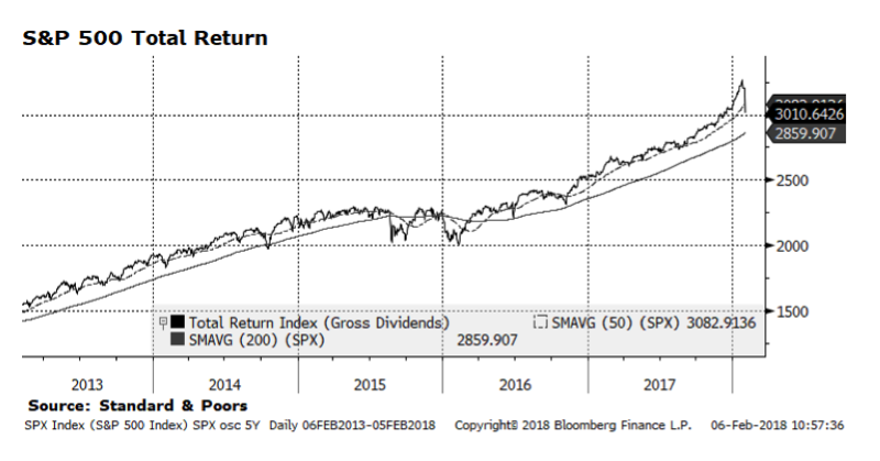
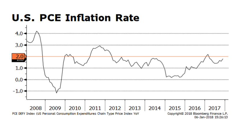
The last few trading sessions in stock markets around the globe have been painful.  The sell-off on Friday February 2nd was the steepest in nearly two years, only to be followed by a deeper fall Monday.  The prompt for the market rout appears to be a strong jobs report in the US that included signs of increasing wage inflation.  Benchmark interest rates, in turn, rose with the yield on the 10-year U.S. treasury climbing to 2.84% on Friday only to fall to 2.7% on Monday evening.  The perception that interest rates may rise faster than the market expects unnerved equity investors.  In our view, the US stock market is consolidating strong gains posted over the past year and its longer term trends are still upward-sloping.  With economic conditions showing continued improvement and corporate earnings accelerating, equities should resume their upward trajectory after this bout of selling pressure recedes.  For now, we view the stock market as experiencing a healthy, albeit harrowing, correction.

WCM Chart of the Week for January 31, 2018

The yield on the 10 Year US Treasury bond reached 2.72% today and has climbed over 65 basis points since early September 2017. This is not wholly unexpected given the strengthening of the US and world economies that has been building over the past several quarters. What we find interesting is that global government bond spreads (the difference between yields in the US and international markets) are staying persistently high, especially in the face of a weakening US dollar. The chart below shows spreads in the US versus comparable yields in the Eurozone, the United Kingdom and Japan going back two decades. US Treasury – Japanese Government Bond (JGBs) spreads have been historically wider, notably in the 2000s, while US Treasury spreads versus the UK (Gilts) and European equivalents are near all-time highs and significantly above 1.0% which served as an upper boundary.

It appears “something has to give” – either the US dollar strengthens, rates in the US recede or yields in Europe rise, thus closing the gap with US Treasury yields. We have our doubts that European economies can absorb materially higher rates even with welcomed improving economic trends.

WCM Chart of the Week for January 22, 2018

Our key position in Asian emerging market equities faced headwinds towards the end of 2017 but appears to have regained lost ground over the past month. Many economies in Asia are export-oriented and many currencies, while not explicitly pegged to the US dollar, remain managed against the greenback. A weaker dollar against the major currencies could serve as a tailwind for Asian corporate earnings. Stronger global economic growth should buttress demand in the region and valuations remain favorable compared to developed markets. The fundamental case for emerging Asia is sound, but political risk from the Korean peninsula or rising interest rates and tighter monetary policy could place downward pressure on regional bourses.

WCM Chart of the Week for January 16, 2018

Weakness in the US Dollar has been a focus of global investors as the greenback has weakened considerably versus the Euro and British pound. While the Japanese Yen has also strengthened against the US dollar over the course of the past several weeks, it doesn’t appear to have the strong momentum that the European currencies are exhibiting. The chart below shows the Euro – Yen cross rate, and the Euro has dominated the Yen for the better part of the past 12 months. Euro strength could prove a headwind for European equities in coming quarters, whereas Yen weakness could provide a boost for Japanese corporate earnings through the currency translation effect. Equities in these geographic regions tend to have a high degree of dependency on export markets and currency movements can have meaningful impact.

Happy New Year. COTW for January 10, 2018

And we’re back! Happy New Year to our friends, clients and partners.

US Personal Consumption Expenditure (PCE) Prices, depicted in this week’s chart, is an inflation indicator that we follow closely. It is still below the US Federal Reserve’s 2% target, but getting closer. This has historically been among the favorite inflation indicators monitored by the Fed and Fed watchers. Our concern is that, if inflationary pressures prompt the new Fed leadership to adopt a more rapid approach to raising the Fed funds target rate, the yield curve could flatten further or even invert. Complicating this picture is that comparable longer-term yields in Europe and Japan will likely stay lower for longer due to central bank intervention. The result could continue to tether comparable US treasury yields and lead to a yield curve inversion in the US, which in the past has been a reliable precursor to recession. However, such an inversion caused by central bank intervention rather than from the natural course of the business cycle could produce unpredictable consequences. This relationship bears watching.

WCM Chart of the Week for Dec 11, 2017

US Large Cap stocks have begun to outpace their global counterparts in the past several months. Stronger employment trends, improving economic activity, moderate inflation measures, expanding corporate earnings and stable, albeit modestly rising interest rates should buffer US corporate securities heading into 2018, in our view.

Newer posts »