Category: Chart of the Week (Page 7 of 18)

WCM Chart of the Week for November 23, 2020

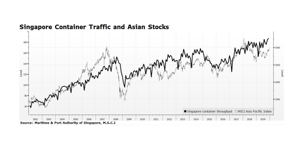
Trade flow in Asia is maintaining momentum after rebounding from the pandemic-caused low in February. Container traffic in Singapore has recently reached an all-time high level which many see as a proxy for trade in the region (or even the world) given its unique geographical location and distribution capacity. Improving economic trends in the region are also reflected in stock prices.  The MSCI Asia Pacific Index, which includes both developed and emerging equity markets, is leading global equities. The total return of the index is up 13.4% compared to the 9.5% return for FTSE All Cap Global Index so far this year through November 20, 2020. We view this as potentially a good omen for global equities because it may signal that the equity rally is broadening beyond the US. [data courtesy Maritime & Port Authority of Singapore, MSCI; chart courtesy Bloomberg LP © 2020]

WCM Chart of the Week for November 16, 2020

With US stock market indices across the capitalization spectrum at or above all-time highs, US Treasury yields have been grinding higher. Since early August, the yield on the benchmark 10-year Treasury has risen from an all-time low of 0.51% to 0.9%, forcing long-term US Treasury prices down over 7% since then according to the Bloomberg Barclays Long Term US Treasury Price Index. US stock prices have been rallying due to the announcements of highly effective COVID-19 vaccine trials, building economic momentum, clarity developing in the US political landscape and resilient as well as improving corporate fundamentals. We expect US interest rates will continue to normalize to pre-pandemic levels in coming quarters and that will likely keep downward price pressure on long term Treasuries. We expect this to be gradual given that comparable sovereign rates in Europe and Asia remain much lower or even negative. Overall conditions should be supportive for equities heading into 2021 even in the face of higher US Treasury yields. [chart courtesy Bloomberg LP © 2020]

WCM Chart of the Week for November 9, 2020

US equity markets have rallied strongly in the days following the national elections. According to Bloomberg, the S&P 500 delivered its largest day-after-election gain in history — 2.2%. This may seem perplexing because the outcome of the presidential election and even some congressional seats are yet to be finalized and markets generally fear uncertainty. It appears that Democrats will maintain control of the House of Representatives and the Senate will remain under Republican leadership while both majorities will likely be less dominant. The Electoral College does not cast its 538 votes until the first Monday following the second Wednesday in December (Dec. 14, 2020), and a lot of work is yet to be done and lawsuits to be filed in battle ground states between now and then. In light of the political uncertainty the positive tone in US equity markets can be explained by several factors. 

First, the balance in Congress is likely to lead to no drastic change in US tax rates as any proposed increase would stall in the Senate. The same would likely result from any major proposed change to US energy policy. Markets generally respond favorably to policy certainty, or at least stability. Second, another round of stimulus will likely be delivered at some point before the end of the year. This tranche of spending or relief will likely be more targeted to the areas of the economy most impacted by the deadly effects of COVID-19. Meanwhile the Fed will remain accommodative.  Markets thrive with generous stimulus. Third, the US economy is rapidly recovering.  As many expected, the US economy rebounded strongly in the third quarter, exceeding economists’ forecasts. The BEA reported GDP grew at a 33.1% annualized rate while the consensus estimates stood at 32.0% prior to the announcement. Finally, the labor market continues to improve with October employment posted as a +638,000 change in payrolls and unemployment falling to 6.9%, both better than consensus expectations.

WCM Chart of the Week for November 2, 2020

As many expected, the US economy rebounded strongly in the third quarter exceeding economists’ forecasts. The BEA reported GDP grew at a 33.1% annualized rate while the consensus estimates stood at 32.0% prior to the announcement. The rebound is quite welcomed in the wake of Q1 and Q2 contractions of 5.0% and 31.4% respectively. Strength was delivered across nearly all key sectors of the economy with the exception of Government Spending. Personal Consumption Expenditures, the largest segment of the economy, grew 40.7% (annualized) in Q3, highlighted by an 82.2% advance in Durable Goods. Gross Domestic Private Investment expanded at an 83% clip.  Exports and Imports also rebounded impressively. The recovery appears to be underway and the recent report is headline grabbing, but the level of GDP is still some 2.8% lower than at this point last year. The key to the trajectory going forward is in state and local lock downs which are lifted or reinstituted as confirmed COVID-19 cases are peaking across the nation. This introduces major uncertainty which, along with the lack of additional stimulus spending, have caused capital markets to become more volatile over the past several trading days. Stay tuned. We will.

WCM Chart of the Week for October 26, 2020

Over the past decade or more, Europe has endured several painful crises spanning Euro-related stresses to the recent Brexit uncertainty.  The common thread retarding recoveries from these epochal events has been the lack of coordinated policy response, in particular fiscal stimulus. The European Union, now with the UK removed, simply does not have the strength to influence its member states to expand fiscal spending that would benefit the region beyond each country’s own national borders. Now the global Coronavirus pandemic is accelerating to frightening levels across Europe as evidenced by case momentum. The imprint on European stock prices is telling.  From the onset of the pandemic, the broad-based EuroStoxx 600 is over 8% lower in US dollar terms and has been range trading since early June. By contrast, The S&P 500 is flirting with all-time highs. We believe the difference is that, while Europe has generally been more aggressive in the public health response to the pandemic, the overwhelming US fiscal and monetary response carries the day as compared to the apparent EU policy vacuum.

WCM Chart of the Week for October 19, 2020

Wildfire has had profound implications both for and because of climate change, for ecosystems, for communities, and for public health and safety. Wildfire has also had major economic consequences. Loss of housing, loss of commercial space, loss of public infrastructure, loss of crops, and loss of tourist revenue all add up to tens of billions of dollars a year just in the United States. The risk of wildfire conspiring with a lack of adequate governance and safety practices led to devastating financial losses and convictions on 84 counts of manslaughter for one of the largest utilities in the country. This week’s chart is from Munich Re and NatCatSERVICE by way of the Insurance Information Institute showing wildfire losses over the last decade (expressed in millions). Note that the spike in 2017 was so significant that the data from prior years is swamped by scale. While 2019 appears to have been a more modest loss year on par with earlier in the decade, according to the National Interagency Fire Center (nifc.gov) as of October 19th this year nearly twice as many acres have burned as by the 19th of last year, on pace with 2018 and 2019. The tale has yet to be written but that would suggest another likely spike in insured and uninsured losses. Economic loss is as much about the incidence of wildfire as it is the private encroachment on wild spaces. People increasingly work, farm and live in vulnerable forested and grassed spaces based on a history of relative fire scarcity that no longer exists. Without addressing both the climate systems issues to mitigate fire risk, and the resiliency of communities and businesses in the face of more frequent and prevalent fire, economic losses will continue to climb.

WCM Chart(s) of the Week for October 12, 2020

The popular, if you can call it that, view of rising carbon levels in the atmosphere is that the carbon problem is primarily an industrial problem. Oil, coal, and gas extraction and refining, power generation, factories, automobiles, chemicals, concrete, do all contribute to atmospheric CO2, and the trajectory of climate consequences tracks well with the Industrial Revolution. But what is far less well understood, but may be of much greater consequence, is global soil health. Modern agriculture, driven by feed lots, monocultures, tilling, chemical pesticides, and off-season bare soil has been systematically eliminating healthy soil as a global carbon sink. From an economic perspective what is really stunning is that these practices actually don’t result in more profit and productivity per acre for farmers. This week’s images are from Kiss the Ground, an initiative to help the world transition (back) to regenerative agriculture, which is better for both planet and profit. Become a soil advocate at www.kisstheground.com, and check out the documentary now streaming on Netflix. #kissthegroundmovie

WCM Chart of the Week for October 5, 2020

Over the past several weeks, credit spreads in US Investment Grade and High Yield bonds have risen while US equity prices hover near key support levels established since the S&P 500 and Nasdaq Composite indexes posted record highs in early September. Some consolidation in equities can be justified given the rapid recovery from the pandemic-induced lows reached in late March. The bond market appears to be sensing heightened risk. Credit spreads fell a considerable amount since the late-March spike but remain elevated compared to pre-pandemic levels and are on the rise even considering the modest tightening this past week. The yield on the 10-year US Treasury has been relatively stable since the beginning of September, fluctuating 5-10 basis points, and the US Federal Reserve remains in hyper-accommodative mode implying that the rising price of money for US corporate creditors is the main driver of widening spreads. This trend suggests that there may be further volatility ahead for US corporate securities. [chart courtesy Bloomberg LP (c) 2020]

WCM Chart of the Week for September 26, 2020

As we close out Climate Week, we need to check in on global temperature. It is climbing. Climate scientists, environmental advocates, legislators, etc. have taken to talking about “climate change” because there has been so much rhetorical pushback about “global warming”. But as the data shows, global average annual temperatures are demonstrably higher as compared to the long-term average over the last century, and decisively trending higher from the pre-Industrial period. In finance we use charts that look like this to argue the benefits of investing in stocks. Trend followers would consider this a definitive and stable factor. Climate change is the outcome and global warming is the driving factor. From a capital markets point of view a professional investor would be derelict for ignoring this data. Scientists still believe mean reversion is possible if we withdraw greenhouse gases (GHGs) from the system. Prudent investment involves deploying capital for mitigation – the reduction in GHGs to reduce climate volatility – and resilience – improving infrastructure, businesses and communities to be able to handle or ideally prevent climate-related damage. [chart courtesy NOAA, August 2020 – https://www.climate.gov/news-features/understanding-climate/climate-change-global-temperature]

WCM Chart of the Week for September 21, 2020

This week’s chart appeared in the Wall Street Journal via Germany’s Kiel Institute for the World Economy and shows the rapid rebound in global trade after the pandemic-induced economic stall.  As the Journal points out, World trade volume has regained half of the volume lost since the COVID-19 outbreak in three months whereas it took nearly 12 months for world trade to regain a similar drop in volume in the aftermath of the global financial crisis. While the rebound is not consistent across the globe, it is an encouraging sign that commerce is returning to normal.

What we find notable is the speed of the recovery in trade volume and consistency with our comments last week regarding the fast pace of US jobs re-creation. The causal nature of this recession was highly unusual, near universal global government-led economic lock-down, so it is not all that surprising that the recovery could be quicker than normal.  Several factors could disrupt the recovery including a potential second wave of viral infections, lack of an effective vaccine or therapeutics, and ongoing trade tensions.  But, improving macroeconomic trends are welcomed worldwide.

« Older posts Newer posts »