Category: Chart of the Week (Page 1 of 18)

WCM Chart for July 22, 2022

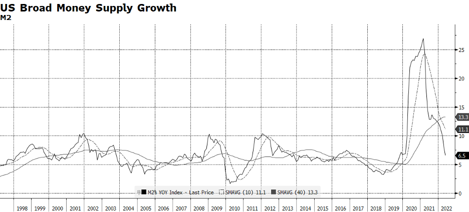
The growth in the US money supply is decelerating rapidly, which is problematic for the economy and capital markets. To be absolutely clear, the money supply itself is not shrinking – the rate of growth is. It is no secret that the US Federal Reserve is reining in liquidity by raising policy rates and decreasing the size of its $8.9 trillion balance sheet. Pre-pandemic, the Fed’s balance sheet was $4.2 trillion, less than half the current level. The reason why this is important is the Fed has largely been responsible for the explosive growth in the money supply over the past two years, which peaked at an annual pace of 26.9% in February 2021. To place that in context, the 30-year average annual growth rate of M2 is 6.4% while the current pace as of May 31st is 6.5%. But, examine the included chart. Barring the extraordinary, the current trace will crash right through the long term trend and keep going.

The 30-year average nominal US GDP growth is 4.6% according to the US Bureau of Economic Analysis. Over the long-term, M2 grows faster than nominal GDP in order to bolster economic activity, and when it slows, so does the economy. The level of M2 peaked at the end of March at $21,809 trillion, and has only grown 1.26% year-to-date. Given the receding liquidity in the US economy, it is no wonder why Q1 2022 was an anemic -1.6% (and revised down). What is critically important to us is that the Fed has been the most dominant force in money supply growth in this cycle. In more normal times, banks create money from their deposit bases, but this has been overwhelmed by the Fed’s quantitative easing programs. And so, navigating the path back to normal involves the Fed stepping back to its more traditional role.

It is difficult to envision a scenario wherein the Fed engineers a “soft landing” while simultaneously reining in 40-year high levels of inflation and supporting economy and employment. GDP growth for the first half of 2022 will be reported on July 31st and we would not be surprised if another weak reading confirms that we are in a recession. Even so, the Fed has little choice but to maintain a less-than-dovish monetary stance given current inflationary trends here and abroad. [chart courtesy Bloomberg LP (c) 2022]
From the Board of Governors of the Federal Reserve System:

  1. M1 consists of (1) currency outside the U.S. Treasury, Federal Reserve Banks, and the vaults of depository institutions; (2) demand deposits at commercial banks (excluding those amounts held by depository institutions, the U.S. government, and foreign banks and official institutions) less cash items in the process of collection and Federal Reserve float; and (3) other liquid deposits, consisting of other checkable deposits (or OCDs, which comprise negotiable order of withdrawal, or NOW, and automatic transfer service, or ATS, accounts at depository institutions, share draft accounts at credit unions, and demand deposits at thrift institutions) and savings deposits (including money market deposit accounts). Seasonally adjusted M1 is constructed by summing currency, demand deposits, and other liquid deposits, each seasonally adjusted separately.
  2. M2 consists of M1 plus (1) small-denomination time deposits (time deposits in amounts of less than $100,000) less individual retirement account (IRA) and Keogh balances at depository institutions; and (2) balances in retail money market funds (MMFs) less IRA and Keogh balances at MMFs. Seasonally adjusted M2 is constructed by summing small-denomination time deposits and retail MMFs, each seasonally adjusted separately, and adding the result to seasonally adjusted M1.

WCM Chart for June 30, 2022

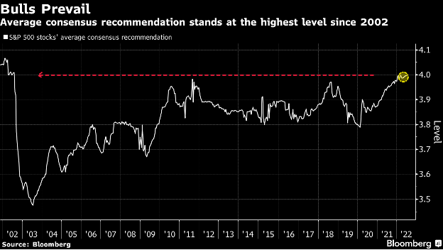
This chart comes to us from a Bloomberg article citing their proprietary US sell-side stock analyst ratings which have not been more bullish since 2002 (their scale is 1 to 5 with 1 being equivalent to a “sell” recommendation and 5 a “buy”). On the surface, they seem optimistic about equities, but we evaluate this data differently. From the end of June 2002, the S&P 500 fell (an additional) 21.1% until it ultimately bottomed at 776.76 on October 9, 2002. The index had previously fallen 33.3% from its peak on March 24, 2000 until June 30, 2002. There are several differences between 20 years ago and today. The S&P was even more top heavy with technology companies back then and there tended to be more gray hair among the analyst community than there is today. Throughout the past twenty years, our observation has been that company and industry analysts have tended to focus on micro issues and management guidance rather than macro forces that are actually dominating the path of equity markets. If the Es catch up with the Ps on the downside, which seems likely with rising rates and petroleum prices, a tight labor market and continuing supply chain issues, we will likely see chastened analysts quickly and belatedly revising down their ratings after the damage is done and the outlook for equities actually is improving.

Juneteenth

There is so much brilliant historical and current writing on the significance of this day that we eagerly defer to the scholarship around it for the authoritative sociopolitical and historical view. Our business is of course investing, and we are taking today to reflect from an ESG perspective on how chattel slavery factors into where people allocate capital and how they benefit. There is a tragic reality that major components of our economy and significant companies and industries have less-than-savory origins connected to the taking of humans and their work, including after constitutional slavery ended and a new form of taking through the carceral and other systems replaced it. This leads to questions of the justice and propriety of investing and profiting where some of today’s prosperity is rooted in historical atrocities. Entire schools of thought have emerged on how to rectify these historical social and economic injustices, and the earliest beginnings of an institutional and societal reckoning are afoot. But, as allocators of capital in the here and now, we recognize that this is not exclusively an exercise in righting wrongs from the 17th to 19th (and early 20th) centuries.

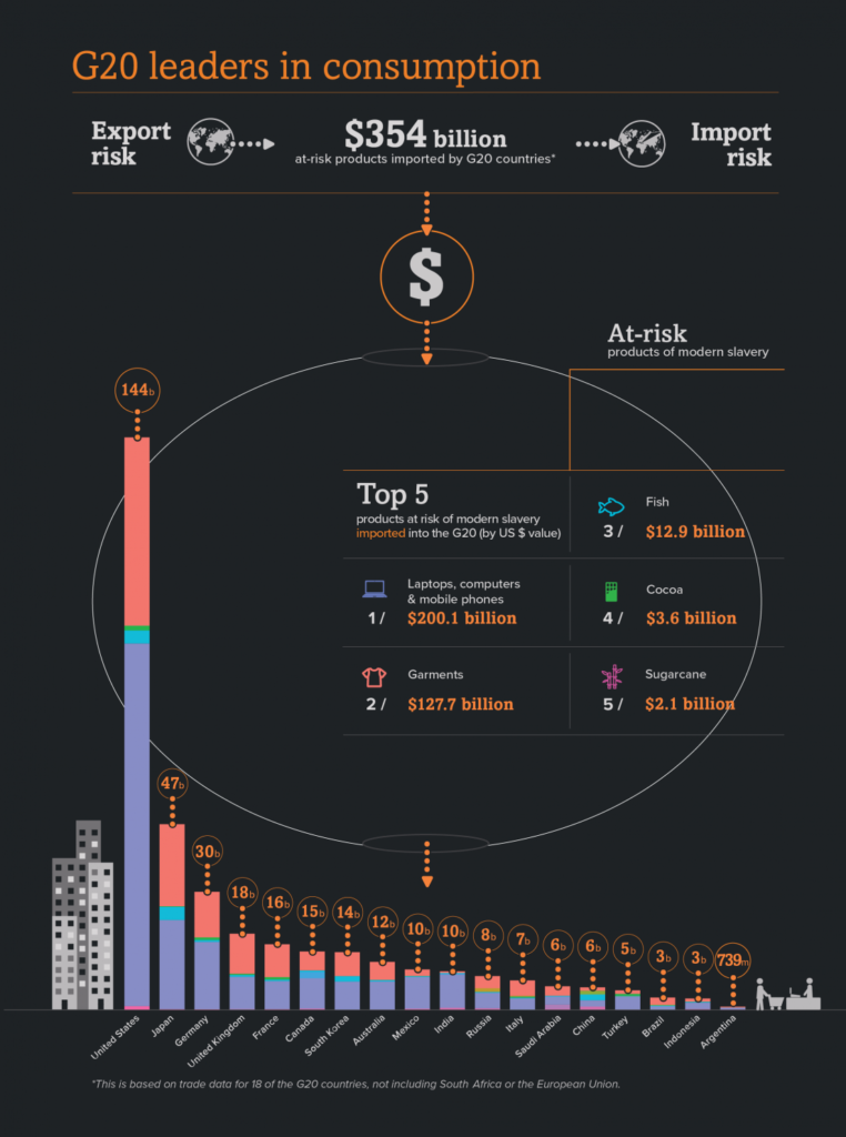
We have written about this before, but it warrants repeating today – according to the 2018 report from the Global Slavery Index, as many as 40 million people globally, the equivalent of the population of California, are in some form of modern slavery, 25 million of which are in forced labor. It is believed that the social, geopolitical and economic stresses of the global pandemic may have further exacerbated this since 2018, and the global rise in inflation may do even more damage in this regard. This is not a contemplation of past deeds or a chapter in a history book. The GSI estimates the risk to imported products by G20 countries at $354 billion, and exposure in just the top 5 at-risk industries crosses technology (computers and mobile phones for instance), apparel, fish, cocoa and sugarcane. It would be difficult to look at any current investment portfolio and not see the potential risk of profiting from slavery in supply chains.

General Order #3 was a monumental moment, but 157 years later there is still work to do in our investing, our consumption and our government policy to truly wring the unjust economic advantages of slavery out of global systems of commerce. [image from the Global Slavery Index (c) 2018]

WCM Chart for June 10, 2022

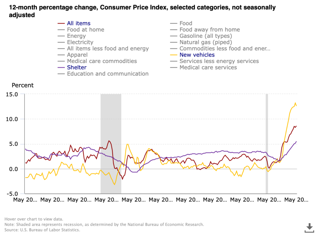
We have a new CPI print today which sent markets into a week-ending nosedive. 8.6% for May puts inflation for consumers near where it was in 1981 before the Volcker Fed cranked rates to an eye-watering 17+%. For as painful as rate increases are right now we have light years to travel before anything even remotely resembling the 80’s, nostalgia for Soviet conflict and striped shirts notwithstanding. This chart from the US Bureau of Labor Statistics compares CPI in total against two of the three components that seem ripe for a nasty mean reversion, the third being energy which we covered in the last chart and commentary. Shelter has broken out, rising to 5.5% which exceeds the lusty moments before the housing market imploded with the Financial Crisis. We have been pointing out repeatedly that there are two major moving parts driving increases in shelter — the speculative fervor over single family housing fueled by low rates, urban migration and non-human (e.g. investment fund) buyers, and the inevitable upward correction in rentals after ending pandemic moratoria on rent, rent increases and evictions. It seems likely that the single family bubble is nearing its bursting point especially as the Fed acts, but rent will continue to grind higher as the economy digests the rental disruptions of the pandemic.

New vehicles on the other hand appear perched on the precipice. Supply chain disruptions, particularly for microchips, have tightened supply and handed dealers tremendous pricing power even while makers have largely kept their price increases steady (but have been able to slow or suspend aggressive promotional programs). The rate of increase peaked at 13.2% in April and posted 12.6% for May. Other than playing demand catch-up after the market for new vehicles crashed in the depths of the Financial Crisis, the 12-month change over the last 20 years has stayed in a band of +/- 2%, and most of the time close to zero. There will come a moment when makers catch up and inventory will be abundant (and auto loan and lease rates will be higher), and the market may well punish the dealers for exploiting the situation, potentially severely. [Chart courtesy US BLS, CPI All Items, Shelter and New Vehicles, May 2002 to May 2022]

WCM Chart for June 2, 2022

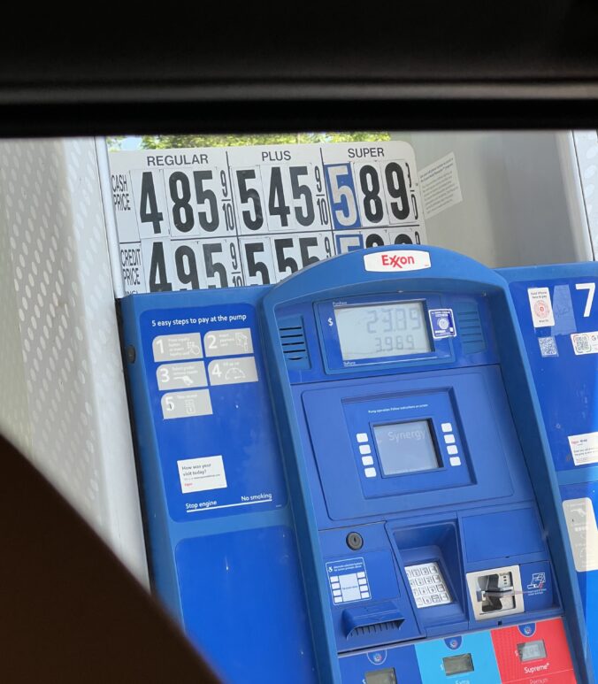
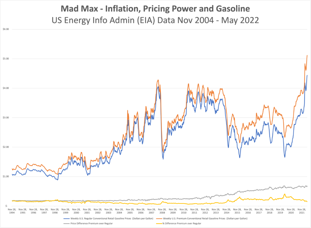
What’s up with gas? Inflation is everywhere, but it is hard to normalize when we are having the breakfast table conversations about how much prices have climbed. Our shopping carts are different from each other’s and aren’t always consistent from one trip to the next, but we get a general sense that the final tally is higher but the receipt isn’t any longer. One thing most of us, with the exception of certain urban dwellers and the small population of EV drivers, do have in common though is the price of gas. There is some geographic dispersion because of cost of delivery and local/state taxes, but we all buy the same three or four grades of gasoline, measure it in gallons, pay for it in dollars, and unless we change vehicles from one fill to the next, consume it at roughly the same rate per mile driven. This chart won’t reveal the mysteries of why prices are up, but there are a few interesting takeaways that show that there aren’t likely any easy answers. Maybe the most notable observation is that gasoline has gotten more expensive than the prior all-time peak in 2008 (about 11% higher right now). What isn’t on the graph is that oil (WTI Cushing) is about 21% cheaper than it was during the ’08 bubble.

Back to the chart, we can see that the spread between premium and regular gas has been steadily grinding higher for years, with few interruptions in the relationship outside of brief reactions to the Tech Bubble, 9/11, the Financial Crisis, etc. For those old enough to remember, it was bankable that mid-grade was 10 cents more than regular, and premium was ten cents more than that. Now that premium/regular spread hovers between 65 and 70 cents, today and two years ago when everyone was hunkered down at home. These figures would indicate that the petro industry still enjoys tremendous pricing power. When thinking about inflation it is important to consider what the drivers are and who gets hurt, but also who benefits. It was almost exactly 11 years ago when WTI was the same price it is today ($112/bbl). Regular was $3.91, and Premium was $4.15. Today at $112/bbl, Regular is $4.44 and Premium $5.12. [chart © WCM 2022, national data from US Energy Information Administration (EIA)]

WCM Chart(s) for April 29, 2022

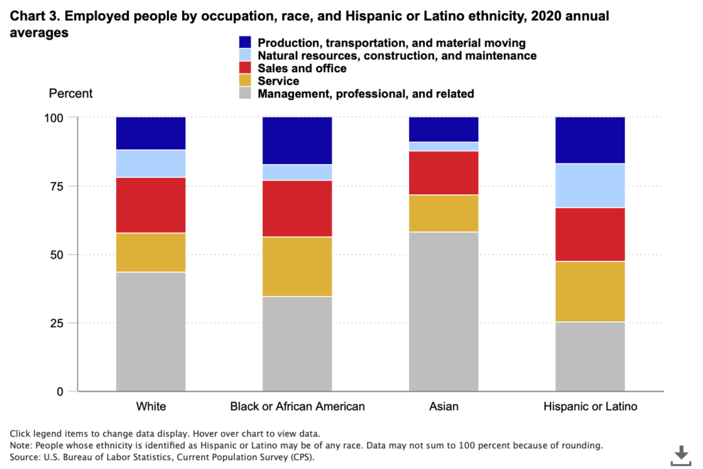
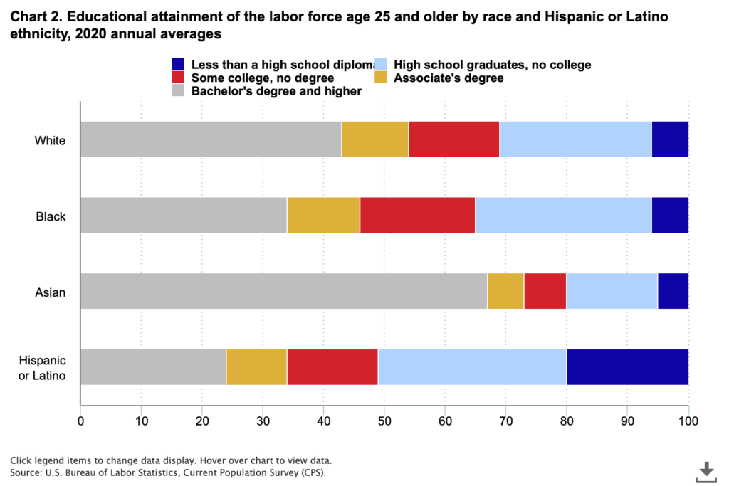
The subject of DE&I – diversity, equity, and inclusion – is having its moment in discussions about companies and workforces. Numerous studies have been conducted attempting to quantify the degree to which all manner of performance metrics improve when access and representation look more like the population at large. We are entirely supportive of a focus on DEI, but not necessarily the focus as it currently stands in the investment world. There is a strong impulse to count and score things to reduce the uncertainty of qualitative observations to quantitative data points, which is not unique to DEI or ESG. DEI happens to lend itself well to that approach because people can be counted. How many women? How many indigenous peoples? How many veterans? What we find is that counting or checking boxes can illuminate deficiencies, but does little to uncover how or why, and fails to understand the interdependencies between different categorizations, such as veterans and health and disability, or race/ethnicity and economic status and education. For instance, a company hiring STEM workers may come up short in its hiring of women or people of color, which could be a failure of policy and practice, or it could be that the supply of qualified candidates is insufficient because universities are not producing a diverse pool of graduates from which to draw. For us, it is a systems-level question. We start with the reasoned assumption that diverse, equitable and inclusive workplaces are more productive and more profitable as well as being more fundamentally just, but our focus is on the systems that perpetuate unproductive biases. That could be and often is rooted in discriminatory practices and systemic biases, but those biases do not exclusively live with the hiring manager or company nor are they fixable in the immediate term no matter how radical a policy shift is implemented. It takes time to establish systems of good governance, cultivate and develop talent, and equalize compensation and promotion opportunities, and those systems extend well beyond the four walls of a given company into our communities and our education, nutrition, health care and other civic services. High performance through an ESG lens where DEI is concerned is establishing and fostering systems and processes that naturally produce a more representative workforce by developing and improving the capability and capacity of candidate workers and opening access to opportunities. [charts courtesy US Bureau of Labor Statistics, Current Population Survey]

WCM Chart of the Week for April 14, 2022

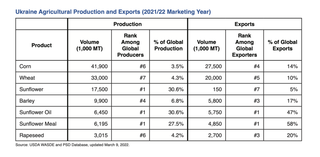
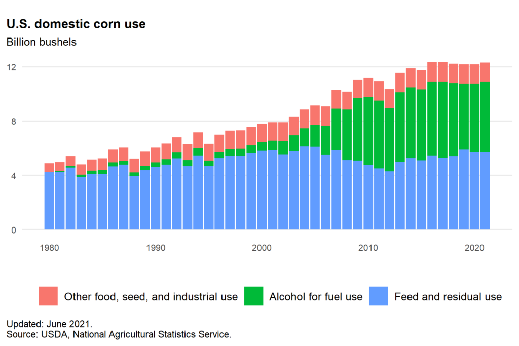
Let’s talk about something that proves that short-sighted or wrong-headed decisionmaking in ESG is bipartisan. One of the incredibly unfortunate halo effects of the Ukraine conflict is the global food shortage caused by Europe’s breadbasket being at war and the sanctions limiting access to Russian natural gas (key source for fertilizer). In addition to placing at risk a large percentage of the world population that are already nutritionally insecure, it has the effect of driving up commodity and food prices in the developed West. As we have discussed in prior blogs and newsletters, the conflict has also destabilized the petroleum market because of Russia’s role as a petrostate. The US is effectively energy independent, or nearly so if we look at all of North America together, but no question energy prices are higher. So what’s an American to do in the face of a global food and energy crisis? The US administration has an answer – put food in your gas tank. The decision to move to E15, 15% anhydrous denatured alcohol in the fuel mix, for the Summer arguably makes the whole situation worse. Referring to the US Energy Information Administration, the ASTM D4806 specification for ethanol compatible with spark-ignition engines is produced by “fermenting the sugar in the starches of grains such as corn, sorghum, and barley, and the sugar in sugar cane and sugar beets”. The first chart is from the USDA Foreign Agricultural Service and shows just how material Ukraine is to the global food supply. The second from the USDA statistics service shows already how much US corn production goes to fuel. There is a whole additional discussion to be had about the sense or senselessness of grain and cane crops being turned into fuel, from the energy intensity of the chemical conversion to the natural gas used to make fertilizer to the diesel burned for farm equipment to the climate costs of unsustainable monocrop farming practices that strongly suggests shortening the path from drill bit to burner tip is more efficient. But right now, we are focusing on the fact the US could (profitably) ameliorate rising food scarcity and prices with the same agricultural products it is planning to ferment and burn to save 10 cents on a $5 gallon of gas at the pump.

WCM Chart of the Week for April 4, 2022

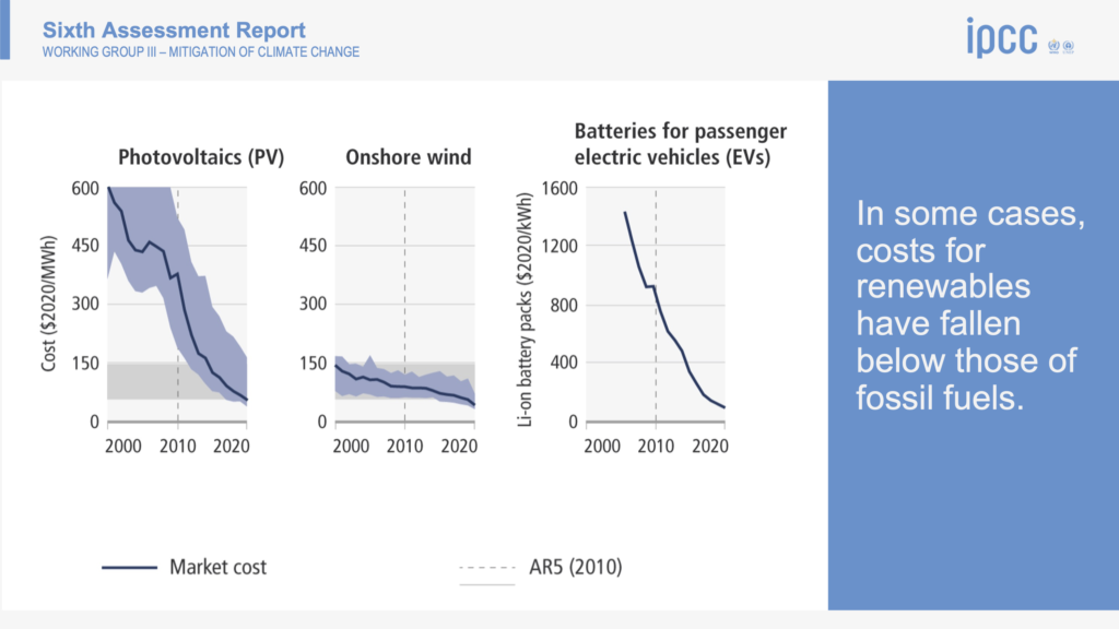
With the release of “Climate Change 2022: Mitigation of climate change”, which is the third segment of this year’s sixth assessment report (AR6) from the IPCC, most of the attention will be focused again on the doomsday charts. One of the notable ones in the press packet is entitled “We are not on track to limit warming to 1.5 (deg) C.” But, the report is surprisingly optimistic in one very critical sense – it declares the problem addressable if global action is taken promptly and capital is called in off the sidelines to drive a transition in energy, land use, industry, urban zones, buildings and transportation that could halve GhG emissions by 2030. At this point the debate then usually swings to the nature of capitalist systems and that capital will flow to where it can be used most efficiently and to greatest effect (e.g. risk-adjusted return), and there it stops. Advocates for changing policy on climate will trot out the “if we don’t act we’ll all die and your money won’t mean anything” argument, having failed to learn that existential threats don’t tend to deter markets until they become existential realities, supporting a party-like-it’s-1999 mentality. However, one slide in the press packet which probably won’t get much attention actually holds the key to activating capital entitled “(In some cases) costs for renewables have fallen below those of fossil fuels.” This is profound in that it doesn’t require the rest of the science or policy or existential concerns to affect the flow of capital. It is simply becoming cheaper to convert today’s sunshine and wind into electricity and shove it into batteries than to dig up fossilized sunshine from more than 65 million years ago and burn it. Even with investment and innovation in efficiency, modern society will continue to be increasingly energy intensive, and as more of the world’s population joins the middle class, utilization will become even more widespread. Intelligent allocators of capital will pursue the cheaper inputs that will meet that demand.

The Doomsday Glacier — It’s Not a Bond Villain’s Plot. It’s Worse.

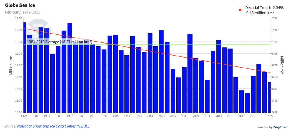
While many other things dominated the headlines from the Russian/Ukrainian conflict to inflation and policy response to COVID-19 Omicron part deux, something that was considered mostly unthinkable by scientists happened in Antarctica. According to the US National Ice Center (https://usicecenter.gov/PressRelease/IcebergC38):  “(USNIC) has confirmed that iceberg C-38… has calved from the Conger Ice Shelf in the Wilkes Land Region of Antarctica. As of March 17, C-38 was centered at 65° 40′ South and 102° 46′ East and measured 16 nautical miles on its longest axis and 10 nautical miles on its widest axis. C-38 comprised virtually all that remained of the Conger ice shelf, which was adjacent to the Glenzer Ice Shelf which calved last week as iceberg C-37.” Eyes had been on another part of Antarctica over concerns about the potential collapse of the so-called “Doomsday glacier” — Thwaite’s glacier. But, Conger beat Thwaite to the punch with a break-away described as nearly the size of Los Angeles. Our attached chart from NOAA NCEI chronicles the decline in global sea ice just since 1979. When split into hemispheres, Northern loss is faster at -2.68% vs. “only” -0.33% for Southern (decadal trend). The fact Conger collapsed and Thwaite’s is trying is deeply concerning because it illustrates just how fragile the system is. Failure to adjust climate-changing activities and to start building resiliency and adaptation into industries and communities poses real threats to economic stability and prosperity and the performance of investments over a shorter-term horizon than many expect.

WCM Chart of the Week for February 22, 2022

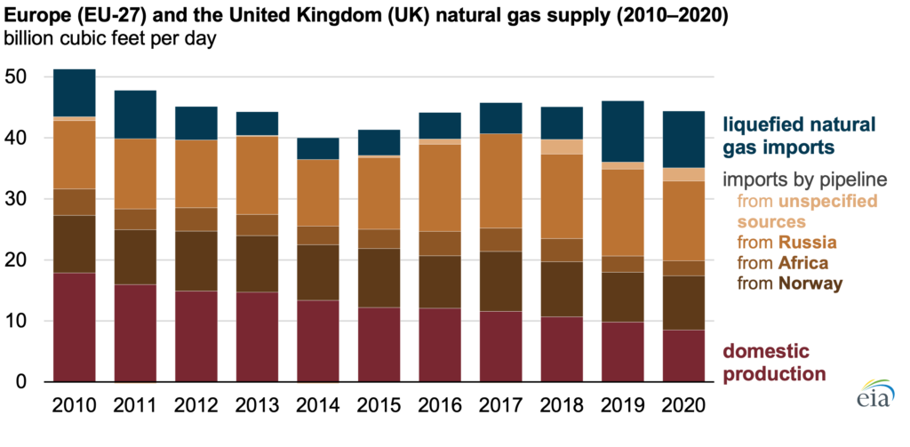
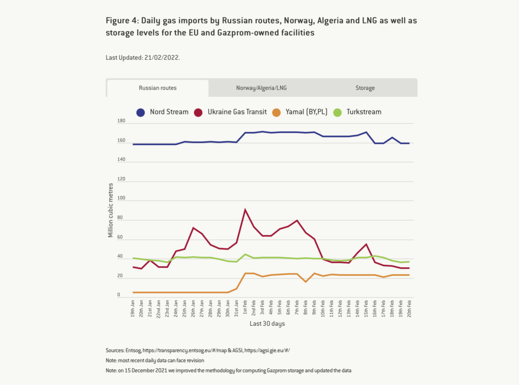
This week we get to take a break from talking about inflation to talk about… inflation. Although, in this case, what effects Russia’s moves on Ukraine might have. Russia’s economy is the 11th largest in the world as measured by nominal GDP, which seems significant until we realize it is smaller than Canada’s and 1/10 the size of China’s. Ukraine is 55th. Where Russia is most consequential in terms of their economy on the world stage is energy – petroleum and natural gas. Europe is a net importer of natural gas, a significant portion but not all of which comes from Russia. They have been increasing LNG imports from the US and Qatar, but that is mostly offset by a steady decline in domestic production. Natural gas is not the only major piece of the European energy portfolio, but it is material. Prices have already been high, and the decision to delay certifying Nord Stream 2 in response to Russian aggression means little relief is on the way. Globally, “OPEC+” has been falling short of targets to increase production post-COVID wind-down and the Ukraine conflict will not help climbing prices for oil either. The West is putting the framework for a new sanctions regime in place but that will mostly be about deciding who takes what share of the economic pain to box out Russia. Rising oil prices have similar effects on the economy as rising interest rates, so we are interested to see how the Fed digests the changing macroeconomic environment and the need to be aggressive on policy rates later in the year. Looking longer term, assuming the priority does not become preventing total war as Putin tries to reassert the borders of the former Soviet Union, we see this moment as a tipping point for Europe to accelerate their transition to a low-carbon future because it is an undeniable security imperative for the EU member states.  [Sources: US Energy Information Administration https://www.eia.gov/todayinenergy/detail.php?id=51258 and McWilliams, B., G. Sgaravatti, G. Zachmann (2021) ‘European natural gas imports’, Bruegel Datasets, first published 29 October, available at https://www.bruegel.org/publications/datasets/european-natural-gas-imports/]

« Older posts